Discuss Scratch

- Discussion Forums
- » Suggestions
- » Change color on "You can't post an empty comment!" & login errors to make them more readable
![[RSS Feed]](//cdn.scratch.mit.edu/scratchr2/static/__f17a70240ea1b997b429416c7f10eabf__//djangobb_forum/img/feed-icon-small.png "[RSS Feed]")
- Zydrolic
-
 Scratcher

1000+ posts
Change color on "You can't post an empty comment!" & login errors to make them more readable
bumpepisode 2
https://scratch.mit.edu/discuss/youtube/H597t74XPtM/
reject proper signatures, embrace comedy!!!111 (joking)
"Everything will be okay"

reject proper signatures, embrace comedy!!!111 (joking)
"Everything will be okay"
- Zydrolic
-
Scratcher
1000+ posts
Change color on "You can't post an empty comment!" & login errors to make them more readable
bump
https://scratch.mit.edu/discuss/youtube/H597t74XPtM/
reject proper signatures, embrace comedy!!!111 (joking)
"Everything will be okay"
reject proper signatures, embrace comedy!!!111 (joking)
"Everything will be okay"
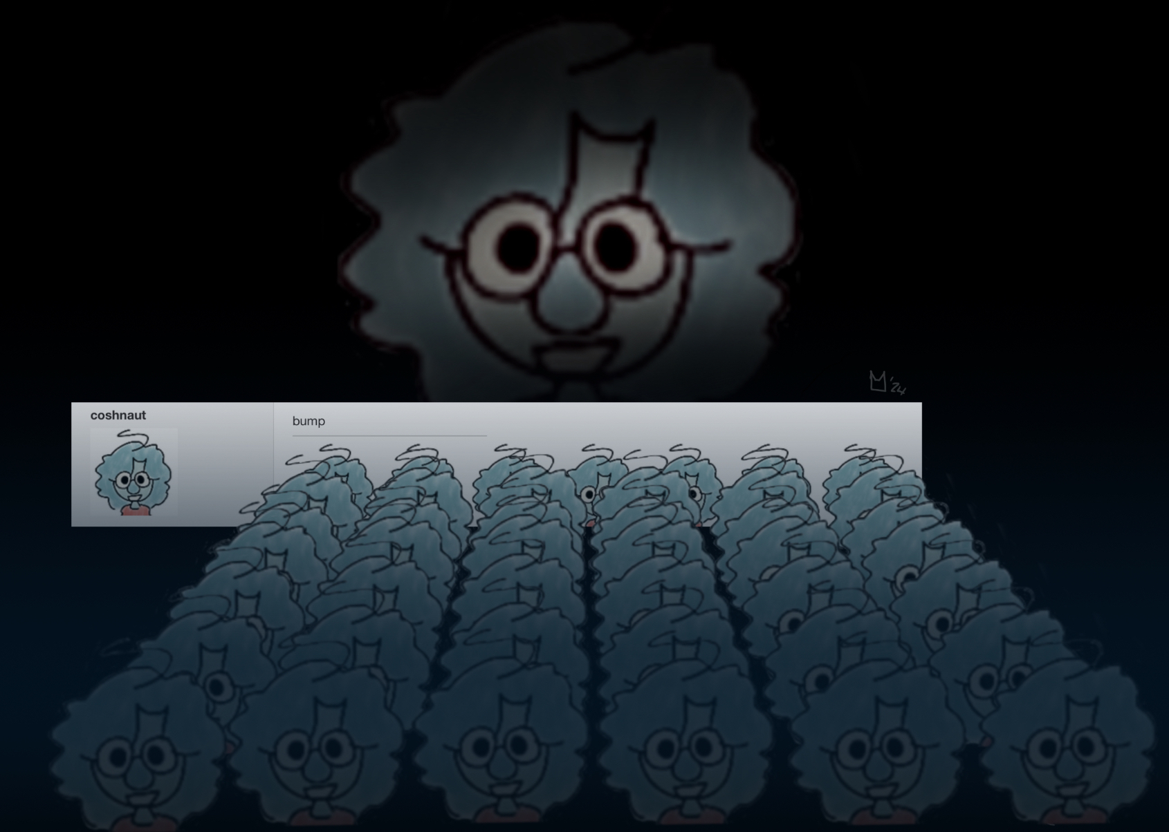
- coshnaut
-
 Scratcher

100+ posts
Change color on "You can't post an empty comment!" & login errors to make them more readable
i feel like by now we should have stopped bumping this
Last edited by coshnaut (Jan. 24, 2024 08:12:51)
- lgrov44
-
 Scratcher

500+ posts
Change color on "You can't post an empty comment!" & login errors to make them more readable
There are mixed people here in this forum. People who think it is will be more readable (most people) and people who think it is less readable and people who bumped the forum alot, however, whether we should add it depends on if it is worth adding it based on the workaround (which is using a browser extenstion I can't name), its effect (changing colours to make more readable), how much effort is required (little) and whether or not there is a better way based on previously mentioned factors. Due to this, I don't think we should increase the contrast, only because of the fact that I think it would be better to instead suggest a suggestion to allow users to customize the colours than this suggestion.(#22)That'd make this a dupe however, and you know that as well.
Honestly, the best solution is let everyone customise the colours.(#22)I'd rather appease people by going with it but honestly
It is a bit ugly, but who cares? You'll barely even see this message.
why the frick does it matter if it looks ugly if its atleast more readable?
Currently it's quite a pain to read still

Last edited by lgrov44 (Jan. 24, 2024 08:39:26)
Don't really know what to put here…
How to get any of your questions answered quick for new Scratchers:
1. Check for any available data or duplicate topics, especially in the Scratch Wiki.
2. Create a forum post, describe the issue or question with great detail. Also consider adding links if an issue with a project.
3. Engage helpfully and nicely with others in this forum.
4. Bump a maximum of once a day if there has been no activity for 24 hours and it is not on the first page.
5. Repeat 3-4 when appropriate until resolved.
6. Close the topic (Located at the very bottom to the left). If it isn't there, wait until the topic is at least 24 hours old.
- INSERT-USER_NAME
-
 Scratcher

1000+ posts
Change color on "You can't post an empty comment!" & login errors to make them more readable
I actually like the example in the post better than the original.

- PaperMarioFan2022
-
 Scratcher

1000+ posts
Change color on "You can't post an empty comment!" & login errors to make them more readable
Support. The original one is a little too hard to read in white over orange since I read in a light theme more than a dark theme, so it would help in contrast to see the message better if it were that color.
Hello! Welcome to my signature!
I am a real Mario enthusiast and a fan of the franchise and also getting into the field of IT. I also play Luigi's Mansion and other games too!
Profile | Ocular | ScratchStats | PostPercent | GitHub Main | Snap!
Professional Mario Enthusiast / (NEW!) 3DS FC: 2252-0951-8546 / (NEW!) Switch FC: SW-2091-2478-9614 / (removed - due to concerns in moderation) ARarePaper


I forgor my account password to give an internet ☠
I’ve been a Scratcher since 2021!
My glorious meme section (scroll down to see more)

- Zydrolic
-
Scratcher
1000+ posts
Change color on "You can't post an empty comment!" & login errors to make them more readable
(#65)Customizing colors already has a thread so suggesting it here just CTRL+D's that suggestion - Just customizability is of course always the better solution, but this is already more readable and fails zero WCAG standards.
There are mixed people here in this forum. People who think it is will be more readable (most people) and people who think it is less readable and people who bumped the forum alot, however, whether we should add it depends on if it is worth adding it based on the workaround (which is using a browser extenstion I can't name), its effect (changing colours to make more readable), how much effort is required (little) and whether or not there is a better way based on previously mentioned factors. Due to this, I don't think we should increase the contrast, only because of the fact that I think it would be better to instead suggest a suggestion to allow users to customize the colours than this suggestion.
https://scratch.mit.edu/discuss/youtube/H597t74XPtM/
reject proper signatures, embrace comedy!!!111 (joking)
"Everything will be okay"
reject proper signatures, embrace comedy!!!111 (joking)
"Everything will be okay"
- Zydrolic
-
Scratcher
1000+ posts
Change color on "You can't post an empty comment!" & login errors to make them more readable
bump
https://scratch.mit.edu/discuss/youtube/H597t74XPtM/
reject proper signatures, embrace comedy!!!111 (joking)
"Everything will be okay"
reject proper signatures, embrace comedy!!!111 (joking)
"Everything will be okay"
- lgrov44
-
Scratcher
500+ posts
Change color on "You can't post an empty comment!" & login errors to make them more readable
Yes, but do you think that if there is a better way to do something, you should at least do that instead, or that, in this case, if there is something better to suggest, you should suggest that instead? Also, if something better is rejected or already has a thread, shouldn't the attention be brought to that thread as if it was rejected, the original thread should probably be rejected too and if it wasn't, it would solve the issue?(#65)Customizing colors already has a thread so suggesting it here just CTRL+D's that suggestion - Just customizability is of course always the better solution, but this is already more readable and fails zero WCAG standards.
There are mixed people here in this forum. People who think it is will be more readable (most people) and people who think it is less readable and people who bumped the forum alot, however, whether we should add it depends on if it is worth adding it based on the workaround (which is using a browser extenstion I can't name), its effect (changing colours to make more readable), how much effort is required (little) and whether or not there is a better way based on previously mentioned factors. Due to this, I don't think we should increase the contrast, only because of the fact that I think it would be better to instead suggest a suggestion to allow users to customize the colours than this suggestion.
Last edited by lgrov44 (Jan. 29, 2024 14:28:42)
Don't really know what to put here…
How to get any of your questions answered quick for new Scratchers:
1. Check for any available data or duplicate topics, especially in the Scratch Wiki.
2. Create a forum post, describe the issue or question with great detail. Also consider adding links if an issue with a project.
3. Engage helpfully and nicely with others in this forum.
4. Bump a maximum of once a day if there has been no activity for 24 hours and it is not on the first page.
5. Repeat 3-4 when appropriate until resolved.
6. Close the topic (Located at the very bottom to the left). If it isn't there, wait until the topic is at least 24 hours old.
- subjectnamehere
-
 Scratcher

1000+ posts
Change color on "You can't post an empty comment!" & login errors to make them more readable
(#71)i had a stroke trying to read this
Yes, but do you think that if there is a better way to do something, you should at least do that instead, or that, in this case, if there is something better to suggest, you should suggest that instead? Also, if something better is rejected or already has a thread, shouldn't the attention be brought to that thread as if it was rejected, the original thread should probably be rejected too and if it wasn't, it would solve the issue.
this suggestion would also be a lot faster and easier to implement, and still does a pretty good job (at least imo) of solving the issue.
uwu
- lgrov44
-
Scratcher
500+ posts
Change color on "You can't post an empty comment!" & login errors to make them more readable
Well, the main issue is that it is not very readable and how readable it is depends on people's preferences (As shown in the graph below), however, most prefer black and white, for this case, yellow/white and dark orange or red and white, but specificly what colour pair is typically best doesn't really matter. If you were to say that one colour pair is more readable, that would apply to a certain group of people. The graph is limited on the used color pairs, however, shows that not everyone has the same color preferences. There will always be people who do not like the colour pairs. So it seems to me like it would be better to allow people to customize their colours, after all, it would solve the problem of people not entirely agreeing on a specific colour pair.

Credit: https://www.w3.org/WAI/RD/2012/text-customization/r11
Credit: https://www.w3.org/WAI/RD/2012/text-customization/r11
Last edited by lgrov44 (Jan. 29, 2024 14:29:19)
Don't really know what to put here…
How to get any of your questions answered quick for new Scratchers:
1. Check for any available data or duplicate topics, especially in the Scratch Wiki.
2. Create a forum post, describe the issue or question with great detail. Also consider adding links if an issue with a project.
3. Engage helpfully and nicely with others in this forum.
4. Bump a maximum of once a day if there has been no activity for 24 hours and it is not on the first page.
5. Repeat 3-4 when appropriate until resolved.
6. Close the topic (Located at the very bottom to the left). If it isn't there, wait until the topic is at least 24 hours old.
- Zydrolic
-
Scratcher
1000+ posts
Change color on "You can't post an empty comment!" & login errors to make them more readable
(#71)Yes, however that does not mean alternatives should be ruled out - While that basically resolves it all, this is not only just a literal 3 letter change (#FFF –> #000) in the CSS styling, but also does not fail WCAG standards either, compared to the current scheme, which just completely fails.
Yes, but do you think that if there is a better way to do something, you should at least do that instead, or that, in this case, if there is something better to suggest, you should suggest that instead? Also, if something better is rejected or already has a thread, shouldn't the attention be brought to that thread as if it was rejected, the original thread should probably be rejected too and if it wasn't, it would solve the issue?
And again, just because a better solution exists does not mean alternatives should not be considered either. Both of these resolve an issue - This, is a smaller one.
(#73)It's obvious that customizing the color freely is a win for everyone - And that not all pairs are best for everyone. I get that, but even then the current one is a complete failure to WCAG standards; I'm unable to word this any better so I'm probably looking bad, but I digress.
Well, the main issue is that it is not very readable and how readable it is depends on people's preferences (As shown in the graph below), however, most prefer black and white, for this case, yellow/white and dark orange or red and white, but specificly what colour pair is typically best doesn't really matter. If you were to say that one colour pair is more readable, that would apply to a certain group of people. The graph is limited on the used color pairs, however, shows that not everyone has the same color preferences. There will always be people who do not like the colour pairs. So it seems to me like it would be better to allow people to customize their colours, after all, it would solve the problem of people not entirely agreeing on a specific colour pair.
-snip-
Credit: https://www.w3.org/WAI/RD/2012/text-customization/r11
From anyone I've asked (offsite) they said black combination was a win, and I have not seen anyone that said that the white combo is better.
And again, this is still just an alternative to that suggestion, and this is a mere 3 character change in the CSS file.
https://scratch.mit.edu/discuss/youtube/H597t74XPtM/
reject proper signatures, embrace comedy!!!111 (joking)
"Everything will be okay"
reject proper signatures, embrace comedy!!!111 (joking)
"Everything will be okay"
- lgrov44
-
Scratcher
500+ posts
Change color on "You can't post an empty comment!" & login errors to make them more readable
You're not looking bad, it's just that there is a suggestion to argue about and we, without much violence or profanity of course, are arguing for the side we seperately agree on. That is supposed to happen. Nevertheless, I would personally prefer the white and orange/red, not because you said you haven't seen anyone that said it was better or that I have a disability affecting vision but because I truthfully think that. Regardless, I do believe that the current one may be more unreadable to some but not to others with some examples affecting more people than others, thus your suggestion is very reasonable and I do think that it should be changed, what the specific color pair is or how it works. I do have to ask you though, do you think it would be better to have most people or almost everyone (except for blind people or people with too severe disabilites affecting vision of course) to be able to say that it is at least readable enough to them?(#71)Yes, however that does not mean alternatives should be ruled out - While that basically resolves it all, this is not only just a literal 3 letter change (#FFF –> #000) in the CSS styling, but also does not fail WCAG standards either, compared to the current scheme, which just completely fails.
snip
And again, just because a better solution exists does not mean alternatives should not be considered either. Both of these resolve an issue - This, is a smaller one.(#73)It's obvious that customizing the color freely is a win for everyone - And that not all pairs are best for everyone. I get that, but even then the current one is a complete failure to WCAG standards; I'm unable to word this any better so I'm probably looking bad, but I digress.
snip
From anyone I've asked (offsite) they said black combination was a win, and I have not seen anyone that said that the white combo is better.
And again, this is still just an alternative to that suggestion, and this is a mere 3 character change in the CSS file.
Also, yes, even if there are alternatives, it doesn't mean we shouldn't consider this one, that is true. It is just that it is related in reasoning to this, so is probably useful to this and to whether or not this suggestion should be done.
(why do i have to write so long sometimes…)
Last edited by lgrov44 (Jan. 30, 2024 04:11:11)
Don't really know what to put here…
How to get any of your questions answered quick for new Scratchers:
1. Check for any available data or duplicate topics, especially in the Scratch Wiki.
2. Create a forum post, describe the issue or question with great detail. Also consider adding links if an issue with a project.
3. Engage helpfully and nicely with others in this forum.
4. Bump a maximum of once a day if there has been no activity for 24 hours and it is not on the first page.
5. Repeat 3-4 when appropriate until resolved.
6. Close the topic (Located at the very bottom to the left). If it isn't there, wait until the topic is at least 24 hours old.
- EDawg2011
-
 Scratcher

1000+ posts
Change color on "You can't post an empty comment!" & login errors to make them more readable
This needs to be done RIGHT NOW! The website could get sued and taken down for breaking UN WCAG guidelines. 

Please note that I may sometimes make a mistake and give wrong information.
Can you please put this at/near the top of your signature and tell people that tag spam isn't allowed and it manipulates the algorithm, to start a chain and spread the word? https://scratch.mit.edu/discuss/topic/747346/?page=1#post-7864829 - Thanks, @EDawg2011.
But then I had a very good idea. I used F5. See, using F5 gave me a whole new perspective and I was able to see a chest I couldn't have seen before.
(Highlight text + down arrow + shift to see the rest of my signature.)
Help find out who ate @cheddargirl's signature! l me when i accidentally spread misinformation l Platformer Skibidi
<0-0::sensing>//This is Charles; he protects my signature from evil kumquats.
when I'm spawned::events hat//This is the code Charles' brain runs on.
forever
if <[100] > (distance to [an evil kumquat v])> then
delete the evil kumquat::control
end
end
Be moist.


- cookieclickerer33
-
 Scratcher

1000+ posts
Change color on "You can't post an empty comment!" & login errors to make them more readable
The contrast between the black Text is actually lower than the contrast between that background and the white text
⠀ ⠀ I beat Mario 64 yay! ⠀⠀ ⠀ ⠀ ⠀ ⠀ I love you ivy & may :3
⠀ ⠀ ⠀ ⠀ ⠀ ⠀⠀ ⠀ ⠀GEOMETRY DASH

- cookieclickerer33
-
Scratcher
1000+ posts
Change color on "You can't post an empty comment!" & login errors to make them more readable
This needs to be done RIGHT NOW! The website could get sued and taken down for breaking UN WCAG guidelines.No, that’s not how that works
What does a failing grade mean?It says nothing about it being not allowed, all it says is it should be avoided
The grading uses a combination of color contrast, text size and text weight. A fail simply means that the color combination offers some visual strain to the person seeing it and should be avoided if possible.
Also scratch is based in the US so why would a random “law” in Europe effect them
⠀ ⠀ I beat Mario 64 yay! ⠀⠀ ⠀ ⠀ ⠀ ⠀ I love you ivy & may :3
⠀ ⠀ ⠀ ⠀ ⠀ ⠀⠀ ⠀ ⠀GEOMETRY DASH
- EDawg2011
-
Scratcher
1000+ posts
Change color on "You can't post an empty comment!" & login errors to make them more readable
Scratch turned purple; if it didn't, the ADA could've sued them.This needs to be done RIGHT NOW! The website could get sued and taken down for breaking UN WCAG guidelines.No, that’s not how that worksWhat does a failing grade mean?It says nothing about it being not allowed, all it says is it should be avoided
The grading uses a combination of color contrast, text size and text weight. A fail simply means that the color combination offers some visual strain to the person seeing it and should be avoided if possible.
Also scratch is based in the US so why would a random “law” in Europe effect them
Sorry that I got it wrong.
Please note that I may sometimes make a mistake and give wrong information.
Can you please put this at/near the top of your signature and tell people that tag spam isn't allowed and it manipulates the algorithm, to start a chain and spread the word? https://scratch.mit.edu/discuss/topic/747346/?page=1#post-7864829 - Thanks, @EDawg2011.
But then I had a very good idea. I used F5. See, using F5 gave me a whole new perspective and I was able to see a chest I couldn't have seen before.
(Highlight text + down arrow + shift to see the rest of my signature.)
Help find out who ate @cheddargirl's signature! l me when i accidentally spread misinformation l Platformer Skibidi
<0-0::sensing>//This is Charles; he protects my signature from evil kumquats.
when I'm spawned::events hat//This is the code Charles' brain runs on.
forever
if <[100] > (distance to [an evil kumquat v])> then
delete the evil kumquat::control
end
end
Be moist.
- cookieclickerer33
-
Scratcher
1000+ posts
Change color on "You can't post an empty comment!" & login errors to make them more readable
They turned purple because it was better contrast for the white text. it wasn’t because they could have been suedScratch turned purple; if it didn't, the ADA could've sued them.This needs to be done RIGHT NOW! The website could get sued and taken down for breaking UN WCAG guidelines.No, that’s not how that worksWhat does a failing grade mean?It says nothing about it being not allowed, all it says is it should be avoided
The grading uses a combination of color contrast, text size and text weight. A fail simply means that the color combination offers some visual strain to the person seeing it and should be avoided if possible.
Also scratch is based in the US so why would a random “law” in Europe effect them
Sorry that I got it wrong.
This is suggesting to change the text color to be worse than the old blue ones contrast
Last edited by cookieclickerer33 (Jan. 30, 2024 14:33:34)
⠀ ⠀ I beat Mario 64 yay! ⠀⠀ ⠀ ⠀ ⠀ ⠀ I love you ivy & may :3
⠀ ⠀ ⠀ ⠀ ⠀ ⠀⠀ ⠀ ⠀GEOMETRY DASH
- Zydrolic
-
Scratcher
1000+ posts
Change color on "You can't post an empty comment!" & login errors to make them more readable
Welp, this is getting long lol
I'd say almost everyone no matter a disability - The thing is that I'd also try looking for a better combo but I really just can't come up with a better one.
I'll retitle in a bit
I haven't done due diligence on that honestly, however AFAIK you can get blocked in the EU if you don't abide by it - Take me with a grain of salt, I can be remembering wrong.
But then again I'm too lost myself to try and argue.
(#75)Fair enough.
You're not looking bad, it's just that there is a suggestion to argue about and we, without much violence or profanity of course, are arguing for the side we seperately agree on. That is supposed to happen. Nevertheless, I would personally prefer the white and orange/red, not because you said you haven't seen anyone that said it was better or that I have a disability affecting vision but because I truthfully think that.
(#75)Personally I can't really come up with another combo here, the first thing I can really think about is decreasing it to dark.
Regardless, I do believe that the current one may be more unreadable to some but not to others with some examples affecting more people than others, thus your suggestion is very reasonable and I do think that it should be changed, what the specific color pair is or how it works.
(#75)Honestly I can't really come up with an answer.
I do have to ask you though, do you think it would be better to have most people or almost everyone (except for blind people or people with too severe disabilites affecting vision of course) to be able to say that it is at least readable enough to them?
I'd say almost everyone no matter a disability - The thing is that I'd also try looking for a better combo but I really just can't come up with a better one.
(#77)I'd been argued offsite that technically the contrast ratio is increasing, so I can't really make up my mind on that
The contrast between the black Text is actually lower than the contrast between that background and the white text
I'll retitle in a bit
(#76)In the EU*
This needs to be done RIGHT NOW! The website could get sued and taken down for breaking UN WCAG guidelines.
(#78)Not law; It's a standard.
Also scratch is based in the US so why would a random “law” in Europe effect them
I haven't done due diligence on that honestly, however AFAIK you can get blocked in the EU if you don't abide by it - Take me with a grain of salt, I can be remembering wrong.
(#79)I'm arguing against this, Scratch, being the largest all-ages coding platform, definitely wouldn't have went under the radar for years and have to do it now.
Scratch turned purple; if it didn't, the ADA could've sued them.
But then again I'm too lost myself to try and argue.
https://scratch.mit.edu/discuss/youtube/H597t74XPtM/
reject proper signatures, embrace comedy!!!111 (joking)
"Everything will be okay"
reject proper signatures, embrace comedy!!!111 (joking)
"Everything will be okay"
- Discussion Forums
- » Suggestions
-
» Change color on "You can't post an empty comment!" & login errors to make them more readable