Discuss Scratch

- Discussion Forums
- » Advanced Topics
- » Non-photorealistic rendering projects
![[RSS Feed]](//cdn.scratch.mit.edu/scratchr2/static/__9c6d3f90ec5f8ace6d3e8ea1e684b778__//djangobb_forum/img/feed-icon-small.png "[RSS Feed]")
- chooper100
-
 Scratcher

500+ posts
Non-photorealistic rendering projects
Nice!
I think instead of displaying the zoom icon over images you should just make them go darker, eg.
Sorry for any typos / syntax errors
I think instead of displaying the zoom icon over images you should just make them go darker, eg.
#myImage {
    background-image: url(LINK HERE);
    transition: 0.5s all ease-in;
    filter: brightness(100%);
}

#myImage :: hover {
   filter: brightness(70%);
}
Sorry for any typos / syntax errors


- PullJosh
-
 Scratcher

1000+ posts
Non-photorealistic rendering projects
Nice!That looks cool! My only concern was that adding filters to filters might make the original filters less cool.
I think instead of displaying the zoom icon over images you should just make them go darker, eg.#myImage {
background-image: url(LINK HERE);
transition: 0.5s all ease-in;
filter: brightness(100%);
}
#myImage :: hover {
filter: brightness(70%);
}
Sorry for any typos / syntax errors

- chooper100
-
Scratcher
500+ posts
Non-photorealistic rendering projects
It would only be for the thumbnails
Also, I'm pretty sure that my syntax doesn't work anyway after some tests on Chrome
Also, I'm pretty sure that my syntax doesn't work anyway after some tests on Chrome
- PullJosh
-
Scratcher
1000+ posts
Non-photorealistic rendering projects
It would only be for the thumbnailsNo, but we could certainly still use the idea (just transition with filters).
Also, I'm pretty sure that my syntax doesn't work anyway after some tests on Chrome
I'll try it out and see how it looks.
- PullJosh
-
Scratcher
1000+ posts
Non-photorealistic rendering projects
I've just tried it out. I used a bit of fancy CSS to make the images alternate (first image uses chooper100's method, second uses mine, third uses his, and so on…)
It's still at the same url. Try at out and let me know which you like better!
It's still at the same url. Try at out and let me know which you like better!
- BookOwl
-
 Scratcher

1000+ posts
Non-photorealistic rendering projects
I've just tried it out. I used a bit of fancy CSS to make the images alternate (first image uses chooper100's method, second uses mine, third uses his, and so on…)I think that I prefer chooper100's method.
It's still at the same url. Try at out and let me know which you like better!
I was kind of hoping that I could work on the website, though…

And PullJosh, shouldn't you be working on Elemental?
who needs signatures
- Znapi
-
 Scratcher

500+ posts
Non-photorealistic rendering projects
Ack! I have it working in real-colour, but only by using hacked blocks to get around a stage3d bug involving stamping with brightness, - even then there appears to be a bug where only brightness < 0 is observed. Brightness approaching 100 is supposed to make the brush white, but it does not… This leaves the sky green instead of white with a hint of green.Instead of brightness, it really means value. Lowering the saturation would make things lighter, but there isn't a block for that. The pen blocks are confusing.

- BookOwl
-
Scratcher
1000+ posts
Non-photorealistic rendering projects
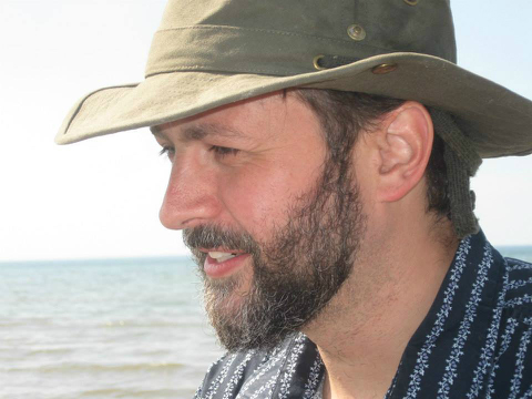
I have released my background remover project!

It isn't perfect, but it does remove all of the sky! (along with some water, part of @Layzej's shirt and hat, and maybe a bit of his beard )
)
It isn't perfect, but it does remove all of the sky! (along with some water, part of @Layzej's shirt and hat, and maybe a bit of his beard
 )
)who needs signatures
- chooper100
-
Scratcher
500+ posts
Non-photorealistic rendering projects
This made me lol:
The pen blocks are confusing.After the Scratch Team deliberately didn't include pen saturation to avoid confusion XD
- gtoal
-
 Scratcher

1000+ posts
Non-photorealistic rendering projects
Ack! I have it working in real-colour, but only by using hacked blocks to get around a stage3d bug involving stamping with brightness, - even then there appears to be a bug where only brightness < 0 is observed. Brightness approaching 100 is supposed to make the brush white, but it does not… This leaves the sky green instead of white with a hint of green.
There's a theory that Van Gogh painted the colours he did because his colour vision was addled. Who is to say that green skies are not the next big thing in impressionism? :-)
Last edited by gtoal (Sept. 7, 2015 17:58:02)
- gtoal
-
Scratcher
1000+ posts
Non-photorealistic rendering projects
Nice!
I think instead of displaying the zoom icon over images you should just make them go darker, eg.
I wouldn't darken something you want to highlight… You might darken everything initially and undarken the highighted item, but then you have a very dark page.
Also I notice that when you remove the mouse from the zoomed image, it fades gradually but when you move into the image it appears immediately. It would be better to fade in the same way as it fades out.
G
- gtoal
-
Scratcher
1000+ posts
Non-photorealistic rendering projects
I have released my background remover project!
It isn't perfect, but it does remove all of the sky! (along with some water, part of @Layzej's shirt and hat, and maybe a bit of his beard
That's pretty close! You might be able to refine it by doing a flood fill from the screen edges to determine contiguous background (and ignore non-contiguous parts) but I'd be wary of doing too much special case code that only worked well with this one image.
G
- Layzej
-
 Scratcher

100+ posts
Non-photorealistic rendering projects
Instead of brightness, it really means value. Lowering the saturation would make things lighter, but there isn't a block for that. The pen blocks are confusing.
I guess so, but the documentation seems to indicate that brightness should brighten to white at 100: “ If the brightness is less than or equal to -100, it will appear entirely black. If it is greater than or equal to 100, it will be white.” - http://wiki.scratch.mit.edu/wiki/Graphic_Effect#Brightness
- novice27b
-
 Scratcher

1000+ posts
Non-photorealistic rendering projects
Where can I get hold of the original image?
i use arch btw
- PullJosh
-
Scratcher
1000+ posts
Non-photorealistic rendering projects
Where can I get hold of the original image?Export the list from any of my recent projects. The list contains the original, and all the transformations are applied as the project is run (but not to the list).
- novice27b
-
Scratcher
1000+ posts
Non-photorealistic rendering projects
Thanks, but I'm looking for the original png/jpg file.Where can I get hold of the original image?Export the list from any of my recent projects. The list contains the original, and all the transformations are applied as the project is run (but not to the list).
i use arch btw
- gtoal
-
Scratcher
1000+ posts
Non-photorealistic rendering projects
Where can I get hold of the original image?http://gtoal.com/scratch/nprguy.jpg
- novice27b
-
Scratcher
1000+ posts
Non-photorealistic rendering projects
Thanks.Where can I get hold of the original image?http://gtoal.com/scratch/nprguy.jpg
i use arch btw
- PullJosh
-
Scratcher
1000+ posts
Non-photorealistic rendering projects
I was kind of hoping that I could work on the website, though…1) Oh wow, sorry. I had no idea.
And PullJosh, shouldn't you be working on Elemental?
2) Yeah, but I tend to jump from project to project. I can't stick with one thing for long.
(Fortunately this site should be a quick deal - short enough to hold my attention.)Also I notice that when you remove the mouse from the zoomed image, it fades gradually but when you move into the image it appears immediately. It would be better to fade in the same way as it fades out.I noticed that as well… Unfortunately, I couldn't figure out a solution.
(It seems that the issue is rather sporadic - sometimes it works, sometimes it doesn't.)
BookOwl, maybe you could figure out what's going on? I have .finalImg (that's the one with all the fancy effects applied, also the one that appears without hover) and I have .oldImg (that's the original image). .finalImg is on top of .oldImg (both positioned absolutely), and the opacity of .finalImg transitions from 1 to 0 on hover (revealing the .oldImg on bottom). The code relating to this portion of the page starts on line 97 of the CSS. It might have something to do with this, but it might not. Worth a look.
- PullJosh
-
Scratcher
1000+ posts
Non-photorealistic rendering projects
Oh, and I've changed the hover effect (at least, for half of them anyway.)
It now changes to be lighter rather than darker and changes the cursor to the “pointer” style (same as what you'll see on links.) This is definitely an improvement over the other version, but I still prefer the zoom icon. What does everyone else think?
It now changes to be lighter rather than darker and changes the cursor to the “pointer” style (same as what you'll see on links.) This is definitely an improvement over the other version, but I still prefer the zoom icon. What does everyone else think?
- Discussion Forums
- » Advanced Topics
-
» Non-photorealistic rendering projects