Discuss Scratch

- Discussion Forums
- » Suggestions
- » The royal blue colour scheme: It looks better *and* it's still accessible.
![[RSS Feed]](//cdn.scratch.mit.edu/scratchr2/static/__74e70580e9dbe93ce1c3f8422dde592d__//djangobb_forum/img/feed-icon-small.png "[RSS Feed]")
- rdococ
-
 Scratcher

500+ posts
The royal blue colour scheme: It looks better *and* it's still accessible.
Recently, the Scratch Team changed the colour scheme for the Scratch website from azure to purple. There are several reasons why this change is just plain silly, but I'll gloss over those for now.
Looking over the w3 organization's accessibility guidelines that the Scratch Team are themselves using, they stipulate that the contrast between small text and the background should be at least 4.5:1. (Though, ideally, it should be at least 7:1.) Here's a website for checking the contrast ratio between two colours. (Thanks to @gilbert_given_189 for the link! Alternatively, here's a spreadsheet to calculate the contrast ratio.)
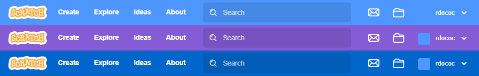
I discovered a royal blue colour, like #0066CC can maintain good contrast ratios (e.g. around 5.57), compared to the purple colour scheme's 4.67. They look far better in my opinion, and will be more familiar to the vast majority of users who are used to the original colour scheme. Here's a comparison of the three navbars: from top to bottom, the original, the current purple scheme and my proposed royal blue scheme.
This will improve the aesthetic of the website tremendously. It would fit in better with the sticky icons, post headers etc. that the Scratch Team haven't yet changed because they're just two different shades of the same colour. It would be much less of a shock to the kids upset that their Scratch is purple now while meeting the accessibility criteria more thoroughly.
I know the Scratch Team has been thinking about a more accessible colour scheme for a while, but I think the Scratch Team should seriously consider a royal blue colour scheme instead of the purple one currently in use.
Edit: Alternative colour #2173D6

Looking over the w3 organization's accessibility guidelines that the Scratch Team are themselves using, they stipulate that the contrast between small text and the background should be at least 4.5:1. (Though, ideally, it should be at least 7:1.) Here's a website for checking the contrast ratio between two colours. (Thanks to @gilbert_given_189 for the link! Alternatively, here's a spreadsheet to calculate the contrast ratio.)
I discovered a royal blue colour, like #0066CC can maintain good contrast ratios (e.g. around 5.57), compared to the purple colour scheme's 4.67. They look far better in my opinion, and will be more familiar to the vast majority of users who are used to the original colour scheme. Here's a comparison of the three navbars: from top to bottom, the original, the current purple scheme and my proposed royal blue scheme.
This will improve the aesthetic of the website tremendously. It would fit in better with the sticky icons, post headers etc. that the Scratch Team haven't yet changed because they're just two different shades of the same colour. It would be much less of a shock to the kids upset that their Scratch is purple now while meeting the accessibility criteria more thoroughly.
I know the Scratch Team has been thinking about a more accessible colour scheme for a while, but I think the Scratch Team should seriously consider a royal blue colour scheme instead of the purple one currently in use.
Edit: Alternative colour #2173D6
Last edited by rdococ (Oct. 2, 2023 07:25:40)
The royal blue colour scheme. Be aesthetic

Links: Search the forums | Autism PSA
Posts: Make cloud variables suck less | Recursive broadcasts | Sprite-local pen
Projects: YaSL tiny LISP with first-class functions & macros | Object-oriented language in Scratch | node logic simulator | The Powder Project
- Crispydogs101
-
 Scratcher

1000+ posts
The royal blue colour scheme: It looks better *and* it's still accessible.
Does this work with the black and white colourblindness (the one moss has)
Hey! Look at this DTA!
Hej! My username is @Crispydogs101. I like listening to music, playing games, and more!
Sarah and duck, Pete the cat, Pegboard nerds, Tokyo machine, FORZA FAN!! Be High contrast Blue Be rich


- rdococ
-
Scratcher
500+ posts
The royal blue colour scheme: It looks better *and* it's still accessible.
Does this work with the black and white colourblindness (the one moss has)It's darker than the current purple colour, so I don't see why not

The royal blue colour scheme. Be aesthetic
Links: Search the forums | Autism PSA
Posts: Make cloud variables suck less | Recursive broadcasts | Sprite-local pen
Projects: YaSL tiny LISP with first-class functions & macros | Object-oriented language in Scratch | node logic simulator | The Powder Project
- ilikecereal1
-
 Scratcher

100+ posts
The royal blue colour scheme: It looks better *and* it's still accessible.
w3schools is inaccurate and i hate it
Be high contrast

Hi there! This is my siggy. This will appear on all my posts.
I like cereal.
- Crispydogs101
-
Scratcher
1000+ posts
The royal blue colour scheme: It looks better *and* it's still accessible.
Huh. This way better than switching back to blue. And might be easy to code in. I'll just ask the scratch team for feedback and if they think it's a good idea or what could be better.Does this work with the black and white colourblindness (the one moss has)It's darker than the current purple colour, so I don't see why not
Hey! Look at this DTA!
Hej! My username is @Crispydogs101. I like listening to music, playing games, and more!
Sarah and duck, Pete the cat, Pegboard nerds, Tokyo machine, FORZA FAN!! Be High contrast Blue Be rich
- colinmacc
-
 Scratcher

1000+ posts
The royal blue colour scheme: It looks better *and* it's still accessible.
Yes I agree that is really smart and looks great!
Also very easy to read.
Also very easy to read.
Sample Projects


- --ThatCrownedKing--
-
 Scratcher

100+ posts
The royal blue colour scheme: It looks better *and* it's still accessible.
When you pick a better color scheme than the Scratch Team
I'm definitely a professional scratcher

- Maximouse
-
 Scratcher

1000+ posts
The royal blue colour scheme: It looks better *and* it's still accessible.
This will improve the aesthetic of the website tremendously.I disagree – it doesn't match the rest of Scratch's color scheme very well. One of the reasons why purple was chosen is that it was already used in Scratch (looks blocks).
I think something more similar to the old blue would look better. #3373cc is a darker version of the old blue (motion block) color that has about the same contrast as the new purple. Scratch already uses it in some places. It would look like this on the website:

- gilbert_given_189
-
 Scratcher

500+ posts
The royal blue colour scheme: It looks better *and* it's still accessible.
Isn't that essentially what the OP calls “royal blue”? If we need to be that specific on colors, let me tell you that the navbar color (#855cd6) is different than the Looks color (#9966ff)This will improve the aesthetic of the website tremendously.I disagree – it doesn't match the rest of Scratch's color scheme very well. One of the reasons why purple was chosen is that it was already used in Scratch (looks blocks).
I think something more similar to the old blue would look better. #3373cc is a darker version of the old blue (motion block) color that has about the same contrast as the new purple. Scratch already uses it in some places. It would look like this on the website:
Speaking of colors, here's some stats of colors and their contrast:
Navbar purple on white :: #855cd6 // 4.66:1
Looks purple on white :: #9966ff // 3.68:1
Royal blue on white :: #0066CC // 5.56:1
Motion blue on white :: #3373cc // 4.7:1
...
Wait… I got 5.56:1 instead of 7.26? Explain the discrepancy!
If you see a line above this text, it means that below this text is my signature.
This place is just a memory to me, I may return occasionally but I'm busy.
I guess I'm an ATer now.
I think I may have seasoned my posts a bit too much.

Colored Pencil is supposed to color the siggy, but Scratch says it's too big.
There is nothing here…
don don pan pan
dondo pan pan
- rdococ
-
Scratcher
500+ posts
The royal blue colour scheme: It looks better *and* it's still accessible.
The two colours are similar enough that I don't mind either one.Isn't that essentially what the OP calls “royal blue”? If we need to be that specific on colors, let me tell you that the navbar color (#855cd6) is different than the Looks color (#9966ff)This will improve the aesthetic of the website tremendously.I disagree – it doesn't match the rest of Scratch's color scheme very well. One of the reasons why purple was chosen is that it was already used in Scratch (looks blocks).
Speaking of colors, here's some stats of colors and their contrast:Darn, it looks like I did the calculations wrong. I've updated the spreadsheet and original post with corrected values, though they're somehow still a bit off from the contrast ratios you got. Either way, the proposed colour is still comfortably accessible and easier on the eyes than purple in my opinionNavbar purple on white :: #855cd6 // 4.66:1
Looks purple on white :: #9966ff // 3.68:1
Royal blue on white :: #0066CC // 5.56:1
Motion blue on white :: #3373cc // 4.7:1
...
Wait… I got 5.56:1 instead of 7.26? Explain the discrepancy!
Edit: The formulas are correct now.
Last edited by rdococ (June 29, 2023 14:18:20)
The royal blue colour scheme. Be aesthetic
Links: Search the forums | Autism PSA
Posts: Make cloud variables suck less | Recursive broadcasts | Sprite-local pen
Projects: YaSL tiny LISP with first-class functions & macros | Object-oriented language in Scratch | node logic simulator | The Powder Project
- Prince_Wolf1
-
 Scratcher

1000+ posts
The royal blue colour scheme: It looks better *and* it's still accessible.
I really like this.I think it looks better, maybe even better than the old blue, and is less intrusive while being high contrast.if all the text isn’t changed to this like the purple I think it’s be good.
Do you like dogs?
I'm a 11 year old girl who spends most of her time on scratch on the forums.I like Warrior Cats, Percy Jackson, and WW2 books.I love music and I like AJR, BoyWithUke, And Hamilton.
you'll mostly see me in Suggestions, Questions About Scratch, and a little in Bugs And Glitches.I'm also in Things I'm Reading And Playing a little bit.i might be in Warrior Cats and School Computers
remix this with what color you think would be good for scratch’s dark mode!/////////////////////////////////////////////////////////////////////////////////////////////////////////////////////////////////////////////////////////////////////////////////////////////
////////////////////////////////////////////////////////////////////////////////////////////////////////////////////////////////////////////////////////////////////////////////////////////////////////////////////
- medians
-
 Scratcher

1000+ posts
The royal blue colour scheme: It looks better *and* it's still accessible.
So you're saying they shouldn't have made it lighter in the first place in 2015?
They literally could have used the old 2.0 color and darkened it, or made that the default.
They literally could have used the old 2.0 color and darkened it, or made that the default.
Last edited by medians (June 29, 2023 13:10:19)
NEW: Medians bamboozled by 3.0 (version 3.0): https://scratch.mit.edu/projects/979822351/
hi875230163394: You're similar to valve in that you both hate a certain number…
Scratch 0.x, 1.x, 2.x, 3.x and LogoBlocks Archives
Bamboozlement: https://scratch.mit.edu/studios/33739789
Fun_Cupcake_i81: https://scratch.mit.edu/projects/850535211/
Years on internet: 15 (soon 16)
medians: Oh god not this utc - 12 thing again..
Fun_Cupcake_i81: What, were you expecting not to see the utc - 12 thing again? THE UTC - 12 THIGN ALWAYS RETURNS. ALWAYS.
medians: I knew it would happen. I was the one who started it last year.
Fun_Cupcake_i81: Well then if you didn't want it back maybe you need to time travel to last year and fix that
Oh wait if you could time travel I think we all know exactly when you would go-
user1: That picture is from 2.0. Now he’s at my house and is my pet.
user2: But this is medians we're talking about, so “from 2.0” can mean the same thing as “from five seconds ago”.
Detect Scratch version here
My other accounts: @selfexplanatory @modesties @chaircard @fireflyhero @dividendyield @colloids @radians @skeuamorphism @dihectogon @anglebisector @aau- @EditBlockColors @AdamantOrb @MoongeistBeam @festively @Ampharos_ @ straightforwardness
i trolled redcat LOL
if you see this
{what method did you use::control hat
answer on profile ::motion
} ::operators;- CST1229
-
 Scratcher

1000+ posts
The royal blue colour scheme: It looks better *and* it's still accessible.
(#9)The navbar color is actually the secondary Looks color (dropdown fill color).
Isn't that essentially what the OP calls “royal blue”? If we need to be that specific on colors, let me tell you that the navbar color (#855cd6) is different than the Looks color (#9966ff)
This is a signature. It's a piece of text that appears below every post I write. Click here to learn more, including how to make your own.
RIP assets image hosting. 2013?-2023


RIP assets image hosting. 2013?-2023
- Elijah999999
-
 Scratcher

1000+ posts
The royal blue colour scheme: It looks better *and* it's still accessible.
I think the ST knows what they're doing.
No longer using the forums. Serious this time.
Really, stop with the “support/no support” thing. I don't care if you give a reason. If you have a reason you don't need to add this to your post in the first place. Stop acting like your opinion makes a difference. It doesn't. Opinions were never the point. The point is whether or not it's a good suggestion. If you can give a good reason at why this is a good idea or point out a flaw, do it, but don't take sides.
This is not sarcasm.
- gilbert_given_189
-
Scratcher
500+ posts
The royal blue colour scheme: It looks better *and* it's still accessible.
I think the ST knows what they're doing.I mean, they seem to be very serious on it… (in fact suggesting to revert the colors back is on TOLORS)
If you see a line above this text, it means that below this text is my signature.
This place is just a memory to me, I may return occasionally but I'm busy.
I guess I'm an ATer now.
I think I may have seasoned my posts a bit too much.
Colored Pencil is supposed to color the siggy, but Scratch says it's too big.
There is nothing here…
don don pan pan
dondo pan pan
- GIitchInTheMatrix
-
 Scratcher

1000+ posts
The royal blue colour scheme: It looks better *and* it's still accessible.
Didn't they do a bunch of research to find the “perfect” color(putting it in quotes due to it being subjective and having differences based off types of colorblindness)
I personally prefer the new purple, it's a lot less stimulating IMO, and k find it much better looking. Maybe it could be a theme brought up in the themes topic?
I personally prefer the new purple, it's a lot less stimulating IMO, and k find it much better looking. Maybe it could be a theme brought up in the themes topic?
- gilbert_given_189
-
Scratcher
500+ posts
The royal blue colour scheme: It looks better *and* it's still accessible.
Didn't they do a bunch of research to find the “perfect” color(putting it in quotes due to it being subjective and having differences based off types of colorblindness)If “a bunch of research” meant “copying the color from the Looks block”, I think my perception of “research” is of higher quality than whoever thought of changing the navbar color to purple. (Is this… a roast?)
I personally prefer the new purple, it's a lot less stimulating IMO, and k find it much better looking. Maybe it could be a theme brought up in the themes topic?
If you see a line above this text, it means that below this text is my signature.
This place is just a memory to me, I may return occasionally but I'm busy.
I guess I'm an ATer now.
I think I may have seasoned my posts a bit too much.
Colored Pencil is supposed to color the siggy, but Scratch says it's too big.
There is nothing here…
don don pan pan
dondo pan pan
- GIitchInTheMatrix
-
Scratcher
1000+ posts
The royal blue colour scheme: It looks better *and* it's still accessible.
Correct me if im wrong, but theybdidnt spend many months simply looking at a look block to update the site.Didn't they do a bunch of research to find the “perfect” color(putting it in quotes due to it being subjective and having differences based off types of colorblindness)If “a bunch of research” meant “copying the color from the Looks block”, I think my perception of “research” is of higher quality than whoever thought of changing the navbar color to purple. (Is this… a roast?)
I personally prefer the new purple, it's a lot less stimulating IMO, and k find it much better looking. Maybe it could be a theme brought up in the themes topic?
If your quality level of a point in an argument is a quick look over of a coincidence and ignoring many trials they have done, to hope that those you're providing an argument against don't know, you may have low standards for points.
And if you thought it based off of a few posts in some random thread, maybe you don't have any perception of research.
- gilbert_given_189
-
Scratcher
500+ posts
The royal blue colour scheme: It looks better *and* it's still accessible.
I was being sarcastic there, but I agree that it might be a coincidence.Correct me if im wrong, but theybdidnt spend many months simply looking at a look block to update the site.Didn't they do a bunch of research to find the “perfect” color(putting it in quotes due to it being subjective and having differences based off types of colorblindness)If “a bunch of research” meant “copying the color from the Looks block”, I think my perception of “research” is of higher quality than whoever thought of changing the navbar color to purple. (Is this… a roast?)
I personally prefer the new purple, it's a lot less stimulating IMO, and k find it much better looking. Maybe it could be a theme brought up in the themes topic?
If your quality level of a point in an argument is a quick look over of a coincidence and ignoring many trials they have done, to hope that those you're providing an argument against don't know, you may have low standards for points.
And if you thought it based off of a few posts in some random thread, maybe you don't have any perception of research.
If you see a line above this text, it means that below this text is my signature.
This place is just a memory to me, I may return occasionally but I'm busy.
I guess I'm an ATer now.
I think I may have seasoned my posts a bit too much.
Colored Pencil is supposed to color the siggy, but Scratch says it's too big.
There is nothing here…
don don pan pan
dondo pan pan
- rdococ
-
Scratcher
500+ posts
The royal blue colour scheme: It looks better *and* it's still accessible.
Whew, you don't have to roast the Scratch Team!Didn't they do a bunch of research to find the “perfect” color(putting it in quotes due to it being subjective and having differences based off types of colorblindness)If “a bunch of research” meant “copying the color from the Looks block”, I think my perception of “research” is of higher quality than whoever thought of changing the navbar color to purple. (Is this… a roast?)
I personally prefer the new purple, it's a lot less stimulating IMO, and k find it much better looking. Maybe it could be a theme brought up in the themes topic?
 You make a good point - what kind of research did the Scratch Team do to reach that shade of purple? I'm no expert, but nothing about vision impairment or colour-blindness leads me to think that white on purple is a particularly accessible colour scheme compared to white on dark blue.
Correct me if im wrong, but theybdidnt spend many months simply looking at a look block to update the site.Unfortunately, there's good reason to believe that the Scratch Team didn't do their research properly. Colour-blind people are saying that it's hard to see purple links amongst black/grey text or on grey backgrounds, and the update itself seems to be half-done as there are several places on both Scratch 2 and 3 pages where the blue colour remains, which makes me think they didn't test these changes at all, nevermind with vision-impaired kids.
If your quality level of a point in an argument is a quick look over of a coincidence and ignoring many trials they have done, to hope that those you're providing an argument against don't know, you may have low standards for points.
And if you thought it based off of a few posts in some random thread, maybe you don't have any perception of research.
Keep in mind that they've had 5 years to get accessibility right, and this is all we've gotten. The high-contrast blocks are nice, but that's about it. I really think the Scratch Team dropped the ball on this one.
Last edited by rdococ (June 29, 2023 14:54:52)
The royal blue colour scheme. Be aesthetic
Links: Search the forums | Autism PSA
Posts: Make cloud variables suck less | Recursive broadcasts | Sprite-local pen
Projects: YaSL tiny LISP with first-class functions & macros | Object-oriented language in Scratch | node logic simulator | The Powder Project
- Discussion Forums
- » Suggestions
-
» The royal blue colour scheme: It looks better *and* it's still accessible.