Discuss Scratch

- Discussion Forums
- » Suggestions
- » ✏️ A new design for Scratch ✏️
![[RSS Feed]](//cdn.scratch.mit.edu/scratchr2/static/__74e70580e9dbe93ce1c3f8422dde592d__//djangobb_forum/img/feed-icon-small.png "[RSS Feed]")
- CatsUnited
-
 Scratcher

1000+ posts
✏️ A new design for Scratch ✏️
Okay, here's my 22 cents -
No Support for the forums, and that's not just because I'm really biased towards the 2.0 design of the forums. The main discussion page there lacks some information which can be useful, such as the most recent post (which I hope gets fixed) and the number of topics and posts on each for each subforum. While yes, it would be nice to have the Forums in a different color since it's more a separate website from the main Scratch site, that could also be a reason for it to stay in the 2.0 style for considerably longer than the rest of the website. The forum post area that you showed looks very incomplete/limiting, such as not having a signature, a quote or report button and not being able to see even their approximated post count. I also wouldn't be a fan of all my post content being centered by default. While yes, the current forum design isn't as clean as your concept, I think that online forums/bulletin boards like this one are relics of the earlier internet back in the 90s and for most of the 2000s, before social media existed or was mainstream, so I think it's fine for it if the forums don't look minimalistic, but that's just my opinion.
The My Stuff concept is pretty good, though it is lacking in some things I think would be useful, such as sorting the projects based on parameters such as view count or in alphabetical order and that there doesn't appear to be an unshare or delete button, although that could just have been because you forgot to put that in when you were creating the concepts. It could also do with a button to quickly add it into a studio, like the 2.0 styled My Stuff page, but otherwise that's pretty good.
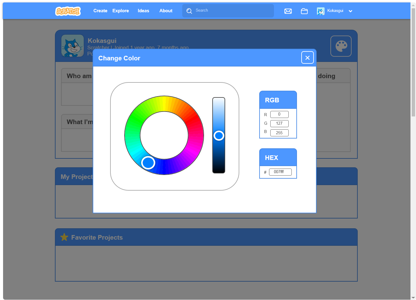
Support for the profile page. Having the ability to change the color of your profile seems like a good idea to personalise it a bit more, hopefully while not ruining the design consistency with the rest of the website. While there is a missing “Show All” button for the project categories, I think I would want to see a design very similar to what you've created on the OP.
I'd also like to see a concept design done for studios since those are still in the 2.0 style
No Support for the forums, and that's not just because I'm really biased towards the 2.0 design of the forums. The main discussion page there lacks some information which can be useful, such as the most recent post (which I hope gets fixed) and the number of topics and posts on each for each subforum. While yes, it would be nice to have the Forums in a different color since it's more a separate website from the main Scratch site, that could also be a reason for it to stay in the 2.0 style for considerably longer than the rest of the website. The forum post area that you showed looks very incomplete/limiting, such as not having a signature, a quote or report button and not being able to see even their approximated post count. I also wouldn't be a fan of all my post content being centered by default. While yes, the current forum design isn't as clean as your concept, I think that online forums/bulletin boards like this one are relics of the earlier internet back in the 90s and for most of the 2000s, before social media existed or was mainstream, so I think it's fine for it if the forums don't look minimalistic, but that's just my opinion.
The My Stuff concept is pretty good, though it is lacking in some things I think would be useful, such as sorting the projects based on parameters such as view count or in alphabetical order and that there doesn't appear to be an unshare or delete button, although that could just have been because you forgot to put that in when you were creating the concepts. It could also do with a button to quickly add it into a studio, like the 2.0 styled My Stuff page, but otherwise that's pretty good.
Support for the profile page. Having the ability to change the color of your profile seems like a good idea to personalise it a bit more, hopefully while not ruining the design consistency with the rest of the website. While there is a missing “Show All” button for the project categories, I think I would want to see a design very similar to what you've created on the OP.
I'd also like to see a concept design done for studios since those are still in the 2.0 style
bottom text
- PinkTabbyHunterLargo
-
 Scratcher

100+ posts
✏️ A new design for Scratch ✏️
Okay, here's my 22 cents -some support, you should add something for the signature, quote, report, and the approximated post count, as CatsUnited said.
No Support for the forums, and that's not just because I'm really biased towards the 2.0 design of the forums. The main discussion page there lacks some information which can be useful, such as the most recent post (which I hope gets fixed) and the number of topics and posts on each for each subforum. While yes, it would be nice to have the Forums in a different color since it's more a separate website from the main Scratch site, that could also be a reason for it to stay in the 2.0 style for considerably longer than the rest of the website. The forum post area that you showed looks very incomplete/limiting, such as not having a signature, a quote or report button and not being able to see even their approximated post count. I also wouldn't be a fan of all my post content being centered by default. While yes, the current forum design isn't as clean as your concept, I think that online forums/bulletin boards like this one are relics of the earlier internet back in the 90s and for most of the 2000s, before social media existed or was mainstream, so I think it's fine for it if the forums don't look minimalistic, but that's just my opinion.
The My Stuff concept is pretty good, though it is lacking in some things I think would be useful, such as sorting the projects based on parameters such as view count or in alphabetical order and that there doesn't appear to be an unshare or delete button, although that could just have been because you forgot to put that in when you were creating the concepts. It could also do with a button to quickly add it into a studio, like the 2.0 styled My Stuff page, but otherwise that's pretty good.
Support for the profile page. Having the ability to change the color of your profile seems like a good idea to personalise it a bit more, hopefully while not ruining the design consistency with the rest of the website. While there is a missing “Show All” button for the project categories, I think I would want to see a design very similar to what you've created on the OP.
I'd also like to see a concept design done for studios since those are still in the 2.0 style
A studio concept design would be nice too, so basically what CatsUnited said.
A signature is a small piece of text that is attached to your posts. In it, you can enter just about anything you like. Perhaps you would like to enter your favourite quote or your star sign. It's up to you! In your signature you can use BBCode if it is allowed in this particular forum. You can see the features that are allowed/enabled listed below whenever you edit your signature.
watching the ATs dissolve
- CatsUnited
-
Scratcher
1000+ posts
✏️ A new design for Scratch ✏️
Thanks?Okay, here's my 22 cents -some support, you should add something for the signature, quote, report, and the approximated post count, as CatsUnited said.
-snip-
I'd also like to see a concept design done for studios since those are still in the 2.0 style
A studio concept design would be nice too, so basically what CatsUnited said.
bottom text
- BlueStarPort
-
 Scratcher

100+ posts
✏️ A new design for Scratch ✏️
Support, except for the “random topic.” That is kinda weird to include. Otherwise, I love it, it makes the site look beautiful.

- LuckyLucky7
-
 Scratcher

1000+ posts
✏️ A new design for Scratch ✏️
Okay, here's my 22 cents -I'm sure it's just that the OP forgot to add some features to the mockups for this suggestion. If it were to actually be implemented, I'm sure that all of the features we have now will be there.
No Support for the forums, and that's not just because I'm really biased towards the 2.0 design of the forums. The main discussion page there lacks some information which can be useful, such as the most recent post (which I hope gets fixed) and the number of topics and posts on each for each subforum. While yes, it would be nice to have the Forums in a different color since it's more a separate website from the main Scratch site, that could also be a reason for it to stay in the 2.0 style for considerably longer than the rest of the website. The forum post area that you showed looks very incomplete/limiting, such as not having a signature, a quote or report button and not being able to see even their approximated post count. I also wouldn't be a fan of all my post content being centered by default. While yes, the current forum design isn't as clean as your concept, I think that online forums/bulletin boards like this one are relics of the earlier internet back in the 90s and for most of the 2000s, before social media existed or was mainstream, so I think it's fine for it if the forums don't look minimalistic, but that's just my opinion.
The My Stuff concept is pretty good, though it is lacking in some things I think would be useful, such as sorting the projects based on parameters such as view count or in alphabetical order and that there doesn't appear to be an unshare or delete button, although that could just have been because you forgot to put that in when you were creating the concepts. It could also do with a button to quickly add it into a studio, like the 2.0 styled My Stuff page, but otherwise that's pretty good.
Support for the profile page. Having the ability to change the color of your profile seems like a good idea to personalise it a bit more, hopefully while not ruining the design consistency with the rest of the website. While there is a missing “Show All” button for the project categories, I think I would want to see a design very similar to what you've created on the OP.
I'd also like to see a concept design done for studios since those are still in the 2.0 style
I have about 3450 posts, 90 shared projects, 180 total created/followed topics, and 425 followers.

- great_elmo
-
 Scratcher

100+ posts
✏️ A new design for Scratch ✏️
Support! the other pages still have the 2.0 design, but changing it to the 3.0 design would be AWESOME!!
also support the new profile pages color changing feature because it is awesome.
also support the new profile pages color changing feature because it is awesome.
Last edited by great_elmo (July 25, 2019 22:39:33)
Recovering Scrstch user. Joining YT hopefully this year.
- FrostyRAhAz
-
 Scratcher

500+ posts
✏️ A new design for Scratch ✏️
I support! The Scratch Team should also had the Newest Post thing in the forums though. The modern and sleek style is graphically appealing. I can't really say anything negative about this! 

Last edited by FrostyRAhAz (July 24, 2019 23:00:47)
Attempting to raise my activity on Scratch

- FrostyRAhAz
-
Scratcher
500+ posts
✏️ A new design for Scratch ✏️
Support, except for the “random topic.” That is kinda weird to include. Otherwise, I love it, it makes the site look beautiful.I think by random topic they meant example topic. You know, just to make it more real.
Attempting to raise my activity on Scratch
- Filereq
-
 Scratcher

100+ posts
✏️ A new design for Scratch ✏️
Hi there! I made some new designs in some parts of the website using PowerPoint that I would like to share with you:Looks very modern! That is a great idea!
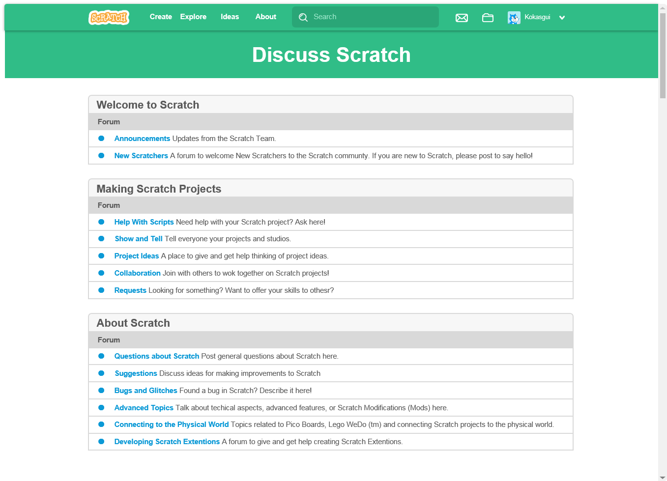
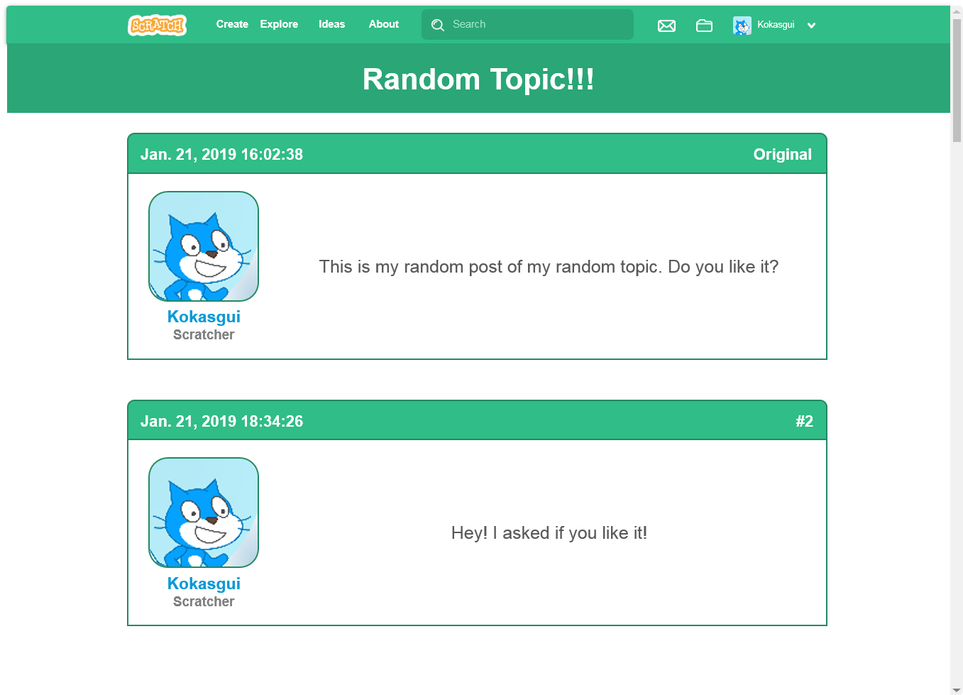
This is the new Forums website. Just like the Wiki, it has a new color, to make it like a separate part of Scratch. I though it would be cool if it had the Pen color on the headline. Aslo, the topic's title would be displayed above and much larger.
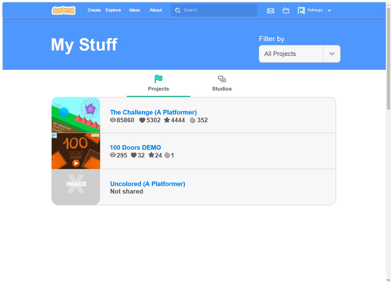
The new My Stuff page. I know, I know, it has a submenu just like the Explore section and a filter but I think that with this design it would look a lot better and simpler. (By the way, Uncolored (A Platformer) is already released. It's my best project. Please check it at the end of this post.)
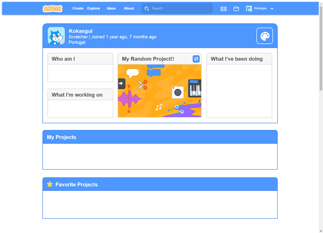
This is my thought of the new profile page. Because it is a personal page, it would have a button that could change the color of the Scratch user headline (the one with the username) and with a button that allowed to change the project in the middle of the page, and change the name of the label.
Play filerecraft and drink your milk
- Filereq
-
Scratcher
100+ posts
✏️ A new design for Scratch ✏️
(space-wasting quote removed by moderator - please don't spam)
This is really great i'm bumping it righto now
This is really great i'm bumping it righto now
Last edited by Paddle2See (June 17, 2020 15:19:50)
Play filerecraft and drink your milk
- Botcho_Otkho
-
 Scratcher

1000+ posts
✏️ A new design for Scratch ✏️
This is really great i'm bumping it righto nowIf it's on the first page and 24 hours since the last post didn't pass yet, there's no need to bump. Also, please, stop quoting the entire OP. It's useless.
I see now that the circumstances of one's birth are irrelevant. It is what you do with the gift of life that determines who you are. - Mewtwo
- seattleowl
-
 Scratcher

18 posts
✏️ A new design for Scratch ✏️
Woah.
I'm impressed, This would be great, thanks for sharing!
I'm impressed, This would be great, thanks for sharing!
Scratch on!
- FlaffyTheBest
-
 Scratcher

500+ posts
✏️ A new design for Scratch ✏️
(space-wasting quote removed by moderator - please don't spam)
That's cool idea!
I'm hope, Scratch Team liked it!
That's cool idea!

I'm hope, Scratch Team liked it!
Last edited by Paddle2See (June 17, 2020 15:18:44)
- Nambaseking01
-
 Scratcher

1000+ posts
✏️ A new design for Scratch ✏️
Semi-support.
If entire Scratch has to change like that, I would prefer to change back to the normal theme someday. I think the design should be optional — and I do not really expect the ST to change whole Scratch to one theme forever (and even if yours was considered by the ST, I think the ST is thinking of working on a dark mode).
If entire Scratch has to change like that, I would prefer to change back to the normal theme someday. I think the design should be optional — and I do not really expect the ST to change whole Scratch to one theme forever (and even if yours was considered by the ST, I think the ST is thinking of working on a dark mode).
Hey there! My name is Nammy. I'm a male Forum Helper and Scratch Wiki Editor.
Profile | Test Account | Talk with me here! | Griffpatch is quitting Scratch?!
Profile | Test Account | Talk with me here! | Griffpatch is quitting Scratch?!
- WaterComesBack
-
 Scratcher

100+ posts
✏️ A new design for Scratch ✏️
Support all the way! I LOVE THIS. Because 2.0 design is awful, I'd like a bit more touch in 3.0. Hope griffpatch will love it 


NOT LIKE THIS https://i.imgur.com/mnylifp.png I mean that's unusable! This is EXTREMELY disrespectful against smartphones!Scratch Team is currently working on it. If you be patient you will probably see a better remake. It's probably going to be like Scratch Jr. as well.

The designs are blinding, like what many of the pages on Scratch have turned into. If this was implemented, I would likely have to leave Scratch.I understand your opinion on Scratch 3.0. Please don't leave if they get updated!
I totally agree with this. It'd make Scratch more modern-looking.Agreed.

Changing the color of the header in the forums also is a great idea, I think that it would help differentiate the main website from the forums.Yeah. I think there should be a slider to change the color, besides of how Scratchers like it.
BA BUM BUM B U M
BA BUM BUM B U M
BA BUM BUM B U M
BA BUM BUM B U M
okay enough, welcome to my siggy. (press down+shift while highlighting a part of my signature to see the rest of my sig)
E
whoops sorry for the accidental e
h
h
h
stop viewing this
move (999999999) steps
move (999999) steps
ende
- JWhandle
-
 Scratcher

65 posts
✏️ A new design for Scratch ✏️
when green flag clicked
say [It looks awesome! I hope that they add something like that!] for (2) secs
I make things. Please look at the things.
- EIephant_Lover
-
 Scratcher

500+ posts
✏️ A new design for Scratch ✏️
Support, as long as what other users have been saying is implemented. For example, add unshare (maybe share button too), delete, sorting projects, and more information which was there in 2.0. But I really like the look of it :)
- coder2045
-
 Scratcher

1000+ posts
✏️ A new design for Scratch ✏️
Forums: Semi-support, I would like it if that was blue too.
Profile: +2 (aka Absolute Support)! I love the 3.0 looks!
Profile: +2 (aka Absolute Support)! I love the 3.0 looks!
Highlight this text and press Ctrl-Shift-Down to view more of my signature. There's a lot in there.
I FOUND THE POSTIE POSTIE POST LINK THIS
Brainteaser: What comes next? Answer on my profile. First correct answer gets a follow.
[ ]
[ [ ] ]
[ [ [ ] ] [ ] ]
Good projects ⬇️
- DaBoi001
-
 Scratcher

1000+ posts
✏️ A new design for Scratch ✏️
Support
I think it would be good for people to introduce themselves.
I think it would be good for people to introduce themselves.
Last Edited by kaj (Tomorrow 00:00:00)
▔▔▔▔▔▔▔▔▔▔▔▔▔▔▔▔
around 2300 posts
I don't use Scratch all that much. I only hop on the forums and stuff. I make stuff on Unity and 3D model now.
“All right, I've been thinking. When life gives you lemons, don't make lemonade. Make life take the lemons back! GET MAD! I DON'T WANT YOUR * LEMONS! What am I supposed to do with these? Demand to see life's manager! Make life rue the day it thought it could give CAVE JOHNSON lemons! Do you know who I am? I'm the man who's gonna BURN YOUR HOUSE DOWN! With the LEMONS! I'm gonna get my engineers to invent a combustible lemon that burns your house down!”
- Cave Johnson
- MinersTrove101
-
 Scratcher

43 posts
✏️ A new design for Scratch ✏️
Support
H E Y! Are you a bored human being? Maybe, just M A Y B E You could check out some of my projects,
just click that –> https://scratch.mit.edu/users/MinersTrove101/
when green flag clicked
repeat until <You look at meh projects>
say [Do it]
end
- Discussion Forums
- » Suggestions
-
» ✏️ A new design for Scratch ✏️