Discuss Scratch

- Discussion Forums
- » Suggestions
- » Is this a good 3.0 page for Account Settings?
![[RSS Feed]](//cdn.scratch.mit.edu/scratchr2/static/__d235e7f35585482ca999583499337ccd__//djangobb_forum/img/feed-icon-small.png "[RSS Feed]")
- SMG4fan7236
-
 Scratcher

500+ posts
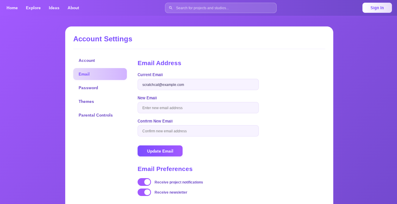
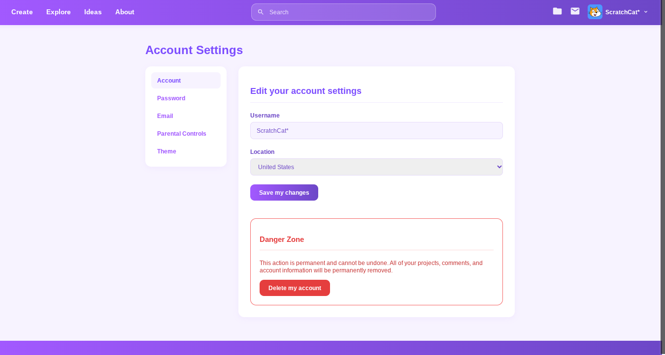
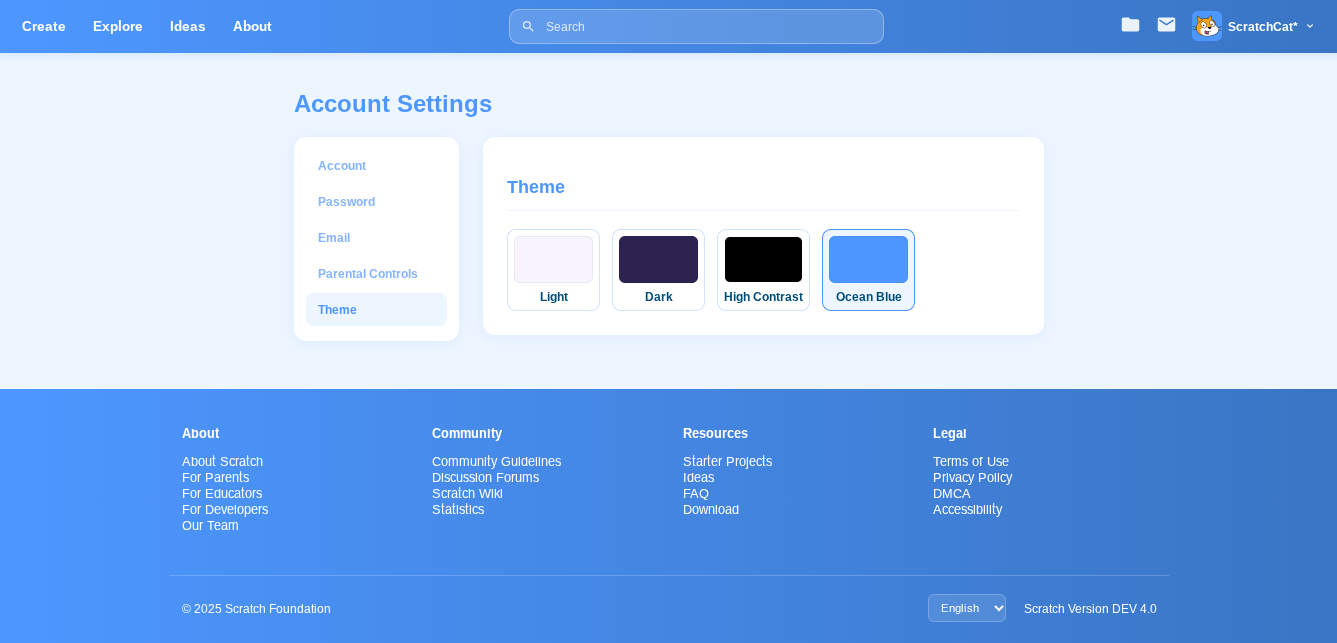
Is this a good 3.0 page for Account Settings?
Last edited by SMG4fan7236 (Oct. 7, 2025 17:21:44)
- MaybeARandomFox
-
 Scratcher

100+ posts
Is this a good 3.0 page for Account Settings?
i think everything would need to be purple due to a disability law in america.
- SMG4fan7236
-
Scratcher
500+ posts
Is this a good 3.0 page for Account Settings?
i think everything would need to be purple due to a disability law in america.Ignore the color.
Last edited by SMG4fan7236 (Oct. 7, 2025 16:13:32)
- suswhopper123
-
 Scratcher

1000+ posts
Is this a good 3.0 page for Account Settings?
i think everything would need to be purple due to a disability law in america.A disability of what? Scratch stayed blue all the way from 2.0 and randomly changed it in 2023, but why?
- SMG4fan7236
-
Scratcher
500+ posts
Is this a good 3.0 page for Account Settings?
ignore the disability, just look at the layouti think everything would need to be purple due to a disability law in america.A disability of what? Scratch stayed blue all the way from 2.0 and randomly changed it in 2023, but why?
- medians
-
 Scratcher

1000+ posts
Is this a good 3.0 page for Account Settings?
i think everything would need to be purple due to a disability law in america.I bet you the topic creator either didn't want to have to disable extensions (that's likely where this comes from), or the topic creator took the screenshot before the color was changed lol
It was meant for vision difficulties and accessibility. However, some people stated that it had the opposite effect (colorblind people and photophobia [unfortunately, I was one of these people :/]), while others stated that it worked fine (photophobia)i think everything would need to be purple due to a disability law in america.A disability of what? Scratch stayed blue all the way from 2.0 and randomly changed it in 2023, but why?
Last edited by medians (Oct. 7, 2025 17:14:19)
- suswhopper123
-
Scratcher
1000+ posts
Is this a good 3.0 page for Account Settings?
-snip-Accessibility? No offense, but you don't need it. Blue looked prettier, and since you said the effect was opposite or fine, that makes the update not necessary since it doesn't bring anything good.
- medians
-
Scratcher
1000+ posts
Is this a good 3.0 page for Account Settings?
Here's a clarification of what I'm talking about: some people said they had troubles with the blue and thought the purple was better (some people said they couldn't really look at the blue without headaches, while others had troubles with the purple (for example, I actually threw up, not exaggerating at all, and it gave me headaches) and thought the blue was better in this situation-snip-Accessibility? No offense, but you don't need it. Blue looked prettier, and since you said the effect was opposite or fine, that makes the update not necessary since it doesn't bring anything good.
The problem is that the purple links look too similar to the text if you have achromatopsia or tritanopia, so colorblind people had issues with it, which was the opposite of what was intended.
Anyways, back to the topic
Last edited by medians (Oct. 7, 2025 17:24:05)
- SMG4fan7236
-
Scratcher
500+ posts
Is this a good 3.0 page for Account Settings?
what I'm asking is is this a good 3.0 page (not talking about the color, so ignore it)Here's a clarification of what I'm talking about: some people said they had troubles with the blue and thought the purple was better (some people said they couldn't really look at the blue without headaches, while others had troubles with the purple (for example, I actually threw up, not exaggerating at all, and it gave me headaches) and thought the blue was better in this situation-snip-Accessibility? No offense, but you don't need it. Blue looked prettier, and since you said the effect was opposite or fine, that makes the update not necessary since it doesn't bring anything good.
The problem is that the purple links look too similar to the text if you have achromatopsia or tritanopia, so colorblind people had issues with it, which was the opposite of what was intended.
- suswhopper123
-
Scratcher
1000+ posts
Is this a good 3.0 page for Account Settings?
-snip-Then just make it an option to switch between the 2! Is it THAT hard? XD
- RoyaleSpark
-
 Scratcher

100+ posts
Is this a good 3.0 page for Account Settings?
Yeah it looks good imo.
- SMG4fan7236
-
Scratcher
500+ posts
Is this a good 3.0 page for Account Settings?
what I'm asking is is this a good 3.0 page (not talking about the color, so ignore it)-snip-Then just make it an option to switch between the 2! Is it THAT hard? XD
- medians
-
Scratcher
1000+ posts
Is this a good 3.0 page for Account Settings?
what I'm asking is is this a good 3.0 page (not talking about the color, so ignore it)I know, but he was asking about it
Anyway, I feel like it would fit better in a suggestion about changing the pages to scratch-www
There's this-snip-Then just make it an option to switch between the 2! Is it THAT hard? XD
https://scratch.mit.edu/discuss/topic/296027
Also I would if I could lol
Last edited by medians (Oct. 7, 2025 17:27:27)
- 82BITMYSTERY
-
 Scratcher

500+ posts
Is this a good 3.0 page for Account Settings?
I think mines look better.

Last edited by 82BITMYSTERY (Oct. 7, 2025 17:30:34)
- alboxer2000
-
 Scratcher

1000+ posts
Is this a good 3.0 page for Account Settings?
Looks good to me.
I reported this to get it moved to Suggestions since it's a better place.
I reported this to get it moved to Suggestions since it's a better place.
- Rosics
-
 Scratcher

1000+ posts
Is this a good 3.0 page for Account Settings?
The U.S. did a law in 2023 about it I'm pretty sure so they could've got sued.-snip-Accessibility? No offense, but you don't need it. Blue looked prettier, and since you said the effect was opposite or fine, that makes the update not necessary since it doesn't bring anything good.
- suswhopper123
-
Scratcher
1000+ posts
Is this a good 3.0 page for Account Settings?
-snip-But I'm not from the US, why respect their rules?
- Rosics
-
Scratcher
1000+ posts
Is this a good 3.0 page for Account Settings?
But Scratch is.. so they had to follow it.-snip-But I'm not from the US, why respect their rules?
- suswhopper123
-
Scratcher
1000+ posts
Is this a good 3.0 page for Account Settings?
Yeah but can't you just make a “Themes” section in account settings so that you can choose between blue and purple?But Scratch is.. so they had to follow it.-snip-But I'm not from the US, why respect their rules?
- YtArie5
-
 Scratcher

1000+ posts
Is this a good 3.0 page for Account Settings?
someone has probably already suggested this.Yeah but can't you just make a “Themes” section in account settings so that you can choose between blue and purple?But Scratch is.. so they had to follow it.-snip-But I'm not from the US, why respect their rules?
- Discussion Forums
- » Suggestions
-
» Is this a good 3.0 page for Account Settings?