Discuss Scratch

- Huqqles
-
 Scratcher

31 posts
New 3.0 Studio Design
And just because some people have a problem doesn’t mean it’s the same for everyone, is my point.Autism is a spectrum. Some people may have more severe cases compared to others.Neurodiversity is a spectrum. They are allowed to share their own experiences, backed up with the fact that they also have ADHD, and the studios have proven to be no problem to them. If y’all want to keep pointing out that autism (they have ADHD though) is a spectrum, be willing to listen to people who have no problem with the new studios.
fair point, however enough people are bothered by the studio update that a change would be a good idea. Just because they don't have a problem doesn't mean that it's the same for everyone.
(ADHD is not autism.)
- ddcxsxdd
-
 Scratcher

80 posts
New 3.0 Studio Design
i agree to all of this
wait if this is a signature, MY SINGNATURE POST QUESTION IS USELESS
when green flag clickedhttps://scratch.mit.edu/projects/632353611/
say [This is a signature.... but what to do with it?]
point towards [ questions about signatures]
say [please join my object camp]
define I like those block things
- BearSlothCoding
-
 Scratcher

1000+ posts
New 3.0 Studio Design
Tried to fix the follow button. Is this better or worse than the original mockup in the OP?

- LegoManiac04
-
 Scratcher

1000+ posts
New 3.0 Studio Design
I get why they decided to make the background blue, but just making it white looks so much better and is so much easier on the eyes. Just this minor change would improve to look so much.
I think moving the follow button back is a good idea too, or at least making it smaller and keeping it around where it is.
Nice job on your mockups!
I think moving the follow button back is a good idea too, or at least making it smaller and keeping it around where it is.
Nice job on your mockups!

- BearSlothCoding
-
Scratcher
1000+ posts
New 3.0 Studio Design
Tried to fix the follow button. Is this better or worse than the original mockup in the OP?Bump
- Milkysplash
-
 Scratcher

1000+ posts
New 3.0 Studio Design
It looks much better!Tried to fix the follow button. Is this better or worse than the original mockup in the OP?Bump
“are you sure you're not jewish?” - howard, tbbt


If you made it down here, if something's hard, rember, it's not rocket science.
- - -
out of contextness
i actually feel sorry for a traffic bollard, bbc news you are too good at your job
“Ground?”
“Plane?”
 yeo - I MEAN YEP NOT YEO I DID NOT SAY YEO YOGURT
- - -
*jams to the Every Tube Station Song*
- Milkysplash
-
Scratcher
1000+ posts
New 3.0 Studio Design
Here is some messing around I did in procreate which (hopefully) makes it have the feel of 2.0 while having the look of 3.0
Badly edited, I know XP
Original iamge credits goes to BearSlothCoding, edited by me
Badly edited, I know XP
Original iamge credits goes to BearSlothCoding, edited by me
Last edited by Milkysplash (July 16, 2021 16:00:51)
“are you sure you're not jewish?” - howard, tbbt
If you made it down here, if something's hard, rember, it's not rocket science.
- - -
out of contextness
i actually feel sorry for a traffic bollard, bbc news you are too good at your job
“Ground?”
“Plane?”
yeo - I MEAN YEP NOT YEO I DID NOT SAY YEO YOGURT- - -
*jams to the Every Tube Station Song*
- Huqqles
-
Scratcher
31 posts
New 3.0 Studio Design
My version: https://scratch.mit.edu/projects/552016437/
- patrovich
-
 New to Scratch

59 posts
New 3.0 Studio Design
the ST should replace the current design with this one! its beutiful (and still fits perfectly with the 3.0 asthetic)
——————————————————————————————————————————————————————————————————
In case you think i'm a new scratcher because i have the “new scratcher” status, i have been here since 2016, it's just that i haven't published any projects (yet).
updating
(;-'),
- foxesrule10
-
 Scratcher

9 posts
New 3.0 Studio Design
Did all the pages! Sorry they're blurry!
Projects page:
Comments page:
Curators page:
Activity page:


That looks really nice and a lot more clean /g
aubrey/tommy
they/them
im aroace B]
- kittynugg
-
 Scratcher

100+ posts
New 3.0 Studio Design
This. Is. Amazing. Honestly, I feel like there could be a few minor tweaks to it, like moving the title back to where it used to be, but otherwise it's pretty much perfect!
Connor is questioning your actions

“bro that's cringe”
literally why are you down here
stop
SERIOUSLY THERE'S NOTHING HERE
DUDE
STOP
ytfhyjghYFKJGSDREG
RGIUDFBG
GDFGHTHJTGODJER
YHTRYGTY
LITERALLY WHY ARE YOU STILL HERE
HOW ARE YOU NOT BORED
GIVE UP
W H Y
DUDE GO AWAY
PLEASE
THERES NOTHING HERE
YOU FOOL

We're no strangers to love
You know the rules and so do I
A full commitment's what I'm thinking of
You wouldn't get this from any other guy
- YesBruh1232
-
 New to Scratch

5 posts
New 3.0 Studio Design
is it bad that im “nd” and I hate being nd because I'm “classified' as ”ND" when the ND people are 99.99999999% of the world and I didn't even know what a sensory overload was until I looked it up and I never even got one?
- BanMeOS
-
Scratcher
500+ posts
New 3.0 Studio Design
is it bad that im “nd” and I hate being nd because I'm “classified' as ”ND" when the ND people are 99.99999999% of the world and I didn't even know what a sensory overload was until I looked it up and I never even got one?
Rip YesBruh because they most likely think that the new one is better than before and this. They're not wrong.Bump
([foo v] ::variables)
([list v] ::list)
set [ v].y to [] ::variables
([foo v] [ v] pos :: variables)
<[] is exactly [] :: operators>
<mouse moving? ::sensing>
point towards x: () y: () ::motion

glide () secs to [sprite v] ::motion

we reach 410 + 10 posts :: sound

lol ::operators
- kat-coder
-
 Scratcher

1000+ posts
New 3.0 Studio Design
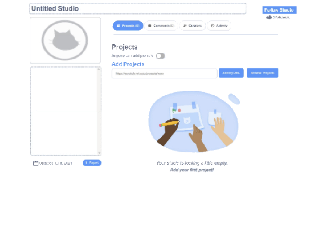
Many people, especially neurodivergent and autistic people, have been complaining about how the new studio page causes sensory overloads. So I had some ideas to fix this.Where do you get such images???
First, I moved the Follow Studio button and put the follower count back under the button. Then, I removed the “Edit thumbnail” button. It will now be like how it was, where there's a “Change” button when you hover over the thumbnail. After that, I put the “Anyone can add projects” toggle underneath the Projects subheader. This is so I could remove some space from that side to make the page less big. I also moved the “Add by URL” and “Browse Projects” buttons to cover some unnecessary space on the project URL text field, for the same reason. After that, I made all the pages white because a lot of people requested it. Then I made a couple minor changes to make the whole thing look better and this is the result:
(it's blurry, i'm sorry)
As you can see, it looks much less cluttered. I suggest that the current studio pages get changed to this or something similar. Thoughts?