Discuss Scratch

- Discussion Forums
- » Suggestions
- » The royal blue colour scheme: It looks better *and* it's still accessible.
![[RSS Feed]](//cdn.scratch.mit.edu/scratchr2/static/__9c6d3f90ec5f8ace6d3e8ea1e684b778__//djangobb_forum/img/feed-icon-small.png "[RSS Feed]")
- medians
-
 Scratcher

1000+ posts
The royal blue colour scheme: It looks better *and* it's still accessible.
Support; this will be better in terms of accessibility while also keeping the familiar blue color. I actually found a different shade of blue (#5c63d6) that has better contrast than the purple and looks just as good, but royal blue would basically be the same.Wait, what if we darkened this color:
#4a6cd4
This is the 2.0 motion color.
Last edited by medians (June 29, 2023 19:12:58)
Medians bamboozled by 3.0 (version 3.0): https://scratch.mit.edu/projects/979822351/
hi875230163394: You're similar to valve in that you both hate a certain number…
Scratch 0.x, 1.x, 2.x, 3.x and LogoBlocks Archives
Bamboozlement: https://scratch.mit.edu/studios/33739789
Years on internet: 15 (soon 16)
medians: Oh god not this utc - 12 thing again..
Fun_Cupcake_i81: What, were you expecting not to see the utc - 12 thing again? THE UTC - 12 THIGN ALWAYS RETURNS. ALWAYS.
medians: I knew it would happen. I was the one who started it last year.
Fun_Cupcake_i81: Well then if you didn't want it back maybe you need to time travel to last year and fix that
Oh wait if you could time travel I think we all know exactly when you would go-
user1: That picture is from 2.0. Now he’s at my house and is my pet.
user2: But this is medians we're talking about, so “from 2.0” can mean the same thing as “from five seconds ago”.
Detect Scratch version here
My other accounts: @selfexplanatory @modesties @chaircard @fireflyhero @dividendyield @colloids @radians @skeuamorphism @dihectogon @anglebisector @aau- @EditBlockColors @AdamantOrb @MoongeistBeam @festively @Ampharos_ @straightforwardness
i trolled redcat LOL
if you see this
{what method did you use::control hat
answer on profile ::motion
} ::operators;- PaperMarioFan2022
-
 Scratcher

1000+ posts
The royal blue colour scheme: It looks better *and* it's still accessible.
Support; this will be better in terms of accessibility while also keeping the familiar blue color. I actually found a different shade of blue (#5c63d6) that has better contrast than the purple and looks just as good, but royal blue would basically be the same.Wait, what if we darkened this color:
#4a6cd4
This is the 2.0 motion color.
Not bad! This might work for those who want blue back on the nav bar, and the whole website.
Hello! Welcome to my signature!
I am a real Mario enthusiast and a fan of the franchise and also getting into the field of IT. I also play Luigi's Mansion and other games too!
Profile | Ocular | ScratchStats | PostPercent | GitHub Main | Snap!
Professional Mario Enthusiast / (NEW!) 3DS FC: 2252-0951-8546 / (NEW!) Switch FC: SW-2091-2478-9614 / (removed - due to concerns in moderation) ARarePaper

I forgor my account password to give an internet ☠
I’ve been a Scratcher since 2021!
My glorious meme section (scroll down to see more)
- ajskateboarder
-
 Scratcher

1000+ posts
The royal blue colour scheme: It looks better *and* it's still accessible.
I think a royal blue color would be more familiar to people who have been on the site for a while (and it does look nice too)
Support, although some basic customization would be nice as well
Support, although some basic customization would be nice as well
- medians
-
Scratcher
1000+ posts
The royal blue colour scheme: It looks better *and* it's still accessible.
#2848A9
This could even be a good color, I got this from the 2.0 motion color.
Edit: Images


This could even be a good color, I got this from the 2.0 motion color.
Edit: Images
Last edited by medians (June 29, 2023 19:32:00)
Medians bamboozled by 3.0 (version 3.0): https://scratch.mit.edu/projects/979822351/
hi875230163394: You're similar to valve in that you both hate a certain number…
Scratch 0.x, 1.x, 2.x, 3.x and LogoBlocks Archives
Bamboozlement: https://scratch.mit.edu/studios/33739789
Years on internet: 15 (soon 16)
medians: Oh god not this utc - 12 thing again..
Fun_Cupcake_i81: What, were you expecting not to see the utc - 12 thing again? THE UTC - 12 THIGN ALWAYS RETURNS. ALWAYS.
medians: I knew it would happen. I was the one who started it last year.
Fun_Cupcake_i81: Well then if you didn't want it back maybe you need to time travel to last year and fix that
Oh wait if you could time travel I think we all know exactly when you would go-
user1: That picture is from 2.0. Now he’s at my house and is my pet.
user2: But this is medians we're talking about, so “from 2.0” can mean the same thing as “from five seconds ago”.
Detect Scratch version here
My other accounts: @selfexplanatory @modesties @chaircard @fireflyhero @dividendyield @colloids @radians @skeuamorphism @dihectogon @anglebisector @aau- @EditBlockColors @AdamantOrb @MoongeistBeam @festively @Ampharos_ @straightforwardness
i trolled redcat LOL
if you see this
{what method did you use::control hat
answer on profile ::motion
} ::operators;- ssvbxx2
-
 Scratcher

100+ posts
The royal blue colour scheme: It looks better *and* it's still accessible.
The contrast actually drops significantly; although it's still higher than the current purple header, it's just barely above it, which may make the ST less incentivized to change it to that. Interesting idea, though.Support; this will be better in terms of accessibility while also keeping the familiar blue color. I actually found a different shade of blue (#5c63d6) that has better contrast than the purple and looks just as good, but royal blue would basically be the same.Wait, what if we darkened this color:
#4a6cd4
This is the 2.0 motion color.
I'm ssvbxx2. I make a variety of original projects: games, animations, etc.
(Tile Scrolling Project | Square Root Calculator | The Sound of Sorting)
Last edited by kaj (Next year 00:00:00)
- medians
-
Scratcher
1000+ posts
The royal blue colour scheme: It looks better *and* it's still accessible.
I was thinking of darkening it, and this is what I got:The contrast actually drops significantly; although it's still higher than the current purple header, it's just barely above it, which may make the ST less incentivized to change it to that. Interesting idea, though.Support; this will be better in terms of accessibility while also keeping the familiar blue color. I actually found a different shade of blue (#5c63d6) that has better contrast than the purple and looks just as good, but royal blue would basically be the same.Wait, what if we darkened this color:
#4a6cd4
This is the 2.0 motion color.
#2848A9
This could even be a good color, I got this from the 2.0 motion color.
Edit: Images
Medians bamboozled by 3.0 (version 3.0): https://scratch.mit.edu/projects/979822351/
hi875230163394: You're similar to valve in that you both hate a certain number…
Scratch 0.x, 1.x, 2.x, 3.x and LogoBlocks Archives
Bamboozlement: https://scratch.mit.edu/studios/33739789
Years on internet: 15 (soon 16)
medians: Oh god not this utc - 12 thing again..
Fun_Cupcake_i81: What, were you expecting not to see the utc - 12 thing again? THE UTC - 12 THIGN ALWAYS RETURNS. ALWAYS.
medians: I knew it would happen. I was the one who started it last year.
Fun_Cupcake_i81: Well then if you didn't want it back maybe you need to time travel to last year and fix that
Oh wait if you could time travel I think we all know exactly when you would go-
user1: That picture is from 2.0. Now he’s at my house and is my pet.
user2: But this is medians we're talking about, so “from 2.0” can mean the same thing as “from five seconds ago”.
Detect Scratch version here
My other accounts: @selfexplanatory @modesties @chaircard @fireflyhero @dividendyield @colloids @radians @skeuamorphism @dihectogon @anglebisector @aau- @EditBlockColors @AdamantOrb @MoongeistBeam @festively @Ampharos_ @straightforwardness
i trolled redcat LOL
if you see this
{what method did you use::control hat
answer on profile ::motion
} ::operators;- ssvbxx2
-
Scratcher
100+ posts
The royal blue colour scheme: It looks better *and* it's still accessible.
#2848A9That actually has way higher contrast than the current header color (8.1:1 compared to 4.67:1); maybe the ST will actually change the color to that if they're made aware of it. Their main goal with changing the header color in the first place is accessibility, after all.
This could even be a good color, I got this from the 2.0 motion color.
I'm ssvbxx2. I make a variety of original projects: games, animations, etc.
(Tile Scrolling Project | Square Root Calculator | The Sound of Sorting)
Last edited by kaj (Next year 00:00:00)
- Crow_Boy08
-
 Scratcher

1000+ posts
The royal blue colour scheme: It looks better *and* it's still accessible.
I like the purple color.
<OUO> :: motion // this is gary he protects my siggy from evil kumquats
(( ( •) ) _ (( •)) :: #000000 // this is Michael incase gary cant defeat the kumquatsPost your fakemon! (I would like to see your fanmade pokemon)
bring back the uploads image host
Website
Please post on fakemon forum.
BFAVRH 1
- SONIC_ULTIMATE23
-
 Scratcher

100+ posts
The royal blue colour scheme: It looks better *and* it's still accessible.
We need to make the scratch team aware of this, so they can bring back the superior blue!#2848A9That actually has way higher contrast than the current header color (8.1:1 compared to 4.67:1); maybe the ST will actually change the color to that if they're made aware of it. Their main goal with changing the header color in the first place is accessibility, after all.
This could even be a good color, I got this from the 2.0 motion color.
- k7e
-
 Scratcher

1000+ posts
The royal blue colour scheme: It looks better *and* it's still accessible.
How long do you think it would take to implement this, and do you think that by then people will be used to the purple color? I mean, what do you think people would say if the Scratch Team announced that the studios are going to be in a format somewhat in between the old 2.0 format and the new 3.0 format?
(maybe it would resemble @medians's version 2.0 of Scratch 3.0)
(maybe it would resemble @medians's version 2.0 of Scratch 3.0)
@mythoslore was so much more obvious than @spookily
- Prince_Wolf1
-
 Scratcher

1000+ posts
The royal blue colour scheme: It looks better *and* it's still accessible.
How come what people like doesn’t matter but consistency does?wasn’t the update made for accessibility, not the look?Avoiding the debate on whether or not we could ever know for sure if that is truly easier … wouldn't the color scheme still suffer the same fate? Links and forum post headers, for example, would still be the old blue color, giving a less consistent look.Substituting a dark blue is easier than updating every little thing to match.This is also a good point.
Do you like dogs?
I'm a 12 year old girl who spends most of her time on scratch on the forums.I like Warrior Cats, Percy Jackson, and WW2 books.I love music and I like AJR, BoyWithUke, And Hamilton.
you'll mostly see me in Suggestions, Questions About Scratch, and a little in Bugs And Glitches.I'm also in Things I'm Reading And Playing a little bit.i might be in Warrior Cats and School Computers
remix this with what color you think would be good for scratch’s dark mode!/////////////////////////////////////////////////////////////////////////////////////////////////////////////////////////////////////////////////////////////////////////////////////////////
////////////////////////////////////////////////////////////////////////////////////////////////////////////////////////////////////////////////////////////////////////////////////////////////////////////////////
- CamperHM68
-
 Scratcher

19 posts
The royal blue colour scheme: It looks better *and* it's still accessible.
Recently, the Scratch Team changed the colour scheme for the Scratch website from azure to purple. There are several reasons why this change is just plain silly, but I'll gloss over those for now.Yeah, that's a good idea!
Looking over the w3 organization's accessibility guidelines that the Scratch Team are themselves using, they stipulate that the contrast between small text and the background should be at least 4.5:1. (Though, ideally, it should be at least 7:1.) Here's a website for checking the contrast ratio between two colours. (Thanks to @gilbert_given_189 for the link! Alternatively, here's a spreadsheet to calculate the contrast ratio.)
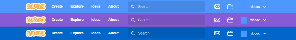
I discovered that the royal blue colour #0066CC has a contrast ratio of around 5.57, instead of the purple colour scheme's 4.67. It looks far better in my opinion, and will be more familiar to the vast majority of users who are used to the original colour scheme. Here's a comparison of the three navbars: from top to bottom, the original, the current purple scheme and my proposed royal blue scheme.
This will improve the aesthetic of the website tremendously. It would fit in better with the sticky icons, post headers etc. that the Scratch Team haven't yet changed because they're just two different shades of the same colour. It would be much less of a shock to the kids upset that their Scratch is purple now while meeting the accessibility criteria more thoroughly.
I know the Scratch Team has been thinking about a more accessible colour scheme for a while, but I implore the Scratch Team to seriously consider this royal blue colour scheme instead of the purple one currently in use.
Lastly, I know this seems like a duplicate, but this is a suggestion for a specific colour rather than a choice to switch between them, and I did my research as well. If the Scratch Team does deem this to be a duplicate, please move the topic to Advanced Topics instead of closing it.

CamperHM68, CEO of Anti-Ham Dungeon
when green flag clicked
if <(username) = [CamperHM68]> then
set [Rizz] to [∞]
end
- Itz-Sodium
-
 Scratcher

74 posts
The royal blue colour scheme: It looks better *and* it's still accessible.
Try this on rdococ and medians:
Edit: sorry, I meant https://webaim.org/resources/contrastchecker/?fcolor=F7F7F7&bcolor=7C0085
Edit: sorry, I meant https://webaim.org/resources/contrastchecker/?fcolor=F7F7F7&bcolor=7C0085
This color :: #7C0085be purple :cool: and blue-:o :/ :mad:
Last edited by Itz-Sodium (June 30, 2023 00:55:45)
my man sodium.
Hi there,
 fire in the hole
- nhy76yh
-
 Scratcher

100 posts
The royal blue colour scheme: It looks better *and* it's still accessible.
WHY TOLORS I'll hate Scratch team for this foreverI think the ST knows what they're doing.I mean, they seem to be very serious on it… (in fact suggesting to revert the colors back is on )
It funny because no grammar
Idk why i'm here :sob:make whatever movie you want to make https://scratch.mit.edu/discuss/topic/743000/
- ssvbxx2
-
Scratcher
100+ posts
The royal blue colour scheme: It looks better *and* it's still accessible.
TOLORS is helpful for keeping track of rejected suggestions; otherwise, users would have to run back and forth between topics to find rejected suggestions, which can be exhausting.WHY TOLORS I'll hate Scratch team for this foreverI think the ST knows what they're doing.I mean, they seem to be very serious on it… (in fact suggesting to revert the colors back is on )
I'm ssvbxx2. I make a variety of original projects: games, animations, etc.
(Tile Scrolling Project | Square Root Calculator | The Sound of Sorting)
Last edited by kaj (Next year 00:00:00)
- MythosLore
-
 Scratcher

1000+ posts
The royal blue colour scheme: It looks better *and* it's still accessible.
How long do you think it would take to implement this, and do you think that by then people will be used to the purple color? I mean, what do you think people would say if the Scratch Team announced that the studios are going to be in a format somewhat in between the old 2.0 format and the new 3.0 format?I've heard that it took four months to implement the purple, I could get used to this purple in that amount of time. Also, I think the Scratch Team would have to do a bunch of research to see if this is true. (Maybe not, I'm not a high-contrast update)
(maybe it would resemble @medians's version 2.0 of Scratch 3.0)
Last edited by MythosLore (June 30, 2023 03:46:29)
- Prince_Wolf1
-
Scratcher
1000+ posts
The royal blue colour scheme: It looks better *and* it's still accessible.
Bump
It’s on second page
It’s on second page
Do you like dogs?
I'm a 12 year old girl who spends most of her time on scratch on the forums.I like Warrior Cats, Percy Jackson, and WW2 books.I love music and I like AJR, BoyWithUke, And Hamilton.
you'll mostly see me in Suggestions, Questions About Scratch, and a little in Bugs And Glitches.I'm also in Things I'm Reading And Playing a little bit.i might be in Warrior Cats and School Computers
remix this with what color you think would be good for scratch’s dark mode!/////////////////////////////////////////////////////////////////////////////////////////////////////////////////////////////////////////////////////////////////////////////////////////////
////////////////////////////////////////////////////////////////////////////////////////////////////////////////////////////////////////////////////////////////////////////////////////////////////////////////////
- Dogs-are-amazing1
-
 Scratcher

500+ posts
The royal blue colour scheme: It looks better *and* it's still accessible.
BumpWait 24 hours before bumping
It’s on second page
_ DOGS ARE THE BEST!
Go see my cattails topic: https://scratch.mit.edu/discuss/topic/599083/
(O-0)
/ \
Generation Y (11): the first time you see this copy and paste it on top of your sig in the scratch forums and increase generation by 1. Social experiment.
- Prince_Wolf1
-
Scratcher
1000+ posts
The royal blue colour scheme: It looks better *and* it's still accessible.
If it’s on the second page you can bumpBumpWait 24 hours before bumping
It’s on second page
Do you like dogs?
I'm a 12 year old girl who spends most of her time on scratch on the forums.I like Warrior Cats, Percy Jackson, and WW2 books.I love music and I like AJR, BoyWithUke, And Hamilton.
you'll mostly see me in Suggestions, Questions About Scratch, and a little in Bugs And Glitches.I'm also in Things I'm Reading And Playing a little bit.i might be in Warrior Cats and School Computers
remix this with what color you think would be good for scratch’s dark mode!/////////////////////////////////////////////////////////////////////////////////////////////////////////////////////////////////////////////////////////////////////////////////////////////
////////////////////////////////////////////////////////////////////////////////////////////////////////////////////////////////////////////////////////////////////////////////////////////////////////////////////
- Backto2011
-
 Scratcher

100+ posts
The royal blue colour scheme: It looks better *and* it's still accessible.
to be honest this just reminds me of some scratch pages that aren't in the the modern scratch style(like the profile pages and the topics) before the “lean mode” appeared in scratch
hello my name is pedrodrocafranco!
currently working in superfinder
“fan” of astdfgihngjombkp,clç
- Discussion Forums
- » Suggestions
-
» The royal blue colour scheme: It looks better *and* it's still accessible.