Discuss Scratch
- Discussion Forums
- » Advanced Topics
- » Mockups of Scratch 3 webpages that are not implemented yet
![[RSS Feed]](//cdn.scratch.mit.edu/scratchr2/static/__d235e7f35585482ca999583499337ccd__//djangobb_forum/img/feed-icon-small.png "[RSS Feed]")
- LuckyLucky7
-
 Scratcher

1000+ posts
Mockups of Scratch 3 webpages that are not implemented yet
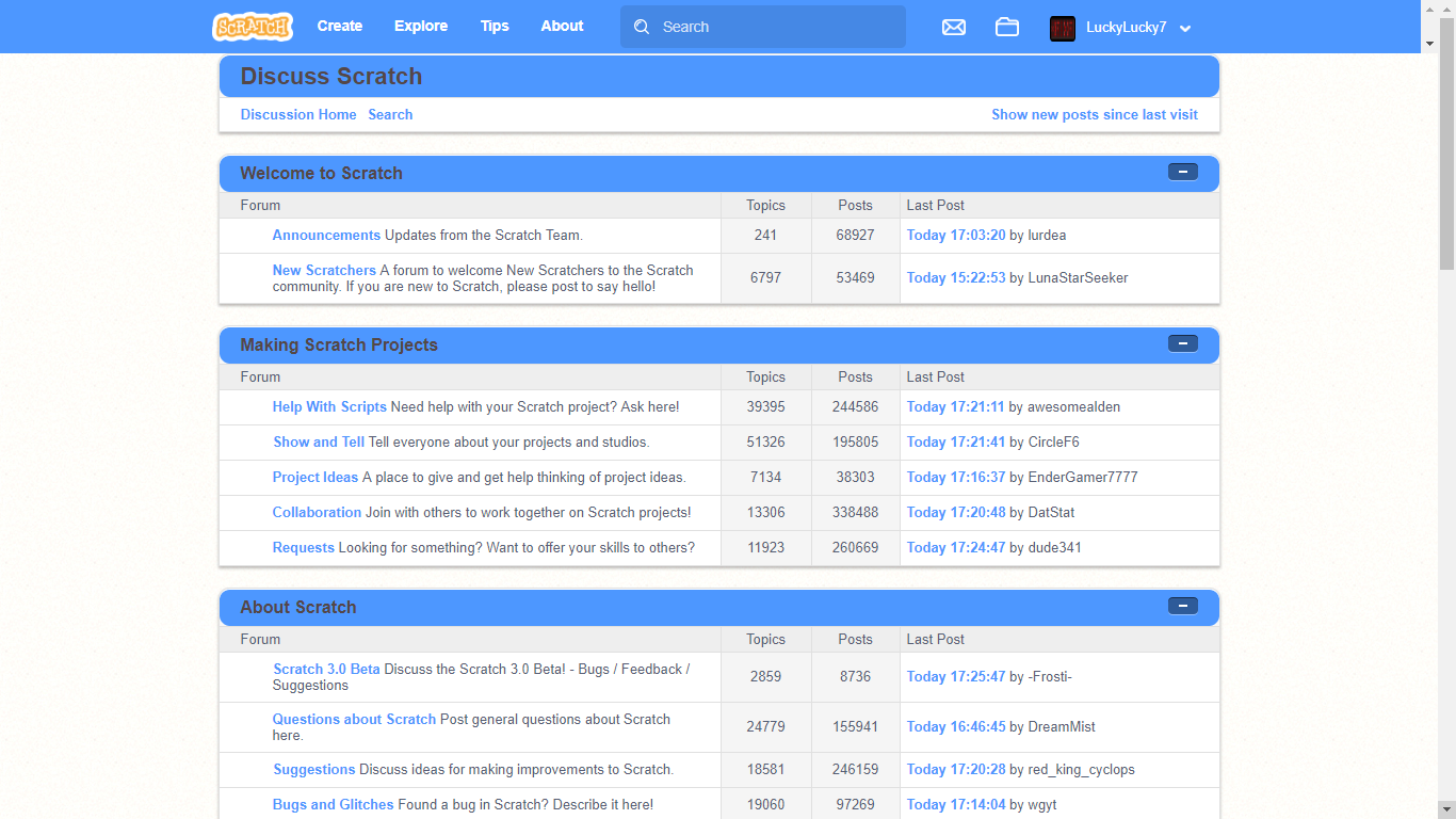
I created a mockup for how some Scratch 3 webpages would look like.
Check them out below!
Check them out below!
1. Discussion Forums homepage:Note: I won't have time to finish these mockups, because probably lots of Scratchers have school, which I'm one of them.
Last edited by LuckyLucky7 (Aug. 26, 2018 21:12:16)
- dude341
-
 Scratcher

1000+ posts
Mockups of Scratch 3 webpages that are not implemented yet
Everything looks fine except for the blue bars on the stuff like “welcome to scratch” and “discuss scratch”. Why would they look like that? They already have ones created, as seen on the homepage.
- LuckyLucky7
-
Scratcher
1000+ posts
Mockups of Scratch 3 webpages that are not implemented yet
Everything looks fine except for the blue bars on the stuff like “welcome to scratch” and “discuss scratch”. Why would they look like that? They already have ones created, as seen on the homepage.I'm just trying to make it have more of a Scratch 3 feel in it.
- dude341
-
Scratcher
1000+ posts
Mockups of Scratch 3 webpages that are not implemented yet
That doesn't really have a Scratch 3 feel though, the ones created for the homepage would fit more.Everything looks fine except for the blue bars on the stuff like “welcome to scratch” and “discuss scratch”. Why would they look like that? They already have ones created, as seen on the homepage.I'm just trying to make it have more of a Scratch 3 feel in it.
- LuckyLucky7
-
Scratcher
1000+ posts
Mockups of Scratch 3 webpages that are not implemented yet
That's because my mockup was made using Inspect Element.That doesn't really have a Scratch 3 feel though, the ones created for the homepage would fit more.Everything looks fine except for the blue bars on the stuff like “welcome to scratch” and “discuss scratch”. Why would they look like that? They already have ones created, as seen on the homepage.I'm just trying to make it have more of a Scratch 3 feel in it.
- ScratchDiogoh
-
 Scratcher

1000+ posts
Mockups of Scratch 3 webpages that are not implemented yet
{no offense} I like the idea, but the purpose of the scratch 3 pages should be almost everything “dark” cyan rather than blue and gray

- dude341
-
Scratcher
1000+ posts
Mockups of Scratch 3 webpages that are not implemented yet
{no offense} I like the idea, but the purpose of the scratch 3 pages should be almost everything “dark” cyan rather than blue and grayThat isn't correct. I don't see the homepage only being dark blue. It's also grey.
- LuckyLucky7
-
Scratcher
1000+ posts
Mockups of Scratch 3 webpages that are not implemented yet
But the Scratch 2 navigation bar IS dark blue.{no offense} I like the idea, but the purpose of the scratch 3 pages should be almost everything “dark” cyan rather than blue and grayThat isn't correct. I don't see the homepage only being dark blue. It's also grey.
- ScratchDiogoh
-
Scratcher
1000+ posts
Mockups of Scratch 3 webpages that are not implemented yet
the 2.0 design{no offense} I like the idea, but the purpose of the scratch 3 pages should be almost everything “dark” cyan rather than blue and grayThat isn't correct. I don't see the homepage only being dark blue. It's also grey.
- dude341
-
Scratcher
1000+ posts
Mockups of Scratch 3 webpages that are not implemented yet
I don't see your point. The Scratch 3 navigation bar is also dark blue. But the pages themselves are grey.But the Scratch 2 navigation bar IS dark blue.{no offense} I like the idea, but the purpose of the scratch 3 pages should be almost everything “dark” cyan rather than blue and grayThat isn't correct. I don't see the homepage only being dark blue. It's also grey.
No, it's not? The homepage has the 3.0 design, and so does the search. An example of a page with the 2.0 design is the forums.the 2.0 design{no offense} I like the idea, but the purpose of the scratch 3 pages should be almost everything “dark” cyan rather than blue and grayThat isn't correct. I don't see the homepage only being dark blue. It's also grey.
- ScratchDiogoh
-
Scratcher
1000+ posts
Mockups of Scratch 3 webpages that are not implemented yet
{off topic} easter egg what are you saying! {/ offtopic}
- LuckyLucky7
-
Scratcher
1000+ posts
Mockups of Scratch 3 webpages that are not implemented yet
The Scratch 3 navigation bar's color is not as dark as the Scratch 2 navigation bar.I don't see your point. The Scratch 3 navigation bar is also dark blue. But the pages themselves are grey.But the Scratch 2 navigation bar IS dark blue.{no offense} I like the idea, but the purpose of the scratch 3 pages should be almost everything “dark” cyan rather than blue and grayThat isn't correct. I don't see the homepage only being dark blue. It's also grey.
- dude341
-
Scratcher
1000+ posts
Mockups of Scratch 3 webpages that are not implemented yet
I still don't see your point. Yes, that is true. I don't know what that has to do with what I said.The Scratch 3 navigation bar's color is not as dark as the Scratch 2 navigation bar.I don't see your point. The Scratch 3 navigation bar is also dark blue. But the pages themselves are grey.But the Scratch 2 navigation bar IS dark blue.{no offense} I like the idea, but the purpose of the scratch 3 pages should be almost everything “dark” cyan rather than blue and grayThat isn't correct. I don't see the homepage only being dark blue. It's also grey.
easter egg what are you saying!???
- red_king_cyclops
-
 Scratcher

500+ posts
Mockups of Scratch 3 webpages that are not implemented yet
The Scratch navigation bar is blue on some webpages and dark blue on other webpages.
- bybb
-
 Scratcher

1000+ posts
Mockups of Scratch 3 webpages that are not implemented yet
The forums aren't getting updated for Scratch 3.0?
- LuckyLucky7
-
Scratcher
1000+ posts
Mockups of Scratch 3 webpages that are not implemented yet
The forums aren't getting updated for Scratch 3.0?I'm not too sure.
- dude341
-
Scratcher
1000+ posts
Mockups of Scratch 3 webpages that are not implemented yet
The Scratch navigation bar is blue on some webpages and dark blue on other webpages.Incorrect.
All 3.0 pages now have the new dark blue colour instead of the light blue that was there before.
I am not aware of any changes to the 2.0 pages (the ones with the really dark blue colour scheme and the ones which look better in my opinion).
Last edited by dude341 (Aug. 16, 2018 22:55:22)
- red_king_cyclops
-
Scratcher
500+ posts
Mockups of Scratch 3 webpages that are not implemented yet
I meant 2.0.The Scratch navigation bar is blue on some webpages and dark blue on other webpages.Incorrect.
All 3.0 pages now have the new dark blue colour instead of the light blue that was there before.
I am not aware of any changes to the 2.0 pages (the ones with the really dark blue colour scheme and the ones which look better in my opinion).
How do you know the new colour of the 3.0 pages? The 3.0 webpages aren't out yet.
I prefer the non-dark blue colour scheme. The dark blue colour scheme feels outdated, while the non-dark blue colour scheme feels perfect for Scratch 3.0.
Last edited by red_king_cyclops (Aug. 16, 2018 23:17:10)
- dude341
-
Scratcher
1000+ posts
Mockups of Scratch 3 webpages that are not implemented yet
The homepage is a 3.0 page… see how it's different from the other ones? The 3.0 homepage design also used to be a different shade of blue.I meant 2.0.The Scratch navigation bar is blue on some webpages and dark blue on other webpages.Incorrect.
All 3.0 pages now have the new dark blue colour instead of the light blue that was there before.
I am not aware of any changes to the 2.0 pages (the ones with the really dark blue colour scheme and the ones which look better in my opinion).
How do you know the new colour of the 3.0 pages? The 3.0 webpages aren't out yet.
I prefer the non-dark blue colour scheme. The dark blue colour scheme feels outdated, while the non-dark blue colour scheme feels perfect for Scratch 3.0.
- Sheep_maker
-
 Scratcher

1000+ posts
Mockups of Scratch 3 webpages that are not implemented yet
They changed the navbar colour to the Scratch 3.0 motion blocks colour; it will carry over to all redesigns of the site.
- Discussion Forums
- » Advanced Topics
-
» Mockups of Scratch 3 webpages that are not implemented yet