Discuss Scratch
- Discussion Forums
- » Suggestions
- » Remove the second my stuff button so the editor doesn’t break on smaller aspect ratios
![[RSS Feed] [RSS Feed]](//cdn.scratch.mit.edu/scratchr2/static/__35b9adb704d6d778f00a893a1b104339__//djangobb_forum/img/feed-icon-small.png)
- cookieclickerer33
-
 Scratcher
1000+ posts
Remove the second my stuff button so the editor doesn’t break on smaller aspect ratios
In the editor currently the top bar does not scale to the aspect ratio of the screen properly.
This usally leads to the issue of the “save now” button appearing causing the space on the right of the screen to extend past your aspect ratio. This causes the browser to add a horosontal scroll bar and on mobile devices this is very bad
If this happens on a mobile device, trying to drag arround in the editor will instead scroll the entire screen due to the new scroll bar. It also causes to screen to flash whenever the button appears
The best fix for this is simply to remove the my stuff button
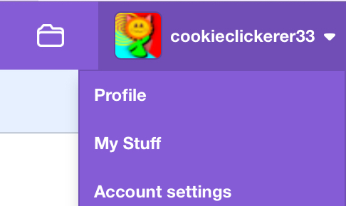
Before you think this is a bad idea, for whatever reason clicking on your profile icon in the editor also shows the my stuff button

This is actually on every page of the scratch website!
I don’t see why there’s 2 buttons for it, so just remove one of them and that’s all the need to do to fix it
This usally leads to the issue of the “save now” button appearing causing the space on the right of the screen to extend past your aspect ratio. This causes the browser to add a horosontal scroll bar and on mobile devices this is very bad
If this happens on a mobile device, trying to drag arround in the editor will instead scroll the entire screen due to the new scroll bar. It also causes to screen to flash whenever the button appears
The best fix for this is simply to remove the my stuff button
Before you think this is a bad idea, for whatever reason clicking on your profile icon in the editor also shows the my stuff button

This is actually on every page of the scratch website!
I don’t see why there’s 2 buttons for it, so just remove one of them and that’s all the need to do to fix it
- ToastRoastBoast
-
 Scratcher
500+ posts
Remove the second my stuff button so the editor doesn’t break on smaller aspect ratios
bump cuz we need posts
- cookieclickerer33
-
 Scratcher
1000+ posts
Remove the second my stuff button so the editor doesn’t break on smaller aspect ratios
bump cuz we need postsThanks but this was on page 1
- PaperMarioFan2022
-
 Scratcher
1000+ posts
Remove the second my stuff button so the editor doesn’t break on smaller aspect ratios
I'm testing this currently with Vanilla Scratch and default Scratch, and it looks pretty broken to me, even on the editor.
Support. Who wants a broken portion of the website to break the original aspect ratio of your screen?
Support. Who wants a broken portion of the website to break the original aspect ratio of your screen?
- Discussion Forums
- » Suggestions
-
» Remove the second my stuff button so the editor doesn’t break on smaller aspect ratios
![[RSS Feed] [RSS Feed]](//cdn.scratch.mit.edu/scratchr2/static/__35b9adb704d6d778f00a893a1b104339__//djangobb_forum/img/feed-icon-small.png)


