Discuss Scratch

- Discussion Forums
- » Questions about Scratch
- » What's the research says that Purple was the better choice for color blindness?
![[RSS Feed]](//cdn.scratch.mit.edu/scratchr2/static/__d99df16e04aff6222b0d15eae35ae560__//djangobb_forum/img/feed-icon-small.png "[RSS Feed]")
- NMario84
-
 Scratcher

1000+ posts
What's the research says that Purple was the better choice for color blindness?
I understand that Scratch was changed to purple to help accessibility of color blindness, and I respect that. But where or what research says that this was the better choice? From what I see on the forums lately (as of after the change), there seem to have been complaints that even Purple are hurting some peoples eyes. They have had at least 1 week (if not more) of notice that this was happening, even with that big huge notice at the top.
Is there something I am missing here? Purple is a nice color, it's just certainly different. But perhaps maybe there could be more research? This doesn't really affect me too much, but it seems to affect some others with color issues.
Is there something I am missing here? Purple is a nice color, it's just certainly different. But perhaps maybe there could be more research? This doesn't really affect me too much, but it seems to affect some others with color issues.
Last edited by NMario84 (June 29, 2023 05:36:44)
- Zydrolic
-
 Scratcher

1000+ posts
What's the research says that Purple was the better choice for color blindness?
I understand that Scratch was changed to purple to help accessibility of color blindness, and I respect that. But where or what research says that this was the better choice? From what I see on the forums lately (as of after the change), there seem to have been complaints that even Purple are hurting some peoples eyes. They have had at least 1 week (if not more) of notice that this was happening, even with that big huge notice at the top.It's not just research, but that is most likely in the mix. jvvg, lead wiki engineer made an essay about why it's understandable that they did it — Research was definetly involved and I bet they(ST) planned it ahead.
Is there something I am missing here? Purple is a nice color, it's just certainly different. But perhaps maybe there could be more research? This doesn't really affect me too much, but it seems to affect some others with color issues.
https://en.scratch-wiki.info/wiki/User:Jvvg/Essays/Accessibility_preempts_aesthetics
Coding a “select your theme m8” isn't as easy as people chalk it up to be;
Research was most likely involved though, dunno about that.
Last edited by Zydrolic (June 29, 2023 06:33:07)
- Za-Chary
-
 Scratcher

1000+ posts
What's the research says that Purple was the better choice for color blindness?
I suspect that complaints that they are hurting peoples' eyes are coming from the fact that it's just a new change. The same sorts of complaints also came up when the Scratch Team released the studio update. Nowadays I don't really see any complaints about the aesthetics of the studio update, so people may have gotten used to them. The same will likely hold with this purple color.
As for the research, there is a post here containing a Contact Us message which describes the process of what the Scratch Team did: https://scratch.mit.edu/discuss/post/7338952/
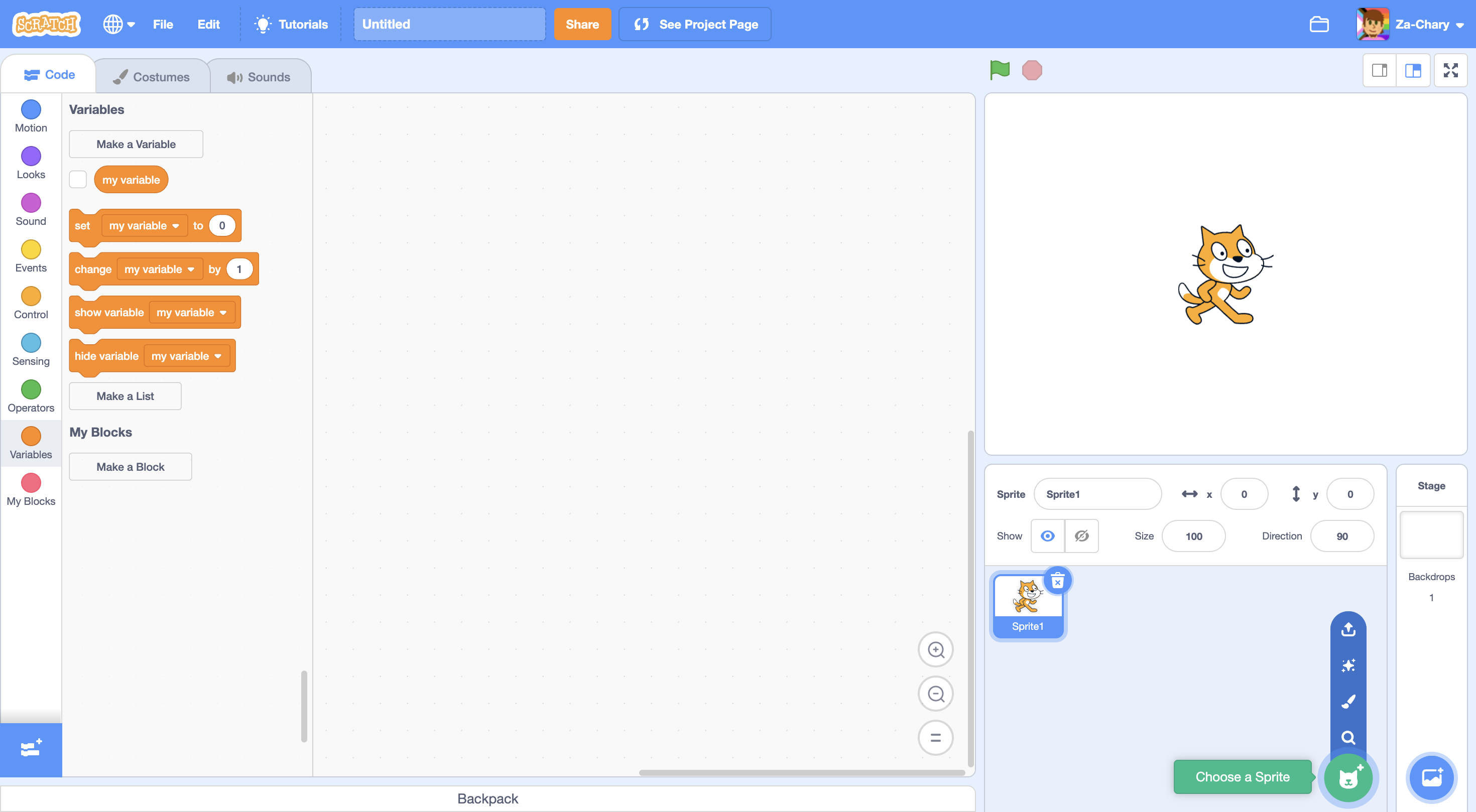
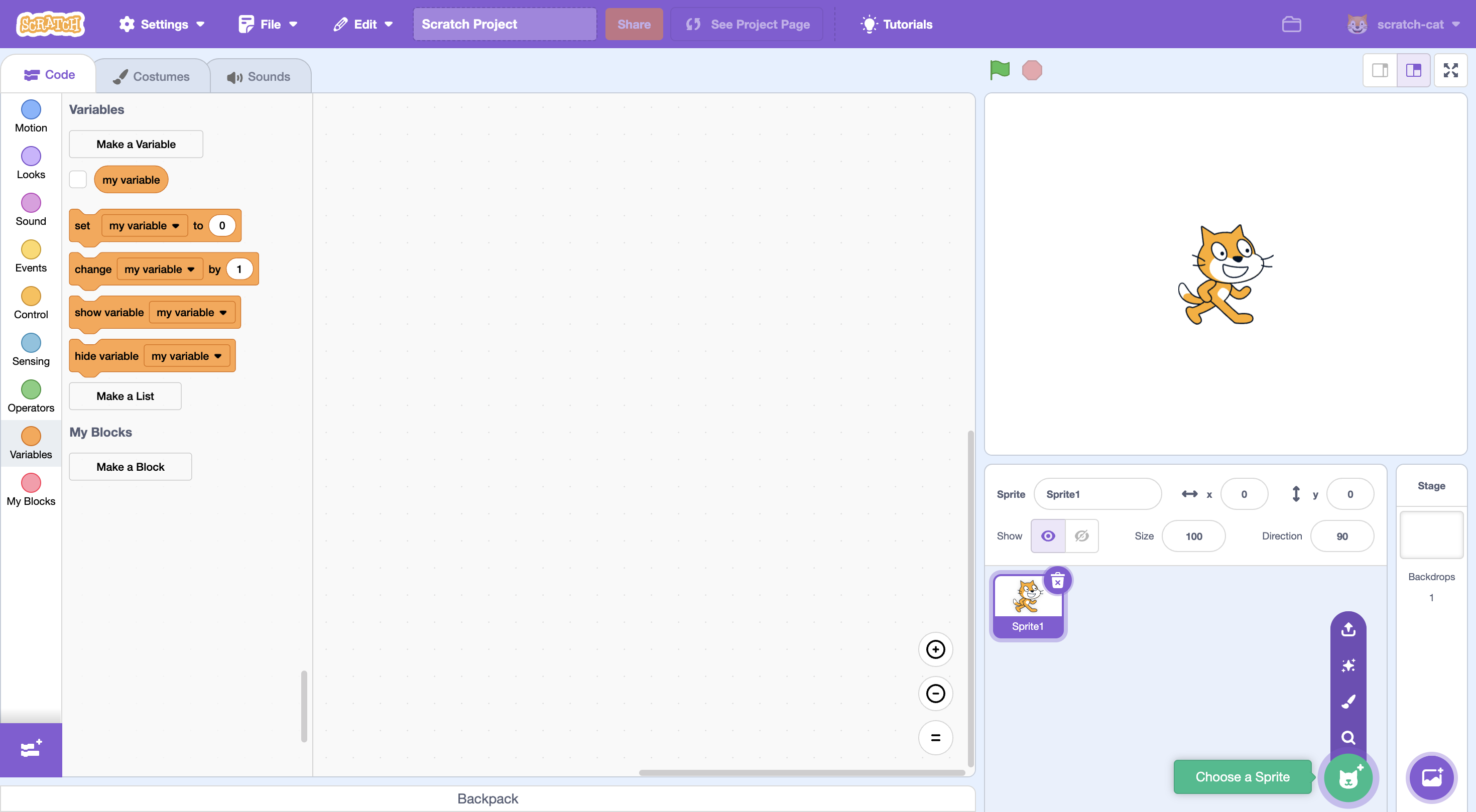
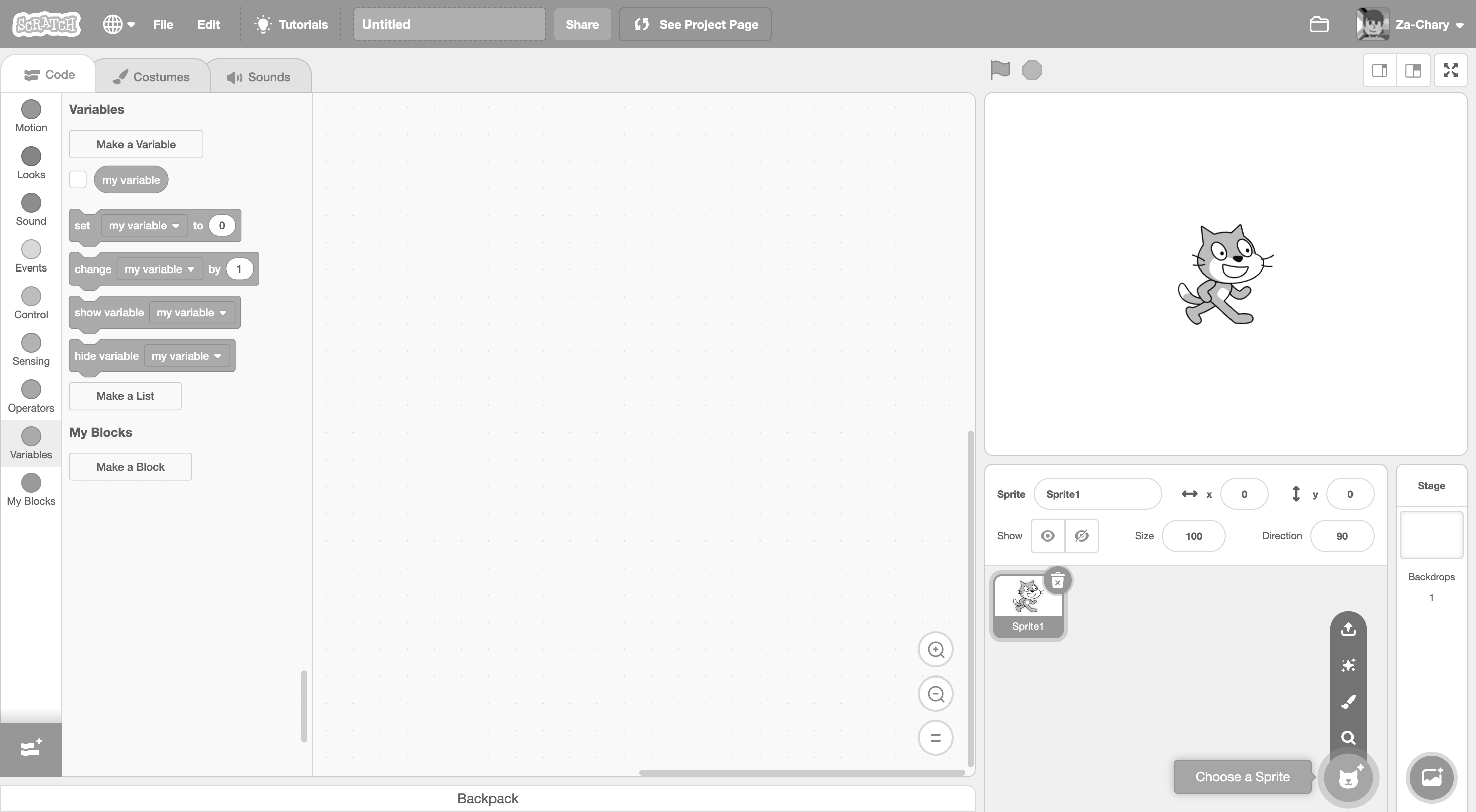
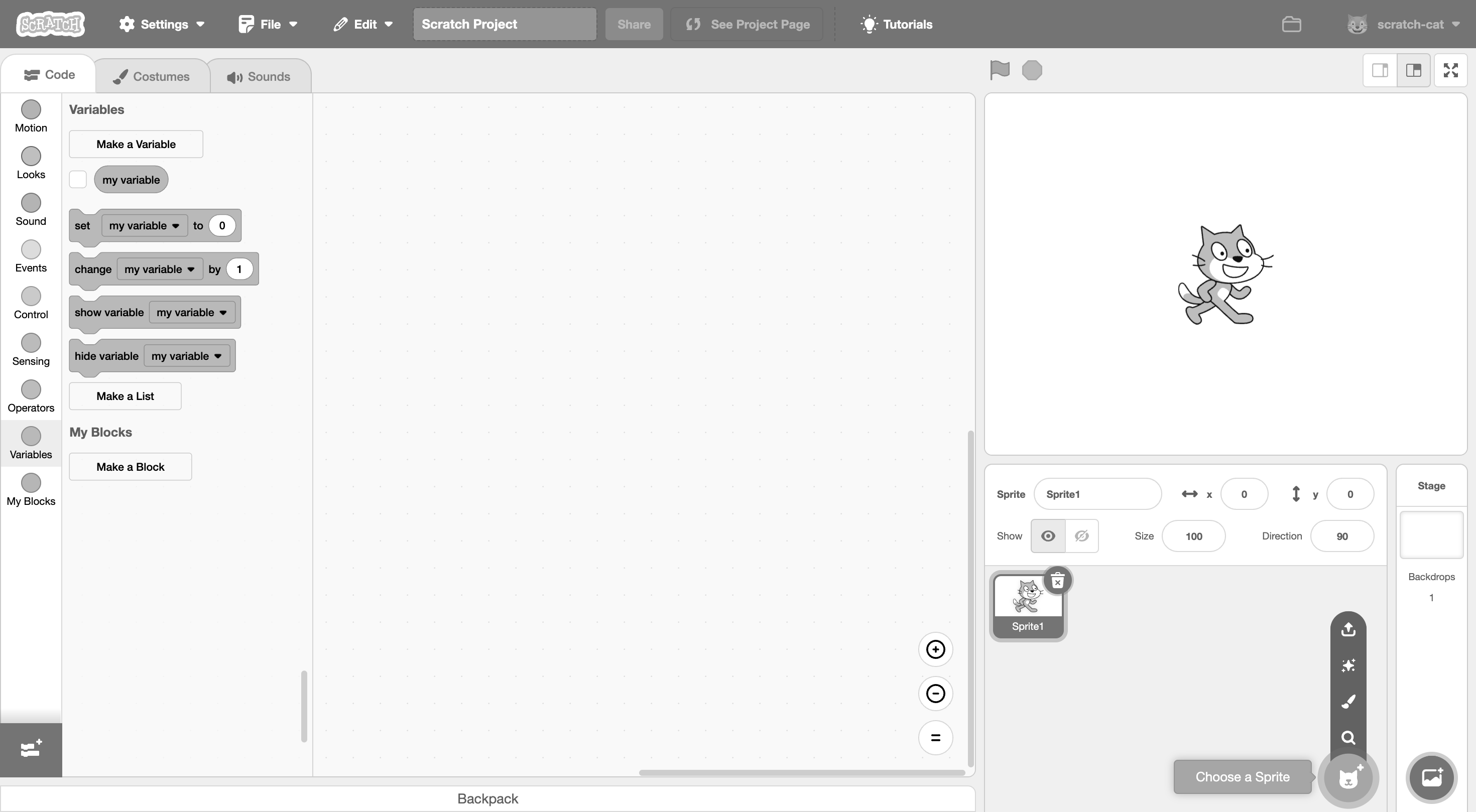
We could also check out the changes for ourselves. The first two images below show the Scratch editor with the original blue and the new purple, respectively. The last two images are the exact same but in complete grayscale (saturation turned all the way down). Undeniably, the purple has higher contrast, which was the Scratch Team's goal in making this update. The purple was likely chosen as opposed to, say, making the blue darker, because it was more “on brand” as a color theme for Scratch, and the purple in Scratch Lab was already used, so it was not a huge shift.
Regardless, it seems we may be seeing more color options in the future. The details are unclear, but let's wait and see what happens.
As for the research, there is a post here containing a Contact Us message which describes the process of what the Scratch Team did: https://scratch.mit.edu/discuss/post/7338952/
We could also check out the changes for ourselves. The first two images below show the Scratch editor with the original blue and the new purple, respectively. The last two images are the exact same but in complete grayscale (saturation turned all the way down). Undeniably, the purple has higher contrast, which was the Scratch Team's goal in making this update. The purple was likely chosen as opposed to, say, making the blue darker, because it was more “on brand” as a color theme for Scratch, and the purple in Scratch Lab was already used, so it was not a huge shift.
Regardless, it seems we may be seeing more color options in the future. The details are unclear, but let's wait and see what happens.
- NMario84
-
Scratcher
1000+ posts
What's the research says that Purple was the better choice for color blindness?
Ah that's interesting. Thanks for the info! 

- scratchcode1_2_3
-
 Scratcher

1000+ posts
What's the research says that Purple was the better choice for color blindness?
yeah but i still think that studio managers are useless now… I don't complain about it as much, I just silently don't like it………… and the purple is bad too but i'll never have to get used to it if i don't have to look at it lol 
I'm not saying Scratch team's decisions are bad, just that they should make it more customizable or be able to change it the way you like
I'm not saying Scratch team's decisions are bad, just that they should make it more customizable or be able to change it the way you like
- Discussion Forums
- » Questions about Scratch
-
» What's the research says that Purple was the better choice for color blindness?