Discuss Scratch
- Discussion Forums
- » Suggestions
- » Signature
![[RSS Feed]](//cdn.scratch.mit.edu/scratchr2/static/__5b3e40ec58a840b41702360e9891321b__//djangobb_forum/img/feed-icon-small.png "[RSS Feed]")
- LionHeart70
-
 Scratcher

1000+ posts
Signature
I found the post! Bump 
I'll be updating the OP with my new ideas.

I'll be updating the OP with my new ideas.
- dude341
-
 Scratcher

1000+ posts
Signature
15% support: the line is clear enough (try adjusting the settings on your computer monitor/tablet display/phone screen etc), and I don't think making it darker would help newer users figure out what is is, while a forum signature feature is on many sites, I doubt New Scratchers know what one is before joining. Perhaps a message on the screen the first time the user sees a signature, it says “This is a forum signature: it is not part of the post, it is not spam” etc?
- Sheep_maker
-
 Scratcher

1000+ posts
Signature
Here's a concept design:
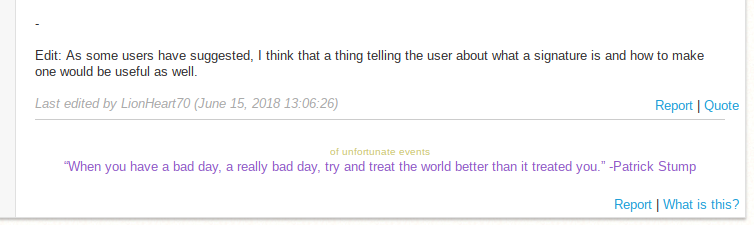
Changes:
Changes:
- moved report/quote to the post content
- made the separating line longer
- added a separate explicit report button for signatures
- link that would explain what a signature is
- Happysoul05
-
 Scratcher

100+ posts
Signature
Support. (I include both things above)Semi-Support. I've seen this happen a few times, but not enough to where it's tedious.Yeah, I guess. Just making it a slightly darker grey would be good.
A new scratcher also took my sig as advertise.
Maybe there could also be a circle next to the line, and when you mouse over it, it would say:“This is the users signature.
This segment of text is present
on all of this user's posts.
Remember that all signatures
are separated from the post by a gray line.”
No support.But i support if it only shows if you are a new scratcher or if your signature is empty.
- dude341
-
Scratcher
1000+ posts
Signature
Here's a concept design:Very nice mock-up! Was it made with inspect element or image editing software? I think this would look like something Scratch would do, I think it should look like that, I'll show Paddle2See.
Changes:The signature could also be faded a bit so that focus is placed on the post body, but that might anger some users who care deeply about their signatures.
- moved report/quote to the post content
- made the separating line longer
- added a separate explicit report button for signatures
- link that would explain what a signature is
- red_king_cyclops
-
 Scratcher

500+ posts
Signature
I support this suggestion, because it makes sense and there are no drawbacks I can think of.
- LionHeart70
-
Scratcher
1000+ posts
Signature
Here's a concept design:It's pretty nice. The only thing I can think of is that it cuts off the top half of the signature which could be relatively annoying for some users.
Changes:The signature could also be faded a bit so that focus is placed on the post body, but that might anger some users who care deeply about their signatures.
- moved report/quote to the post content
- made the separating line longer
- added a separate explicit report button for signatures
- link that would explain what a signature is
- dude341
-
Scratcher
1000+ posts
Signature
That would be probably an editing mistake.Here's a concept design:It's pretty nice. The only thing I can think of is that it cuts off the top half of the signature which could be relatively annoying for some users.
Changes:The signature could also be faded a bit so that focus is placed on the post body, but that might anger some users who care deeply about their signatures.
- moved report/quote to the post content
- made the separating line longer
- added a separate explicit report button for signatures
- link that would explain what a signature is
- owlannaelsa
-
 Scratcher

1000+ posts
Signature
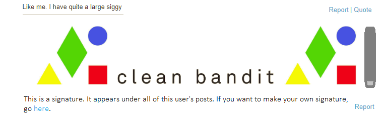
Like me. I have quite a large siggyHere's a concept design:It's pretty nice. The only thing I can think of is that it cuts off the top half of the signature which could be relatively annoying for some users.
Changes:The signature could also be faded a bit so that focus is placed on the post body, but that might anger some users who care deeply about their signatures.
- moved report/quote to the post content
- made the separating line longer
- added a separate explicit report button for signatures
- link that would explain what a signature is
- TheAdriCoolManDude
-
 Scratcher

1000+ posts
Signature
Here is a possible mock-up I made of what could happen:

Just it appears with your username, not TheAdriCoolManDude for your siggy.
Just it appears with your username, not TheAdriCoolManDude for your siggy.
Last edited by TheAdriCoolManDude (June 28, 2018 01:38:39)
- LionHeart70
-
Scratcher
1000+ posts
Signature
Here is a possible mock-up I made of what could happen:I don't know, could still look like it was in the signature and could be especially problematic for users with larger signatures.
Just it appears with your username, not TheAdriCoolManDude for your siggy.
- TheAdriCoolManDude
-
Scratcher
1000+ posts
Signature
Yeah, I guess. My signature is already too big to fit in the signature box. I suggest a scroll bar, then?Here is a possible mock-up I made of what could happen:I don't know, could still look like it was in the signature and could be especially problematic for users with larger signatures.
Just it appears with your username, not TheAdriCoolManDude for your siggy.
- red_king_cyclops
-
Scratcher
500+ posts
Signature
Yeah, I guess. My signature is already too big to fit in the signature box. I suggest a scroll bar, then?Here is a possible mock-up I made of what could happen:I don't know, could still look like it was in the signature and could be especially problematic for users with larger signatures.
Just it appears with your username, not TheAdriCoolManDude for your siggy.
It is already possible to have a scroll bar in your signature. You use the code feature on the forums, like so:
[code]Put text here[/code]
Here is an example of a scroll-able signature:
Hello. My name is red_king_cyclops. I make cool games and things. I'm good at coming up with ideas and stories. My most popular project has over 50 loves.
- TheAdriCoolManDude
-
Scratcher
1000+ posts
Signature
No. Something that scrolls down, not right.Yeah, I guess. My signature is already too big to fit in the signature box. I suggest a scroll bar, then?Here is a possible mock-up I made of what could happen:I don't know, could still look like it was in the signature and could be especially problematic for users with larger signatures.
Just it appears with your username, not TheAdriCoolManDude for your siggy.
It is already possible to have a scroll bar in your signature. You use the code feature on the forums, like so:[code]Put text here[/code]
Here is an example of a scroll-able signature:Hello. My name is red_king_cyclops. I make cool games and things. I'm good at coming up with ideas and stories. My most popular project has over 50 loves.
- TheAdriCoolManDude
-
Scratcher
1000+ posts
Signature
A new mockup:
Features:
An explanation that it is a signature
A report button
A scroll wheel
A link to where you can make your signature
Well this should help.
Features:
An explanation that it is a signature
A report button
A scroll wheel
A link to where you can make your signature
Well this should help.
- LionHeart70
-
Scratcher
1000+ posts
Signature
A new mockup:Looks nice, should probably be cleaned up a little more but not too bad.
Features:
An explanation that it is a signature
A report button
A scroll wheel
A link to where you can make your signature
Well this should help.
- TheAdriCoolManDude
-
Scratcher
1000+ posts
Signature
Yeah. I used Microsoft Paint to use this so.A new mockup:Looks nice, should probably be cleaned up a little more but not too bad.
Features:
An explanation that it is a signature
A report button
A scroll wheel
A link to where you can make your signature
Well this should help.
- Discussion Forums
- » Suggestions
-
» Signature