Discuss Scratch
- Discussion Forums
- » Suggestions
- » The Ultimate Scratch 3.0 Block Style Protest Megathread
![[RSS Feed]](//cdn.scratch.mit.edu/scratchr2/static/__74e70580e9dbe93ce1c3f8422dde592d__//djangobb_forum/img/feed-icon-small.png "[RSS Feed]")
- titanscratch
-
 Scratcher

100+ posts
The Ultimate Scratch 3.0 Block Style Protest Megathread
Welcome to The Ultimate Scratch 3.0 Block Style Protest Megathread!
This is the Scratch 3.0 Github page: https://llk.github.io/scratch-gui
The problem with Scratch 3.0 is the big, chunky blocks!!!!!!!!!!
If you hate them, you came to the right place!!!!!!!!!
Why I hate them:
1. You need to do a lot of scrolling.
2. The blocks take up a lot of space.
3. The text is tiny compared to the size of the blocks. The options below might be better:
4.1. Make the text bigger.
4.2. Make the blocks smaller or
4.3. Make an option called “computer/tablet (small style)” and “smartphone (big style)”.
4. I would like to have the Scratch 2.0 style back!!!!!!!!!!
5. The events section in Scratch 3.0 is the same colour as the control section in Scratch 2.0 and vice versa. I would like them to stay in Scratch 2.0 format!!!!!!!!!
6. The custom blocks are a weird pink colour!!!!!!!!!!
7. The colours are very similar:
7.1. The pen block's colour and the operators block's colour are very similar.
7.2. The sensing block's colour and the motion block's colour are very similar.
7.3. The data block's colour and the control block's colour are very similar.
Some images and comments from stickfiregames:
Please support.
P.S. This topic stays forever so you are allowed to necropost here!
This is the Scratch 3.0 Github page: https://llk.github.io/scratch-gui
The problem with Scratch 3.0 is the big, chunky blocks!!!!!!!!!!
If you hate them, you came to the right place!!!!!!!!!
Why I hate them:
1. You need to do a lot of scrolling.
2. The blocks take up a lot of space.
3. The text is tiny compared to the size of the blocks. The options below might be better:
4.1. Make the text bigger.
4.2. Make the blocks smaller or
4.3. Make an option called “computer/tablet (small style)” and “smartphone (big style)”.
4. I would like to have the Scratch 2.0 style back!!!!!!!!!!
5. The events section in Scratch 3.0 is the same colour as the control section in Scratch 2.0 and vice versa. I would like them to stay in Scratch 2.0 format!!!!!!!!!
6. The custom blocks are a weird pink colour!!!!!!!!!!
7. The colours are very similar:
7.1. The pen block's colour and the operators block's colour are very similar.
7.2. The sensing block's colour and the motion block's colour are very similar.
7.3. The data block's colour and the control block's colour are very similar.
Some images and comments from stickfiregames:
Time to bump up my padding rant again… with a picture:
here's how much space we could save by getting rid of the ridiculous padding on each block.
Also, why is there no visual difference between string and number inputs? That's probably also been said in the first 100 pages, but I still haven't read them all.
Maybe it's already been said (I'm not going to read nearly 100 pages right now), but why is the text so tiny and the blocks so huge?
The default zoom level is nearly twice as high as in 2.0, so there's going to be a lot more scrolling going on. If you zoom out to the same height as the old blocks, the text becomes nearly unreadable.
It could be worse though:
that is just zoomed out be one level - I had to zoom out by 4 to get to the same size as 2.0 blocks.
Maybe I'm just being picky (scrolling isn't too bad), but I don't get why there needs to be so much padding.

Please support.

P.S. This topic stays forever so you are allowed to necropost here!
Last edited by titanscratch (June 5, 2017 15:43:11)
Scratch Wiki Contributor • Active Forum User • New goal: 500 posts • 310/500 posts (62%) • My projects • My studios • My profile


(-_-) // This is the Bob the good kumquat. He and his army fight evil kumquats.:cool::cool::cool::cool::cool::cool::cool::cool::cool::cool::cool::cool::cool::cool::cool::cool::cool::cool::cool::cool::cool::cool::cool::cool::cool::cool::cool::cool::cool::cool::cool::cool::cool::cool::cool::cool::cool::cool::cool::cool::cool::cool::cool::cool::cool::cool::cool::cool::cool::cool::cool::cool::cool::cool::cool::cool::cool::cool::cool::cool::cool::cool::cool::cool::cool::cool::cool::cool::cool::cool::cool::cool::cool::cool::cool::cool::cool::cool::cool::cool::cool::cool::cool::cool::cool::cool::cool::cool::cool::cool::cool::cool::cool::cool::cool::cool::cool::cool::cool::cool::cool::cool::cool::cool::cool::cool::cool::cool::cool::cool::cool::cool:
(-@-) // This is one of the evil kumquats that eat up your signature!!!
- Austinato
-
 Scratcher

1000+ posts
The Ultimate Scratch 3.0 Block Style Protest Megathread
I agree that the padding should be reduced a bit, but perhaps a little bit more than the one on the right of the picture.
Or, there could be a setting screen where you adjust it from small to large padding.
Or, there could be a setting screen where you adjust it from small to large padding.

- DominoDragon1
-
 Scratcher

1000+ posts
The Ultimate Scratch 3.0 Block Style Protest Megathread
I agree that the padding should be reduced a bit, but perhaps a little bit more than the one on the right of the picture.That seems like a better idea. People who can't see very well could make the blocks bigger, but people who can see better can make it easier to see the while program.
Or, there could be a setting screen where you adjust it from small to large padding.

There are 10 kinds of people in the world, those who know binary and those who don't. “And those who think they do but are still waiting on 8 more people.” (Sigton).

- Ceo_
-
 Scratcher

500+ posts
The Ultimate Scratch 3.0 Block Style Protest Megathread
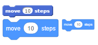
I know they are chunky, but there is a difference between to much chunky and not chunky at all x)
For example:
The original version is chunky, but the right version is not chunky at all ! There isn't any space between the blocks and their composants.
What I suggest is:
- Keep the style of Scratch 3.0 (Flat design), but using the Scratch 2.0 size for big screen (Computer/Tablet)
- Use the actual size for small devices (smartphone)
- Rework the colors, because actually they are too much bright.

- WolfCat67
-
 Scratcher

1000+ posts
The Ultimate Scratch 3.0 Block Style Protest Megathread
Is it normal to barely be able to tell the difference in colour between the events blocks and the control blocks in 3.0? I hope they make the events block brown again…
EDIT: The variables shown are also really similar as well.
EDIT: The variables shown are also really similar as well.
Last edited by WolfCat67 (March 15, 2017 19:30:20)


- miniepicness
-
 Scratcher

1000+ posts
The Ultimate Scratch 3.0 Block Style Protest Megathread
Is it normal to barely be able to tell the difference in colour between the events blocks and the control blocks in 3.0? I hope they make the events block brown again…They are literally both shades of yellow
This should definitely be a new suggestion topic (and I support it)
Last edited by miniepicness (March 15, 2017 19:00:29)
—————————–
-Click here to go to my profile —-Invited to scratch by AmazingProgrammer123
-Some Old Games: Racing Cats,Hungry Cat, Trapped, Mini-nation, ᴍAdvεnturᴇ﹗ and more!
- My“Any-Game”studio- All of My Projects/Games -My first project -my 200th project - handimation old shop:ACM-PICSHOP
click here for all my posts search the forums my first post :) my first thread/topic | click here
this signature is old⁽¹⁾
uV3b51yWZStHBjA8Lw7k
- stickfiregames
-
 Scratcher

1000+ posts
The Ultimate Scratch 3.0 Block Style Protest Megathread
Is it normal to barely be able to tell the difference in colour between the events blocks and the control blocks in 3.0? I hope they make the events block brown again…In 1.4 there was no events category, and all the current events blocks were in control. It does seem strange though that they would make them almost the same but not quite.
Naturally I support this since it was my posts that led you to make it, although I wouldn't call it a protest. I'll also add that many people on the Scratch 3 topic said there should be an option to choose between the two, and that the extra padding would help mobile users to pick up the blocks.


If you can read this, my signature cubeupload has been eaten by an evil kumquat!
or you just used Inspect Element, you hacker
;
- jromagnoli
-
 Scratcher

1000+ posts
The Ultimate Scratch 3.0 Block Style Protest Megathread
Maybe reduce a tad bit of padding for PC, but for mobile you want big blocks, they're easier to drag.
Last edited by jromagnoli (March 15, 2017 19:31:04)

ROAD TO 10,000 POSTS
████████████████████████████████████████████████████████████████░░░░░░░░░░░░░░░░░░░░░░░░░░░░░░░░░░░░ 64%
████████████████████████████████████████████████████████████████░░░░░░░░░░░░░░░░░░░░░░░░░░░░░░░░░░░░ 64%

If you can read this, my signature cubeupload has been eaten by an evil kumquat!
hehehe!Mytiptopsecrettopicidentifier!ahjdgggfhjadggahjsahasgdjfsdjfga
- NitroCipher
-
 Scratcher

500+ posts
The Ultimate Scratch 3.0 Block Style Protest Megathread
I know they are chunky, but there is a difference between to much chunky and not chunky at all x)
For example:
The original version is chunky, but the right version is not chunky at all ! There isn't any space between the blocks and their composants.
What I suggest is:
- Keep the style of Scratch 3.0 (Flat design), but using the Scratch 2.0 size for big screen (Computer/Tablet)
- Use the actual size for small devices (smartphone)
- Rework the colors, because actually they are too much bright.
I mostly agree with you.
In my opinion the blocks should look basically the same, just with a flat design (maybe with a small appropriately colored border).
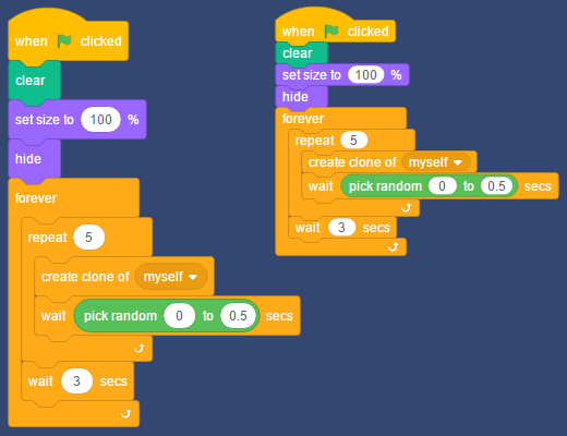
Mock-up below:
Last edited by NitroCipher (March 15, 2017 20:03:02)
I hope my post helped you in some way! Post count: 500+
Current project: [s3Blocks: scratchblocks rewritten for Scratch 3.0] ::#4b4a60 //https://scratch.mit.edu/discuss/topic/290031/ Basically done!This is my signature identifier “aWFtbml0cm9jaXBoZXI=”
- Austinato
-
Scratcher
1000+ posts
The Ultimate Scratch 3.0 Block Style Protest Megathread
Yes, and I think the slider idea is better than a large/small setting because we all have our own preferences, most likely in between both sides.I agree that the padding should be reduced a bit, but perhaps a little bit more than the one on the right of the picture.That seems like a better idea. People who can't see very well could make the blocks bigger, but people who can see better can make it easier to see the while program.
Or, there could be a setting screen where you adjust it from small to large padding.
Maybe reduce a tad bit of padding for PC, but for mobile you want big blocks, they're easier to drag.Good point.
- marscratcher
-
 Scratcher

100+ posts
The Ultimate Scratch 3.0 Block Style Protest Megathread
I agree with all that has been said above ^  I just looked at the github.
 I just looked at the github.
Marscratcher

- MathlyCat
-
 Scratcher

1000+ posts
The Ultimate Scratch 3.0 Block Style Protest Megathread
The padding is absolutely freaking HUGE
Think before you act.
Actions speek louder than words.
hi there fella
Actions speek louder than words.
hi there fella
- Sigton
-
 Scratcher

1000+ posts
The Ultimate Scratch 3.0 Block Style Protest Megathread
So much hate. I think they're not so bad, honestly the extra padding isn't really affecting me.
Sigton
Sigton
Last edited by Sigton (March 16, 2017 19:19:30)

- Blaze349
-
 Scratcher

1000+ posts
The Ultimate Scratch 3.0 Block Style Protest Megathread
Padding makes it clearer. It is so much better.
I love provoking people who care about unimportant things.
I love provoking people who care about unimportant things.
- Austinato
-
Scratcher
1000+ posts
The Ultimate Scratch 3.0 Block Style Protest Megathread
So much hate. I think they're not so bad, honestly the extra padding isn't really affecting me.I think it's more of personal preference, I kind of like the precision of smaller padding, and some others don't, so I think my suggestions pretty applicable:
Sigton
Or, there could be a setting screen where you adjust it from small to large padding.In clarification, that would be a slider from small to large.
- customhacker
-
 Scratcher

1000+ posts
The Ultimate Scratch 3.0 Block Style Protest Megathread
Gah! Support! If they look so big and gigantic, what is the point?
Also, what happened to the horizontal blocks implementation?
Also, what happened to the horizontal blocks implementation?
❖ Member of the Forum Helpers ❖ Experienced Wikian ❖
❖ Member of the Wiki Warehouse ❖ Owner of Customhacker's Royal Logo and Banner Shop ❖
❖ Member of Unloved Loves ❖ Former Member of the Services Planning Department ❖
❖ Member of the Wiki Warehouse ❖ Owner of Customhacker's Royal Logo and Banner Shop ❖
❖ Member of Unloved Loves ❖ Former Member of the Services Planning Department ❖
- Sigton
-
Scratcher
1000+ posts
The Ultimate Scratch 3.0 Block Style Protest Megathread
Its easier to be precise with bigger blocks…So much hate. I think they're not so bad, honestly the extra padding isn't really affecting me.I think it's more of personal preference, I kind of like the precision of smaller padding, and some others don't, so I think my suggestions pretty applicable:
SigtonOr, there could be a setting screen where you adjust it from small to large padding.In clarification, that would be a slider from small to large.
Sigton
- Austinato
-
Scratcher
1000+ posts
The Ultimate Scratch 3.0 Block Style Protest Megathread
Gah! Support! If they look so big and gigantic, what is the point?As for horizontal blocks implementation, I think they're still in the works but this has gained more popularity/controversy/public appeal.
Also, what happened to the horizontal blocks implementation?
- WolfCat67
-
Scratcher
1000+ posts
The Ultimate Scratch 3.0 Block Style Protest Megathread
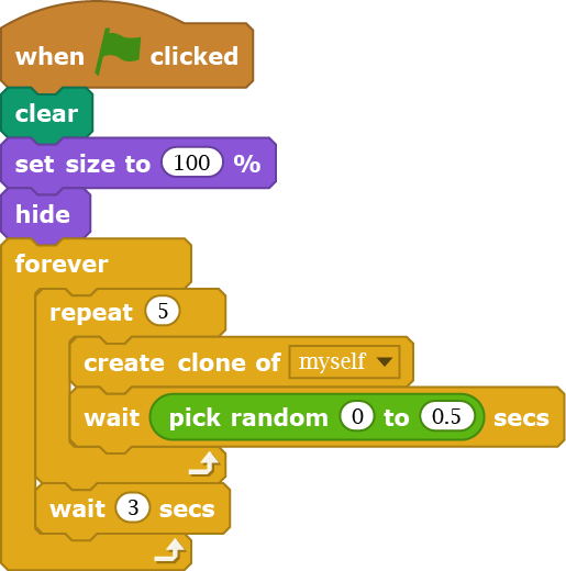
We need @NitroCipher's Scratch blocks; they're much better.I know they are chunky, but there is a difference between to much chunky and not chunky at all x)
For example:
- Snip Bad Scratch Blocks -
The original version is chunky, but the right version is not chunky at all ! There isn't any space between the blocks and their composants.
What I suggest is:
- Keep the style of Scratch 3.0 (Flat design), but using the Scratch 2.0 size for big screen (Computer/Tablet)
- Use the actual size for small devices (smartphone)
- Rework the colors, because actually they are too much bright.
I mostly agree with you.
In my opinion the blocks should look basically the same, just with a flat design (maybe with a small appropriately colored border).
Mock-up below:
- Snip Good Scratch Blocks -
- stickfiregames
-
Scratcher
1000+ posts
The Ultimate Scratch 3.0 Block Style Protest Megathread
Just for the record, in my mockup I was trying to go for the same size as Scratch 2.0. It turns out the blocks are a couple of pixels smaller because I was too lazy to measure them, but I would prefer the new blocks to be about the same size as in 2.0.
A lot of people are saying that the bigger blocks are easier to grab, and I know this would help on mobile, but that doesn't explain why the text has to be so small compared with the block itself.
I don't mind the brighter colours or flat style, but I agree with WolfCat67 that events and control are too similar. I also don't like the new pink custom blocks, but that's probably just because I'm not used to them.
Last edited by stickfiregames (March 16, 2017 22:05:36)
If you can read this, my signature cubeupload has been eaten by an evil kumquat!
or you just used Inspect Element, you hacker
;