Discuss Scratch

- Discussion Forums
- » Suggestions
- » Making Blocks Easier to Distinguish for Users with Limited Color Vision.
![[RSS Feed]](//cdn.scratch.mit.edu/scratchr2/static/__b3a0234be9d6cf9c4178ac9bbd21a1bc__//djangobb_forum/img/feed-icon-small.png "[RSS Feed]")
- 2357895
-
 Scratcher

62 posts
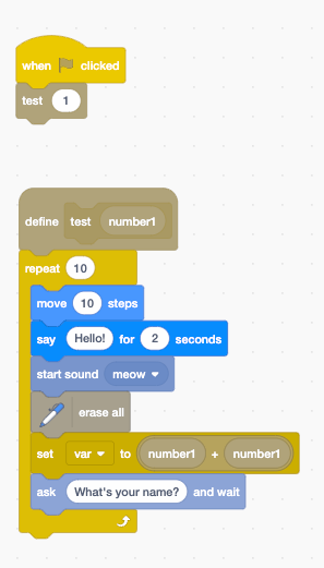
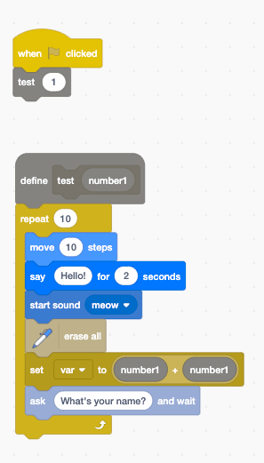
Making Blocks Easier to Distinguish for Users with Limited Color Vision.
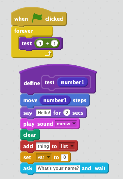
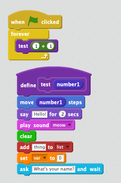
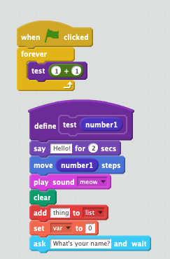
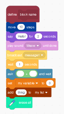
The user @i-stubbed-my-toe said on @griffpatch “To me, the Looks and Motion blocks look the exact same color, so I think Scratch needs accessibility options for people who have deuteranopia.”
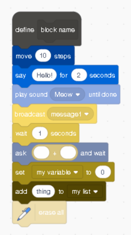
A lot of people find using the colors of blocks to distinguish what they are very helpful. But some users can't really tell the difference because they can't easily tell colors apart. An option to make blocks even more distinguishable or even to change colors to whatever you want for easier recognition would be very nice. I know a high contrast mode exists but that's more for making the text in blocks easier to read and doesn't help much in this case.
I think that the best option is allowing people to select their own colors, as a certain color scheme may work for some people but not for everyone. This will make scratch more accessible. We should have presets for different kinds of color blindness but a color selector would allow everyone to make a color scheme that works for them.
@SCLF-Xingshu also suggested in the replies to add images inside of the blocks like in paint blocks for easier recognition. This could be added along with color changes but shouldn't be added seperately because it takes more time to recognize images than colors.
If you have any suggestions of stuff I could add or remove tell me in the replies!
Last edited by 2357895 (March 10, 2025 13:06:47)
- _-duckies-_
-
 Scratcher

76 posts
Making Blocks Easier to Distinguish for Users with Limited Color Vision.
As a strong protan I support
Last edited by _-duckies-_ (Dec. 18, 2024 22:06:18)
- medians
-
 Scratcher

1000+ posts
Making Blocks Easier to Distinguish for Users with Limited Color Vision.
Honestly agree, since the high contrast blocks didn't seem to help with colorblindness (which was one of the intended effects of the update and the purple update) really, as I showed with screenshots (I also made custom modes for each type of colorblindness somewhere)
Edit: Actually I didn't finish achromatopsia but yea
Edit: Actually I didn't finish achromatopsia but yea
Last edited by medians (Dec. 19, 2024 00:29:36)
- medians
-
Scratcher
1000+ posts
Making Blocks Easier to Distinguish for Users with Limited Color Vision.
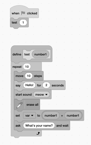
Note: Approximation, but yea
“Original” blocks (these are what the colors are called in the editor):
Deutan:
Protan:
Tritan
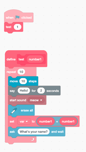
Achromatopsia:
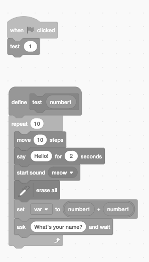
And then the high contrast blocks:
Deutan:
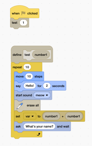
Protan:
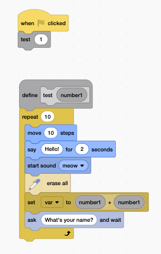
Tritan:
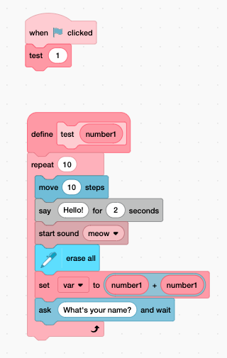
Achromatopsia:
“Original” blocks (these are what the colors are called in the editor):
Deutan:
Protan:
Tritan
Achromatopsia:
And then the high contrast blocks:
Deutan:
Protan:
Tritan:
Achromatopsia:
- medians
-
Scratcher
1000+ posts
Making Blocks Easier to Distinguish for Users with Limited Color Vision.
Mockups I made for this too
Protan colors (I made 2 for this one)
Tritan
Deutan
(these were also intended for more severe colorblindness)
Protan colors (I made 2 for this one)
Tritan
Deutan
(these were also intended for more severe colorblindness)
- 2357895
-
Scratcher
62 posts
Making Blocks Easier to Distinguish for Users with Limited Color Vision.
Note: Approximation, but yea
“Original” blocks (these are what the colors are called in the editor):
I can't see the images for some reason.
- medians
-
Scratcher
1000+ posts
Making Blocks Easier to Distinguish for Users with Limited Color Vision.
Are you on a school computer (try from home as the images are on cubeupload)Note: Approximation, but yea
“Original” blocks (these are what the colors are called in the editor):
I can't see the images for some reason.
- 2357895
-
Scratcher
62 posts
Making Blocks Easier to Distinguish for Users with Limited Color Vision.
Are you on a school computer (try from home as the images are on cubeupload)
No. For some reason I just can't see them.
- medians
-
Scratcher
1000+ posts
Making Blocks Easier to Distinguish for Users with Limited Color Vision.
I'm able to view them, does your device/computer have any restrictions?Are you on a school computer (try from home as the images are on cubeupload)
No. For some reason I just can't see them.
Last edited by medians (Dec. 19, 2024 15:18:29)
- 2357895
-
Scratcher
62 posts
Making Blocks Easier to Distinguish for Users with Limited Color Vision.
I don't really know lol. Wait a second. This is a school computer. That explains it. Not sure how I forgot that lol.I'm able to view them, does your device/computer have any restrictions?Are you on a school computer (try from home as the images are on cubeupload)
No. For some reason I just can't see them.
- _-duckies-_
-
Scratcher
76 posts
Making Blocks Easier to Distinguish for Users with Limited Color Vision.
bump (not my post but needs more attention)
- shrimplink
-
 Scratcher

4 posts
Making Blocks Easier to Distinguish for Users with Limited Color Vision.
I've created a single colour scheme that should work both for people with protanopia and deuteranopia (I used simulators to check contrasts):
Modified colour scheme (Normal Vision):
Protanopia (Simulated by Brettel 1997):
Deuteranopia (Simulated by Brettel 1997):
I'll work on schemes for tritanopia and achromatopsia later, they'll just be more difficult because they're very different from protanopia and deuteranopia.
Modified colour scheme (Normal Vision):
Protanopia (Simulated by Brettel 1997):
Deuteranopia (Simulated by Brettel 1997):
I'll work on schemes for tritanopia and achromatopsia later, they'll just be more difficult because they're very different from protanopia and deuteranopia.
Last edited by shrimplink (Dec. 20, 2024 12:53:04)
- _-duckies-_
-
Scratcher
76 posts
Making Blocks Easier to Distinguish for Users with Limited Color Vision.
bump
- medians
-
Scratcher
1000+ posts
Making Blocks Easier to Distinguish for Users with Limited Color Vision.
I've created a single colour scheme that should work both for people with protanopia and deuteranopia (I used simulators to check contrasts):I'm wondering if extension block text may be too hard to see for protanopia, or if Control and Operators could be confused there, and if More Blocks and Lists could be confused in deuteranopia.
Modified colour scheme (Normal Vision):
I'll work on schemes for tritanopia and achromatopsia later, they'll just be more difficult because they're very different from protanopia and deuteranopia.
Though I think these should be presets, with custom colors allowed too.
- medians
-
Scratcher
1000+ posts
Making Blocks Easier to Distinguish for Users with Limited Color Vision.
As a strong protan I supportCan you provide feedback on my block colors for protanopia?
- Sir_Potter_lV
-
 Scratcher

100+ posts
Making Blocks Easier to Distinguish for Users with Limited Color Vision.
My eyes are bad, so the Motion and Looks look very similar. Control and Variables looks similar to me, too. This is a good idea!
- _-duckies-_
-
Scratcher
76 posts
Making Blocks Easier to Distinguish for Users with Limited Color Vision.
Your color scheme is quite good, but the extensions and operators blocks are very similar… also motion, sound, and sensing.snipCan you provide feedback on my block colors for protanopia?
It's still better than the original scheme though
- i-stubbed-my-toe
-
 Scratcher

66 posts
Making Blocks Easier to Distinguish for Users with Limited Color Vision.
I can post a discussion forum now.
I like @shrimplink colors, they are very easy to tell apart for deuteranopia.
I like @shrimplink colors, they are very easy to tell apart for deuteranopia.
- SCLF-Xingshu
-
 Scratcher

100+ posts
Making Blocks Easier to Distinguish for Users with Limited Color Vision.
How about, instead of changing colors, do as the extensions blocks, adding a image describing the category of the block ?
- Queen_Bee_12
-
 Scratcher
500+ posts
Making Blocks Easier to Distinguish for Users with Limited Color Vision.
This seems like a great idea!
- Discussion Forums
- » Suggestions
-
» Making Blocks Easier to Distinguish for Users with Limited Color Vision.