Discuss Scratch

- starlightsparker
-
 Scratcher

1000+ posts
Home Page Redesign
Home Page Redesign - a Concept
Contents—————————————
- About
- What’s the Redesign?
AboutThis is a suggestion for a homepage redesign. This isn’t really a suggestion for 4.0, as pages can have fresh new redesigns while still remaining 3.x
What’s the Redesign?Alright, let’s get started then!
This is the current homepage:
And let’s see what can be changed!
First of all, I think the thumbnails can be changed a bit. What if the edges of the thumbnails were rounded? I think they kind of are in studios, and why not add that to homepage too?
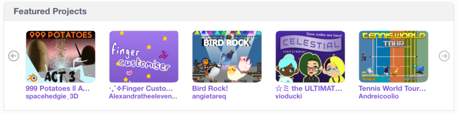
I think that looks pretty nice! And the same can be done with studios as well.
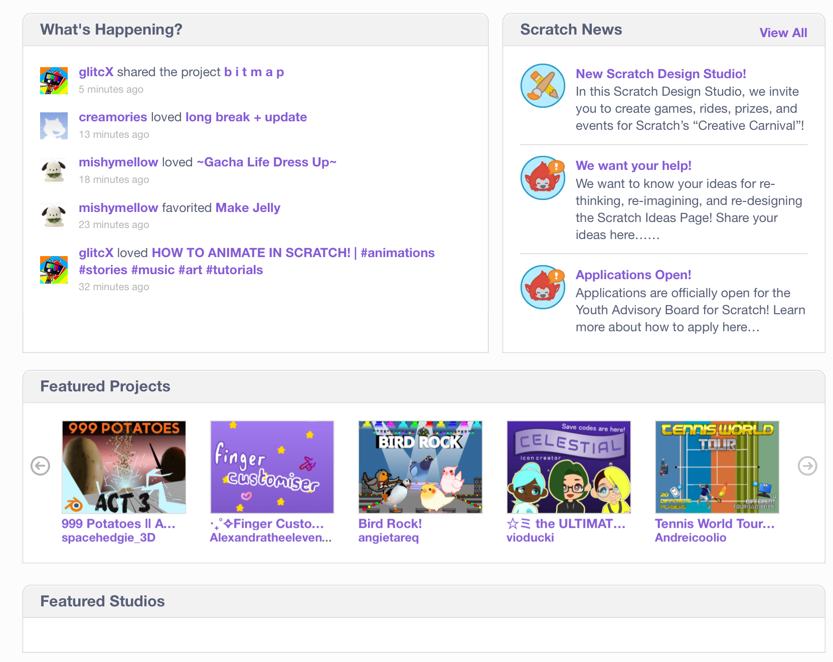
And maybe some changes can be made to the top area too:
As you can see, I replaced the pfps on “What’s Happening?” with Icons, and I changed the icon circle thingys on “Scratch News”. The grey line thing indicates that you can scroll, so Scratch News should be scrollable, so is the new section I added called “Recently Viewed”, that section will have your recently viewed projects. I also made the text on the headers black. (what’s happening?, scratch News, recently viewed). And if you look closely, the bottom of the boxes that have the things are a bit rounded.
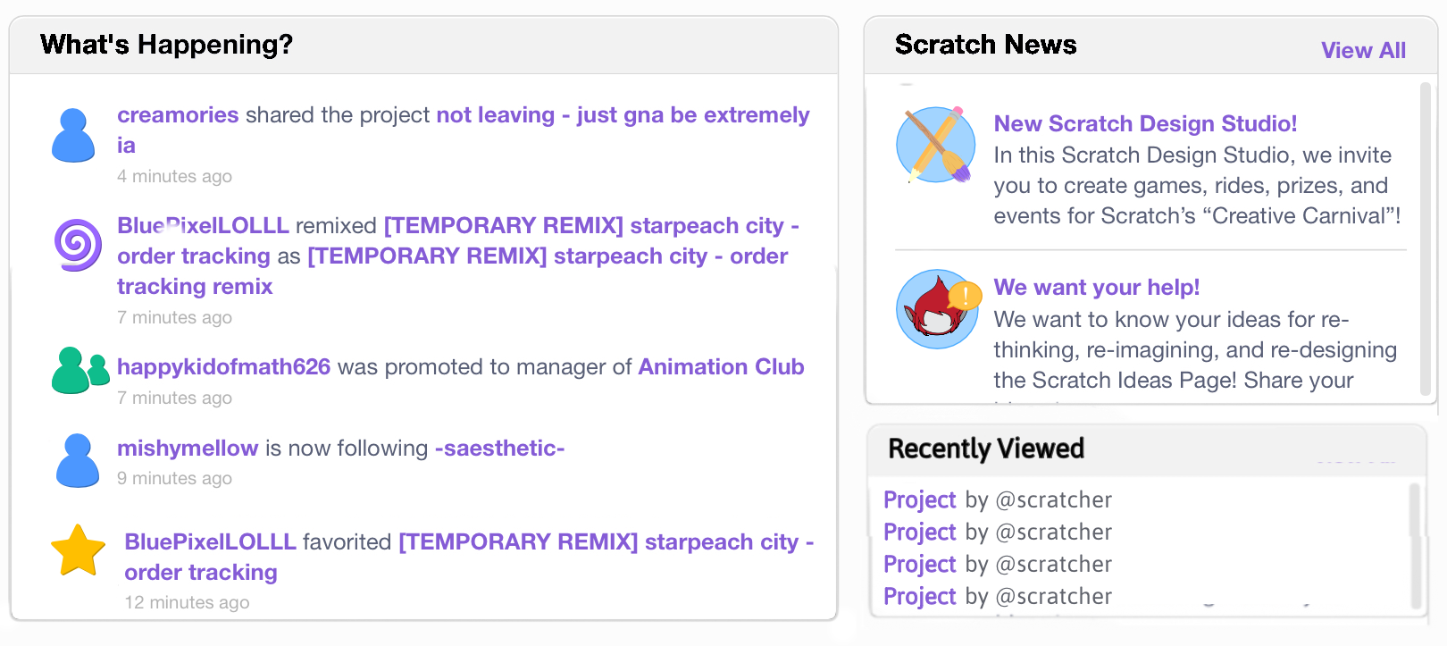
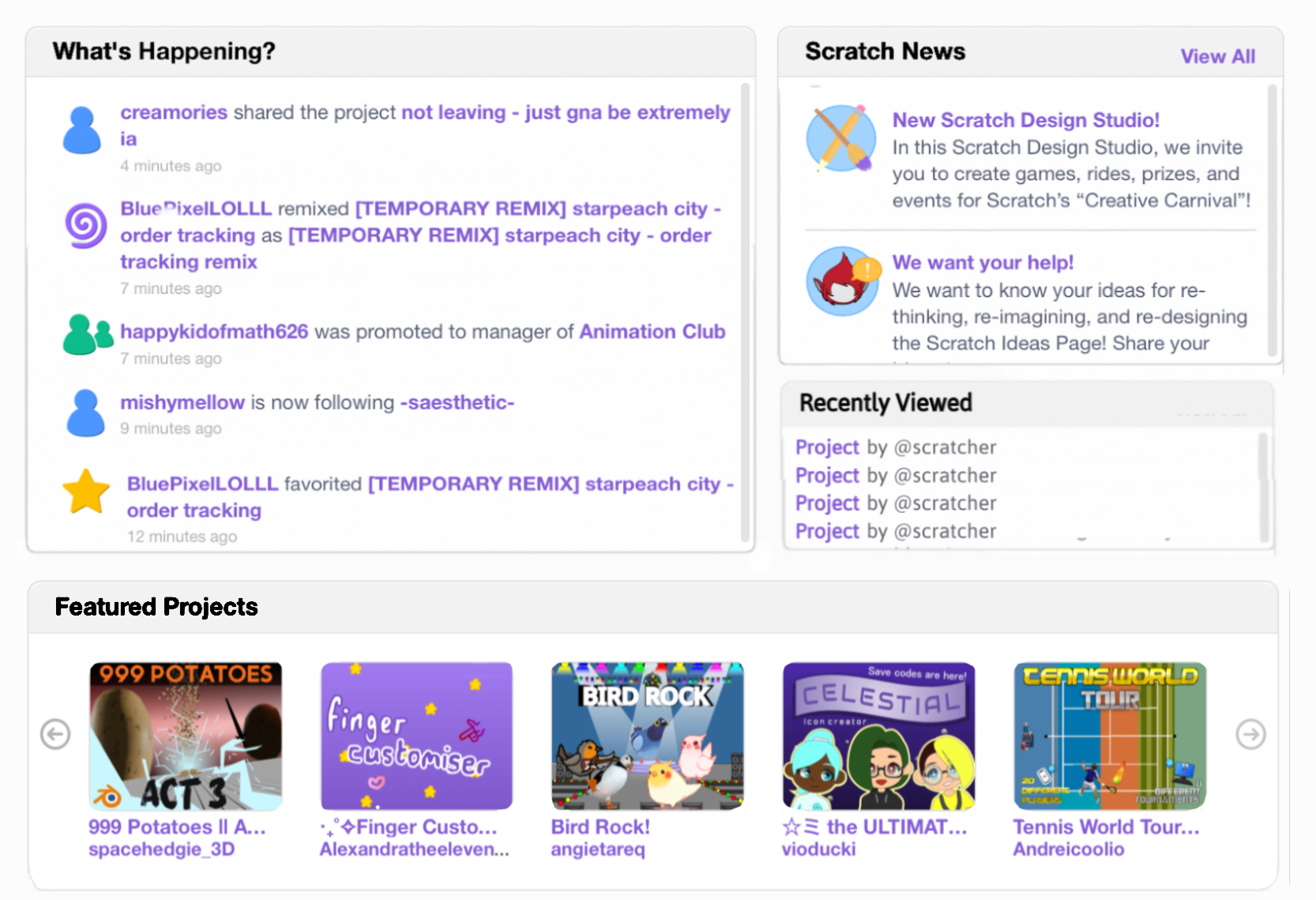
Now here’s the final result! In this one, the top section is a bit different then the one I showed before

QnAThese could be questions I made up, or questions asked by people!
Why?
Well, why not? I think this’ll be a good idea and some people might like it! Plus, this even adds some new useful stuff, like the recently viewed, and scrolling in scratch News and what’s happening!
-
Feel free to ask more questions!
Last edited by starlightsparker (July 20, 2024 17:08:44)
- TheCreatorOfUnTV
-
 Scratcher

1000+ posts
Home Page Redesign
Suggestions should be about why it should be added, not trying to keep everyone else from saying why not.
- starlightsparker
-
Scratcher
1000+ posts
Home Page Redesign
Suggestions should be about why it should be added, not trying to keep everyone else from saying why not.I did say
“I think this’ll be a good idea and some people might like it! Plus, this even adds some new useful stuff, like the recently viewed, and scrolling in scratch News and what’s happening!”
Is that not a reason?
- ThisIsTemp1
-
 Scratcher

1000+ posts
Home Page Redesign
This looks good, but I do not like that the PFPs are gone, because they help you easily recognize who did what, and pretty quickly as well.
- starlightsparker
-
Scratcher
1000+ posts
Home Page Redesign
This looks good, but I do not like that the PFPs are gone, because they help you easily recognize who did what, and pretty quickly as well.What if there was the profile picture, and on top of the pfp there was the icon in low opacity?
- ThisIsTemp1
-
Scratcher
1000+ posts
Home Page Redesign
This looks good, but I do not like that the PFPs are gone, because they help you easily recognize who did what, and pretty quickly as well.What if there was the profile picture, and on top of the pfp there was the icon in low opacity?
That would be fine.
- SidewaysCoder
-
 Scratcher

500+ posts
Home Page Redesign
Interesting concept but I would like to point out 3 things that have not been mentioned before:
1. I don't like the “recently viewed projects” pane. Some people don't like having their every move on Scratch logged, especially when they don't want to see it right when they open up the Scratch website. Now, I know that Scratch already logs your recently viewed projects (you can actually see this when you try adding a project into a studio). But, I certainly don't like it when you have to see it every time you go on Scratch. There needs to be a way to make this optional.
2. The header on the boxes are not totally black (#000000) in the actual website because it would be too harsh to view such dark text on a light background.
3. The rounding of the border on the bottom of the boxes kinda shifts away from Scratch's design of boxes in the rest of the website, which may appear as inconsistent.
Anyways, those are my two cents on this concept. I'm not a “graphic design god” or anything like that, but I'm just suggesting some changes here. Otherwise, I like the idea

- PeteyTheParrot
-
 Scratcher

100+ posts
Home Page Redesign
I think the icons are a little too big and distracting, and the bright colors could hurt peoples eyes, BUT it’s not a bad redesign and I like it quite a bit! The recently viewed section is an interesting idea too
- ilovestories
-
 Scratcher

1000+ posts
Home Page Redesign
I prefer the old Scratch News icons. They look much more professional.
- starlightsparker
-
Scratcher
1000+ posts
Home Page Redesign
Interesting concept but I would like to point out 3 things that have not been mentioned before:1. But.. what? They’re just projects? But sure, there CAN be an option to disable it maybe but.. why?
1. I don't like the “recently viewed projects” pane. Some people don't like having their every move on Scratch logged, especially when they don't want to see it right when they open up the Scratch website. Now, I know that Scratch already logs your recently viewed projects (you can actually see this when you try adding a project into a studio). But, I certainly don't like it when you have to see it every time you go on Scratch. There needs to be a way to make this optional.
2. The header on the boxes are not totally black (#000000) in the actual website because it would be too harsh to view such dark text on a light background.
3. The rounding of the border on the bottom of the boxes kinda shifts away from Scratch's design of boxes in the rest of the website, which may appear as inconsistent.
2. Right, it could be changed if ST wants.
3. They could round the other ones too. Or does rounded look bad? /gen
Last edited by starlightsparker (July 19, 2024 22:25:41)
- starlightsparker
-
Scratcher
1000+ posts
Home Page Redesign
I think the icons are a little too big and distracting, and the bright colors could hurt peoples eyes, BUT it’s not a bad redesign and I like it quite a bit! The recently viewed section is an interesting idea tooWhich icons?
I prefer the old Scratch News icons. They look much more professional.Alright, but remember if this was implemented, ST can certainty pick and choose what parts of the redesign they want to leave out so if they don’t like the icons it doesn’t have to be added ofc
- SidewaysCoder
-
Scratcher
500+ posts
Home Page Redesign
1. But.. what? They’re just projects? But sure, there CAN be an option to disable it maybe but.. why?
2. Right, it could be changed if ST wants.
3. They could round the other ones too. Or does rounded look bad? /gen
1 is kinda my opinion, (I would certainly not look at bad stuff on Scratch), but in my opinion, I don't like having my entire browsing history on Scratch right in my face every single time I go on Scratch, and also for privacy reasons (it kinda feels… safer?), but that's just a nitpick of mine. Maybe some people don't care, and that's okay
3… rounded doesn't look bad imo but it's what the ST has been sticking to for years, I wouldn't want to see it go away
 , but again, personal thing
Last edited by SidewaysCoder (July 19, 2024 22:31:36)
- Za-Chary
-
 Scratcher

1000+ posts
Home Page Redesign
1. I don't like the “recently viewed projects” pane. Some people don't like having their every move on Scratch logged, especially when they don't want to see it right when they open up the Scratch website.Agreed. Note that “notification for viewing projects” or “ability to see who viewed your project” (or something like that) is rejected — so I don't imagine that the Scratch Team would be willing to implement this particular feature.
Actually, I think I misunderstood the suggestion. Is this just to show you the projects that you most recently viewed?
Last edited by Za-Chary (July 20, 2024 03:30:32)
- starlightsparker
-
Scratcher
1000+ posts
Home Page Redesign
Yeah it doesn’t announce ur recently viewed stuff to the world, it’s just for you to see.1. I don't like the “recently viewed projects” pane. Some people don't like having their every move on Scratch logged, especially when they don't want to see it right when they open up the Scratch website.Agreed. Note that “notification for viewing projects” or “ability to see who viewed your project” (or something like that) is rejected — so I don't imagine that the Scratch Team would be willing to implement this particular feature.
Actually, I think I misunderstood the suggestion. Is this just to show you the projects that you most recently viewed?
And maybe it can be toggled off In account settings, I think that could work. If it was toggled off, News can fill it the empty space of recently viewed.
- hydrofungus
-
 Scratcher

1000+ posts
Home Page Redesign
I think it’s neat and all, but i’m kinda against it, design-wise
First they look too round for my liking
1, the titles contrasts too much with the title background, if it’s less bolded and color reverted to the original title background would be easier on the eyes
2, the icons that replace pfps in the what’s happening box looks too big and off-center. It kinda gives a crowded look to the box
3, the current icons of the scratch news pages looks more 3.0-esque than the ones you made
4, finally, the recently viewed box. Would it show the projects you recently viewed, or would it show projects that you recently got view from? If it’s the latter then it’s rejected, but if it’s the former, then why?
Another thing, i don’t think “why not” and “i like it and hopefully people will” are good reasons to add something. You haven’t said how the recently viewed can be useful. The only perk i think may be useful is the scrollbar.
So in my opinion, the current layout is still better
I find it funny how “redesign concepts” are just excuses to make suggestion lists that sometimes are duplicates
- Bestdragon234
-
 Scratcher

100+ posts
Home Page Redesign
I think it’s neat and all, but i’m kinda against it, design-wisein my opinion they are very good
First they look too round for my liking
1, the titles contrasts too much with the title background, if it’s less bolded and color reverted to the original title background would be easier on the eyes
2, the icons that replace pfps in the what’s happening box looks too big and off-center. It kinda gives a crowded look to the box
3, the current icons of the scratch news pages looks more 3.0-esque than the ones you made
4, finally, the recently viewed box. Would it show the projects you recently viewed, or would it show projects that you recently got view from? If it’s the latter then it’s rejected, but if it’s the former, then why?
Another thing, i don’t think “why not” and “i like it and hopefully people will” are good reasons to add something. You haven’t said how the recently viewed can be useful. The only perk i think may be useful is the scrollbar.
So in my opinion, the current layout is still better
I find it funny how “redesign concepts” are just excuses to make suggestion lists that sometimes are duplicates
- medians
-
 Scratcher

1000+ posts
Home Page Redesign
1. But.. what? They’re just projects? But sure, there CAN be an option to disable it maybe but.. why?Honestly, I don't like rounded with the “modern design” at all, but according to opinions on Windows 11 and newer Mac OS versions, apparently I'm pretty much alone on that.
2. Right, it could be changed if ST wants.
3. They could round the other ones too. Or does rounded look bad? /gen
Also, I can't really look at the black, that would hurt my eyes (I think instead there should just be a blue/purple switch or something, whatever color, if you're doing this for people with blue-yellow or complete colorblindness).
Last edited by medians (July 20, 2024 13:32:10)
- ajskateboarder
-
 Scratcher

1000+ posts
Home Page Redesign
I honestly preferred being able to see profile pictures in the “What's Happening?” section, but having icons to show what happened is also nice, so I suggest making it so the “action icon” (remixing icon, promotion icon, etc) goes at the bottom right of the user's profile picture. The share icon could be made an arrow going out of a box instead of a person silhouette. The header above each box could also be made a bit lighter

- starlightsparker
-
Scratcher
1000+ posts
Home Page Redesign
I think it’s neat and all, but i’m kinda against it, design-wise1. yeah the black might be too bold, I could change that.
First they look too round for my liking
1, the titles contrasts too much with the title background, if it’s less bolded and color reverted to the original title background would be easier on the eyes
2, the icons that replace pfps in the what’s happening box looks too big and off-center. It kinda gives a crowded look to the box
3, the current icons of the scratch news pages looks more 3.0-esque than the ones you made
4, finally, the recently viewed box. Would it show the projects you recently viewed, or would it show projects that you recently got view from? If it’s the latter then it’s rejected, but if it’s the former, then why?
Another thing, i don’t think “why not” and “i like it and hopefully people will” are good reasons to add something. You haven’t said how the recently viewed can be useful. The only perk i think may be useful is the scrollbar.
So in my opinion, the current layout is still better
I find it funny how “redesign concepts” are just excuses to make suggestion lists that sometimes are duplicates
2. Isn’t that my editing? If scratch did it, they could obviously place those better.
3. alright
4. Projects you recently viewed. Why? Because people might wanna find a project they didn’t save that they viewed earlier, or maybe they wanna retry a game that they also didn’t save.
5. should I take that as an insult /hj
Last edited by starlightsparker (July 20, 2024 16:47:34)
- Elijah999999
-
 Scratcher

1000+ posts
Home Page Redesign
One thing I prefer about the original is being able to see the profile pictures in the “what's happening” pane. It seems kind of confusing with the icons instead.