Discuss Scratch

- Discussion Forums
- » Suggestions
- » As a colorblind person, I can't see links
![[RSS Feed]](//cdn.scratch.mit.edu/scratchr2/static/__5b3e40ec58a840b41702360e9891321b__//djangobb_forum/img/feed-icon-small.png "[RSS Feed]")
- CT-OfficialScratcher
-
 Scratcher

500+ posts
As a colorblind person, I can't see links
I… I agree, the above color isn’t good for light sensitivity. TBH medians color is bestHow does this color scheme look for links?I actually think that it looks more like a link now. I don't think it looks bad, either.
Also, how would #1a0dab look? Its Google's link color? Or #3366cc, its Wikipedia's link color. Or #2479e9, which is Inspect Element's blue? Or #1b78d0, another link color? Also, how about #0000cd, which is called “medium blue”? Or #4b61d1, which is known as “Savoy blue”? There's also #5865f2, which is known as “blurple”? (Probably not blurple, because Discord uses it.)

Last edited by CT-OfficialScratcher (July 30, 2023 10:39:13)
- gdfsgdfsgdfg
-
 Scratcher

1000+ posts
As a colorblind person, I can't see links
There is the only free image hosting and easy option:
cubeupload
(yes I know it might be said before but I don’t want to search everything)
cubeupload
(yes I know it might be said before but I don’t want to search everything)
- k7e
-
 Scratcher

1000+ posts
As a colorblind person, I can't see links
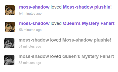
You can use this image in the OP:I think now is a good time to bump this post.[img]https://u.cubeupload.com/k7e/1E65B8E44F734D14A702.png[/img]
- cheddargirl
-
 Scratch Team

1000+ posts
As a colorblind person, I can't see links
Also, how would #1a0dab look? Its Google's link color? Or #3366cc, its Wikipedia's link color. Or #2479e9, which is Inspect Element's blue? Or #1b78d0, another link color? Also, how about #0000cd, which is called “medium blue”? Or #4b61d1, which is known as “Savoy blue”? There's also #5865f2, which is known as “blurple”? (Probably not blurple, because Discord uses it.)I had to step away from this post for hours because I took off my glasses to see how bad it was (which in turn was a bad idea).
The only one that works for me is #1a0dab, but just barely (the rest being proposed are much too light and #0000cd is too saturated).
An easier color on my eyes would be #2c106a if I had a choice in the matter since it's a darker shade of purple-leaning indigo.
- CT-OfficialScratcher
-
Scratcher
500+ posts
As a colorblind person, I can't see links
What. About. Medians. Color.Also, how would #1a0dab look? Its Google's link color? Or #3366cc, its Wikipedia's link color. Or #2479e9, which is Inspect Element's blue? Or #1b78d0, another link color? Also, how about #0000cd, which is called “medium blue”? Or #4b61d1, which is known as “Savoy blue”? There's also #5865f2, which is known as “blurple”? (Probably not blurple, because Discord uses it.)I had to step away from this post for hours because I took off my glasses to see how bad it was (which in turn was a bad idea).
The only one that works for me is #1a0dab, but just barely (the rest being proposed are much too light and #0000cd is too saturated).
An easier color on my eyes would be #2c106a if I had a choice in the matter since it's a darker shade of purple-leaning indigo.
- PaperMarioFan2022
-
 Scratcher

1000+ posts
As a colorblind person, I can't see links
What. About. Medians. Color.Like Za-Chary said before..
“Green is a color that diverts attention”.
Last edited by PaperMarioFan2022 (July 30, 2023 16:31:19)
- cheddargirl
-
Scratch Team
1000+ posts
As a colorblind person, I can't see links
The link color is not great for me, and I suspect it would also be not great for those who don't have access to vision healthcare to get glasses that would remove the blue glare.What. About. Medians. Color.Also, how would #1a0dab look? Its Google's link color? Or #3366cc, its Wikipedia's link color. Or #2479e9, which is Inspect Element's blue? Or #1b78d0, another link color? Also, how about #0000cd, which is called “medium blue”? Or #4b61d1, which is known as “Savoy blue”? There's also #5865f2, which is known as “blurple”? (Probably not blurple, because Discord uses it.)I had to step away from this post for hours because I took off my glasses to see how bad it was (which in turn was a bad idea).
The only one that works for me is #1a0dab, but just barely (the rest being proposed are much too light and #0000cd is too saturated).
An easier color on my eyes would be #2c106a if I had a choice in the matter since it's a darker shade of purple-leaning indigo.
- Za-Chary
-
 Scratcher

1000+ posts
As a colorblind person, I can't see links
Like Za-Chary said before..The quote is probably “diverts,” not “diverse” — as in, the green diverts attention away from the links in question — but it's taken out of context here anyway. That was probably said on a thread asking to make links to stickies a separate color from links to all other forum posts — so the reasoning isn't relevant here — and the proposed green in question was a very neon green, which wouldn't be suitable for the high-contrast requirements here anyway.“Green is a color that diverse attention”.
- PaperMarioFan2022
-
Scratcher
1000+ posts
As a colorblind person, I can't see links
The quote is probably “diverts,” not “diverse” — as in, the green diverts attention away from the links in question — but it's taken out of context here anyway. That was probably said on a thread asking to make links to stickies a separate color from links to all other forum posts — so the reasoning isn't relevant here — and the proposed green in question was a very neon green, which wouldn't be suitable for the high-contrast requirements here anyway.Fair enough. I knew I worded it the wrong way. Still, any green isn’t very good for the eyes or the people who are visually impaired or colorblind.
- CT-OfficialScratcher
-
Scratcher
500+ posts
As a colorblind person, I can't see links
How do you knowThe quote is probably “diverts,” not “diverse” — as in, the green diverts attention away from the links in question — but it's taken out of context here anyway. That was probably said on a thread asking to make links to stickies a separate color from links to all other forum posts — so the reasoning isn't relevant here — and the proposed green in question was a very neon green, which wouldn't be suitable for the high-contrast requirements here anyway.Fair enough. I knew I worded it the wrong way. Still, any green isn’t very good for the eyes or the people who are visually impaired or colorblind.
- PaperMarioFan2022
-
Scratcher
1000+ posts
As a colorblind person, I can't see links
I took a colorblind test. Not everyone can see green, so it’s not the best option of color.How do you knowThe quote is probably “diverts,” not “diverse” — as in, the green diverts attention away from the links in question — but it's taken out of context here anyway. That was probably said on a thread asking to make links to stickies a separate color from links to all other forum posts — so the reasoning isn't relevant here — and the proposed green in question was a very neon green, which wouldn't be suitable for the high-contrast requirements here anyway.Fair enough. I knew I worded it the wrong way. Still, any green isn’t very good for the eyes or the people who are visually impaired or colorblind.
- CT-OfficialScratcher
-
Scratcher
500+ posts
As a colorblind person, I can't see links
Well how does it look like grey?I took a colorblind test. Not everyone can see green, so it’s not the best option of color.How do you knowThe quote is probably “diverts,” not “diverse” — as in, the green diverts attention away from the links in question — but it's taken out of context here anyway. That was probably said on a thread asking to make links to stickies a separate color from links to all other forum posts — so the reasoning isn't relevant here — and the proposed green in question was a very neon green, which wouldn't be suitable for the high-contrast requirements here anyway.Fair enough. I knew I worded it the wrong way. Still, any green isn’t very good for the eyes or the people who are visually impaired or colorblind.
- medians
-
 Scratcher

1000+ posts
As a colorblind person, I can't see links
if ur talking about that messages green i have you can ignore that lol or use some modified ver or somethingI took a colorblind test. Not everyone can see green, so it’s not the best option of color.How do you knowThe quote is probably “diverts,” not “diverse” — as in, the green diverts attention away from the links in question — but it's taken out of context here anyway. That was probably said on a thread asking to make links to stickies a separate color from links to all other forum posts — so the reasoning isn't relevant here — and the proposed green in question was a very neon green, which wouldn't be suitable for the high-contrast requirements here anyway.Fair enough. I knew I worded it the wrong way. Still, any green isn’t very good for the eyes or the people who are visually impaired or colorblind.
- CT-OfficialScratcher
-
Scratcher
500+ posts
As a colorblind person, I can't see links
Well, I guess 1a0dab is an option then. How is the medians color without your glasses?Also, how would #1a0dab look? Its Google's link color? Or #3366cc, its Wikipedia's link color. Or #2479e9, which is Inspect Element's blue? Or #1b78d0, another link color? Also, how about #0000cd, which is called “medium blue”? Or #4b61d1, which is known as “Savoy blue”? There's also #5865f2, which is known as “blurple”? (Probably not blurple, because Discord uses it.)I had to step away from this post for hours because I took off my glasses to see how bad it was (which in turn was a bad idea).
The only one that works for me is #1a0dab, but just barely (the rest being proposed are much too light and #0000cd is too saturated).
An easier color on my eyes would be #2c106a if I had a choice in the matter since it's a darker shade of purple-leaning indigo.
- CT-OfficialScratcher
-
Scratcher
500+ posts
As a colorblind person, I can't see links
Guys… orange is too off-brand.
- cheddargirl
-
Scratch Team
1000+ posts
As a colorblind person, I can't see links
Also bad (due to super-saturation).Well, I guess 1a0dab is an option then. How is the medians color without your glasses?Also, how would #1a0dab look? Its Google's link color? Or #3366cc, its Wikipedia's link color. Or #2479e9, which is Inspect Element's blue? Or #1b78d0, another link color? Also, how about #0000cd, which is called “medium blue”? Or #4b61d1, which is known as “Savoy blue”? There's also #5865f2, which is known as “blurple”? (Probably not blurple, because Discord uses it.)I had to step away from this post for hours because I took off my glasses to see how bad it was (which in turn was a bad idea).
The only one that works for me is #1a0dab, but just barely (the rest being proposed are much too light and #0000cd is too saturated).
An easier color on my eyes would be #2c106a if I had a choice in the matter since it's a darker shade of purple-leaning indigo.
- CT-OfficialScratcher
-
Scratcher
500+ posts
As a colorblind person, I can't see links
I'll try to make it less saturated.Also bad (due to super-saturation).Well, I guess 1a0dab is an option then. How is the medians color without your glasses?Also, how would #1a0dab look? Its Google's link color? Or #3366cc, its Wikipedia's link color. Or #2479e9, which is Inspect Element's blue? Or #1b78d0, another link color? Also, how about #0000cd, which is called “medium blue”? Or #4b61d1, which is known as “Savoy blue”? There's also #5865f2, which is known as “blurple”? (Probably not blurple, because Discord uses it.)I had to step away from this post for hours because I took off my glasses to see how bad it was (which in turn was a bad idea).
The only one that works for me is #1a0dab, but just barely (the rest being proposed are much too light and #0000cd is too saturated).
An easier color on my eyes would be #2c106a if I had a choice in the matter since it's a darker shade of purple-leaning indigo.
- cheddargirl
-
Scratch Team
1000+ posts
As a colorblind person, I can't see links
If would also need to be significantly dark in my case. Nothing that trends towards making the color lighter (ie no using blues that are commonly seen in graph paper).I'll try to make it less saturated.Also bad (due to super-saturation).Well, I guess 1a0dab is an option then. How is the medians color without your glasses?Also, how would #1a0dab look? Its Google's link color? Or #3366cc, its Wikipedia's link color. Or #2479e9, which is Inspect Element's blue? Or #1b78d0, another link color? Also, how about #0000cd, which is called “medium blue”? Or #4b61d1, which is known as “Savoy blue”? There's also #5865f2, which is known as “blurple”? (Probably not blurple, because Discord uses it.)I had to step away from this post for hours because I took off my glasses to see how bad it was (which in turn was a bad idea).
The only one that works for me is #1a0dab, but just barely (the rest being proposed are much too light and #0000cd is too saturated).
An easier color on my eyes would be #2c106a if I had a choice in the matter since it's a darker shade of purple-leaning indigo.
- Dogs-are-amazing1
-
 Scratcher

500+ posts
As a colorblind person, I can't see links
So something not too saturated, too light, or too dark?If would also need to be significantly dark in my case. Nothing that trends towards making the color lighter (ie no using blues that are commonly seen in graph paper).I'll try to make it less saturated.Also bad (due to super-saturation).Well, I guess 1a0dab is an option then. How is the medians color without your glasses?Also, how would #1a0dab look? Its Google's link color? Or #3366cc, its Wikipedia's link color. Or #2479e9, which is Inspect Element's blue? Or #1b78d0, another link color? Also, how about #0000cd, which is called “medium blue”? Or #4b61d1, which is known as “Savoy blue”? There's also #5865f2, which is known as “blurple”? (Probably not blurple, because Discord uses it.)I had to step away from this post for hours because I took off my glasses to see how bad it was (which in turn was a bad idea).
The only one that works for me is #1a0dab, but just barely (the rest being proposed are much too light and #0000cd is too saturated).
An easier color on my eyes would be #2c106a if I had a choice in the matter since it's a darker shade of purple-leaning indigo.
Last edited by Dogs-are-amazing1 (July 31, 2023 18:22:13)
- cheddargirl
-
Scratch Team
1000+ posts
As a colorblind person, I can't see links
For people like me that need reduced blue light and glare, the closer it is on the scale to off-black indigo grey for text (against a white background), the better because it shows up better than having to struggle with focusing on blue text against a screen emitting blue light.So something not too saturated, too light, or too dark?If would also need to be significantly dark in my case. Nothing that trends towards making the color lighter (ie no using blues that are commonly seen in graph paper).I'll try to make it less saturated.Also bad (due to super-saturation).Well, I guess 1a0dab is an option then. How is the medians color without your glasses?Also, how would #1a0dab look? Its Google's link color? Or #3366cc, its Wikipedia's link color. Or #2479e9, which is Inspect Element's blue? Or #1b78d0, another link color? Also, how about #0000cd, which is called “medium blue”? Or #4b61d1, which is known as “Savoy blue”? There's also #5865f2, which is known as “blurple”? (Probably not blurple, because Discord uses it.)I had to step away from this post for hours because I took off my glasses to see how bad it was (which in turn was a bad idea).
The only one that works for me is #1a0dab, but just barely (the rest being proposed are much too light and #0000cd is too saturated).
An easier color on my eyes would be #2c106a if I had a choice in the matter since it's a darker shade of purple-leaning indigo.