Discuss Scratch

- Discussion Forums
- » Suggestions
- » [PLEASE DO NOT PROTEST THE PURPLE] An option in account settings to change the site's theme and navigation bar colour
![[RSS Feed]](//cdn.scratch.mit.edu/scratchr2/static/__35b9adb704d6d778f00a893a1b104339__//djangobb_forum/img/feed-icon-small.png "[RSS Feed]")
- colinmacc
-
 Scratcher

1000+ posts
[PLEASE DO NOT PROTEST THE PURPLE] An option in account settings to change the site's theme and navigation bar colour
#TeamBlue, it's just WAY too iconic to leave.I guess I'll link it. There is a reason why the blue interface is gone: https://en.scratch-wiki.info/wiki/User:Jvvg/Essays/Accessibility_preempts_aesthetics
Oh yeah, and other colours would be fine too.
I get that it's iconic and all, but personally I've seen the interface for 1 year and 8 months (Again, I'm an alt. My main is in plain sight in my signature as well.) and I'm personally not really caring about this change.
I also support this suggestion, simply just I cannot understand why people are mad on the change. Iconic, sure. But there's still alot to consider.
They get sued or they try their best to avoid that situation, PERIOD.
No if-s, no else-s.
I'm just pointing this out as people really just get mad without seeing why they did it in the first place.
It seems that blue is fine for other huge platforms, such as facebook, twitter, outlook, etc.
I don't understand why you think blue is not OK for Scratch. Are they all going to get sued too?
The best solution obviously is to make it optional.
- Basilikos
-
 Scratcher

1000+ posts
[PLEASE DO NOT PROTEST THE PURPLE] An option in account settings to change the site's theme and navigation bar colour
Pretty sure all they need to do is to put in some java which changes the CSSYou did not just say that
- rdococ
-
 Scratcher

1000+ posts
[PLEASE DO NOT PROTEST THE PURPLE] An option in account settings to change the site's theme and navigation bar colour
I'm not sure this is the best thread to discuss the new colour scheme, because it's a suggestion for a setting to choose between multiple colour schemes. Most Scratchers are still posting new suggestions asking to change the scheme back to blue, indicating that they see the suggestion as distinct, and it's also a much simpler change.
Last edited by rdococ (June 29, 2023 09:22:14)
- Zydrolic
-
 Scratcher

1000+ posts
[PLEASE DO NOT PROTEST THE PURPLE] An option in account settings to change the site's theme and navigation bar colour
Not saying blue is not alright for Scratch. I infact didn't say it in my sentences. I have zero problem with it, and never said it isn't alright for Scratch. Simply pointing the fact that either they get sued without the attempt of staying on a small brick considering their limited resources. I myself was abit mad when I first heard the change, but then realized jvvg's essay and just decided to go with it, and I still am.#TeamBlue, it's just WAY too iconic to leave.I guess I'll link it. There is a reason why the blue interface is gone: https://en.scratch-wiki.info/wiki/User:Jvvg/Essays/Accessibility_preempts_aesthetics
Oh yeah, and other colours would be fine too.
I get that it's iconic and all, but personally I've seen the interface for 1 year and 8 months (Again, I'm an alt. My main is in plain sight in my signature as well.) and I'm personally not really caring about this change.
I also support this suggestion, simply just I cannot understand why people are mad on the change. Iconic, sure. But there's still alot to consider.
They get sued or they try their best to avoid that situation, PERIOD.
No if-s, no else-s.
I'm just pointing this out as people really just get mad without seeing why they did it in the first place.
It seems that blue is fine for other huge platforms, such as facebook, twitter, outlook, etc.
I don't understand why you think blue is not OK for Scratch. Are they all going to get sued too?
The best solution obviously is to make it optional.
Difference with those platforms is that they aren't for education, Scratch is. Which is what this law mentions if you look at it's wikipedia page.
I also never mentioned I liked the purple more.
People are adding a purple shade over their profiles for the memes.
Last edited by Zydrolic (June 29, 2023 09:29:02)
- VedanshS933
-
 Scratcher

1000+ posts
[PLEASE DO NOT PROTEST THE PURPLE] An option in account settings to change the site's theme and navigation bar colour
Support once again especially to give an option to revert back to blue. This purple is not looking like what I expected
- ButterflyWings22
-
 Scratcher

100+ posts
[PLEASE DO NOT PROTEST THE PURPLE] An option in account settings to change the site's theme and navigation bar colour
personally, i kind of support. maybe you don’t need lots of different options. this is high contrast mode for easier accessibility, they didnt just change the color for no reason.
i think scratch should let us toggle high contrast mode in scratch on/off in settings, where you can have it blue or purple. no one necessarily needs their own customization of the navigation bar and link colors. you get me?
i think scratch should let us toggle high contrast mode in scratch on/off in settings, where you can have it blue or purple. no one necessarily needs their own customization of the navigation bar and link colors. you get me?
Last edited by ButterflyWings22 (June 29, 2023 09:40:43)
- colinmacc
-
Scratcher
1000+ posts
[PLEASE DO NOT PROTEST THE PURPLE] An option in account settings to change the site's theme and navigation bar colour
Not saying blue is not alright for Scratch. I infact didn't say it in my sentences. I have zero problem with it, and never said it isn't alright for Scratch. Simply pointing the fact that either they get sued without the attempt of staying on a small brick considering their limited resources. I myself was abit mad when I first heard the change, but then realized jvvg's essay and just decided to go with it, and I still am.#TeamBlue, it's just WAY too iconic to leave.I guess I'll link it. There is a reason why the blue interface is gone: https://en.scratch-wiki.info/wiki/User:Jvvg/Essays/Accessibility_preempts_aesthetics
Oh yeah, and other colours would be fine too.
I get that it's iconic and all, but personally I've seen the interface for 1 year and 8 months (Again, I'm an alt. My main is in plain sight in my signature as well.) and I'm personally not really caring about this change.
I also support this suggestion, simply just I cannot understand why people are mad on the change. Iconic, sure. But there's still alot to consider.
They get sued or they try their best to avoid that situation, PERIOD.
No if-s, no else-s.
I'm just pointing this out as people really just get mad without seeing why they did it in the first place.
It seems that blue is fine for other huge platforms, such as facebook, twitter, outlook, etc.
I don't understand why you think blue is not OK for Scratch. Are they all going to get sued too?
The best solution obviously is to make it optional.
Difference with those platforms is that they aren't for education, Scratch is. Which is what this law mentions if you look at it's wikipedia page.
I also never mentioned I liked the purple more.
People are adding a purple shade over their profiles for the memes.
There is no mention of education on this site.. https://www.ada.gov/resources/web-guidance/
- ToastersUnited
-
 Scratcher

1000+ posts
[PLEASE DO NOT PROTEST THE PURPLE] An option in account settings to change the site's theme and navigation bar colour
~gearra~Facts
There is no mention of education on this site.. https://www.ada.gov/resources/web-guidance/
Last edited by ToastersUnited (June 29, 2023 10:05:07)
- VicvillionFermany
-
 Scratcher

20 posts
[PLEASE DO NOT PROTEST THE PURPLE] An option in account settings to change the site's theme and navigation bar colour
Okay, this should be implemented when the skin is pushed to the whole site, but here are a few reasons why this should happen:
Scratch Wiki:
The wiki has it. Why shouldn't we have it?
A nice feature:
It gives users the freedom to break free from the blue and use a colour they may prefer
Simple:
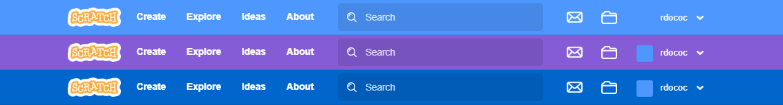
It's somewhat simple. All you need to do is have a box requesting a colour code, or a colour name and it inputs it into a variable. That then extracts to the navigation bar and text colour.
Okay, but what if someone's set it to light grey, or white?
Then the site would automatically notice and change the text colour and colour of the messages and my stuff buttons on the navigation bar to black.
What about the default colour? What would it be?
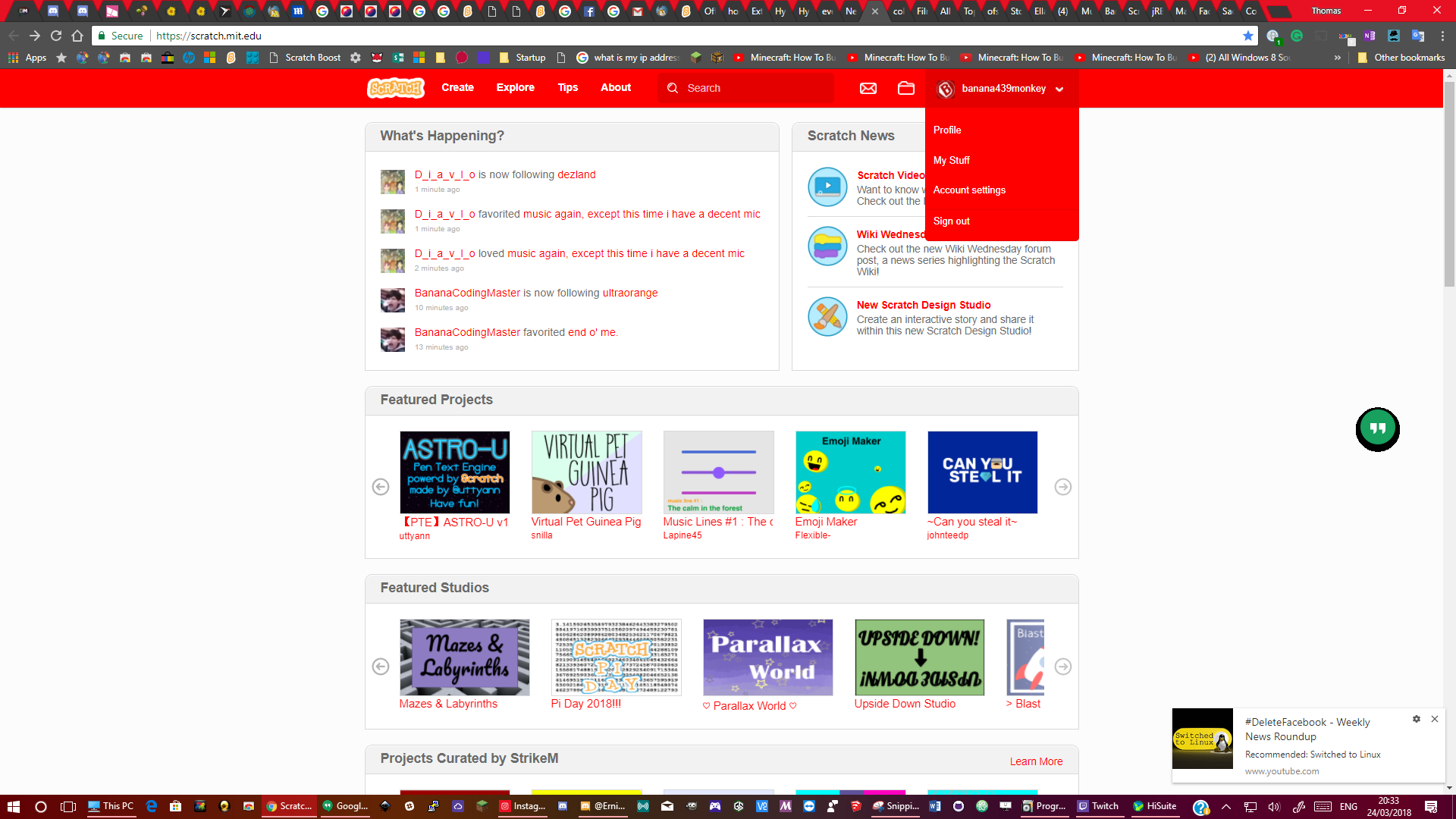
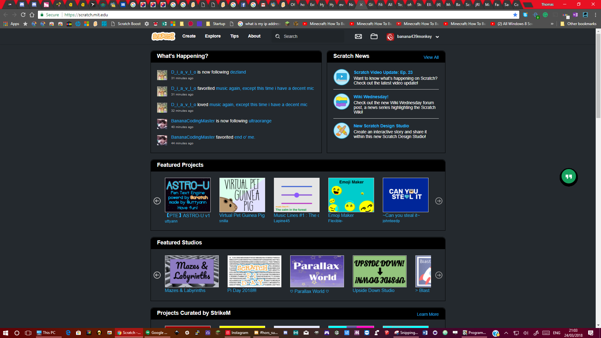
Good question there. It would be the colour we have now. #855cd6 - purple. The text would automatically be in this text box.
What if a user is logged out?
It works the same as the wiki. You can't change it when logged out.
Use extensions!!!
Okay, there are people who are lazy in this world. Aside from being lazy, those extensions are only local, they don't apply to everywhere. I want to see this being quick and simple to set. I want to be able to log into a library all the way over in London (I live in the West Midlands) and still immediately see Scratch in dark theme as soon as I log into it. No tooling around or anything. Long story stort, I'm a productivity guy. When doing things, I find the quickest way to do it to save time, because it matters!
Lemme elaborate even more:
An option in account settings to change the skin's colour. This text box's contents, when applied will be imported into a variable and the text colour and navigation bar would change to that colour. This text box should also be accompanied by a colour picker that includes the full sRGB colour spectrum (thanks kenny2scratch for the idea). A list of pre-sets could be given for the user to click on, in order for that user to select a colour of their choice (although the comprehensive sRGB colour picker should absolutely still be present; thanks Vetzlan for the idea).That's pretty simple, right? Right so far. On top of that, though another suggestion, it's still concerning the skin itself. Here's an example screenshot of the homepage with another colour:
Anyway, here's my other idea. Dark theme. In account settings, there would be an option to switch to and from dark theme and light theme. Here's a screenshot of dark theme:
Here's a guide of the colours used:
Non-links/navigation bar links: #ffffff
Section headers: #24292e then #000000
Links: default
Background/section backgrounds/footer: #24292e
It also may be an idea to introduce this to the editor as well, since it's as (if not more) important as the website itself. The whole theme would synchronise across the whole site including the editor.
If you do get the option to actually log into the 3.0 offline editor (which would be cool), it would be cool to synchronise this idea to there.
Thoughts?
Banana
I agree there should be a setting
———————————————-
Cleared by FuN
- ToastersUnited
-
Scratcher
1000+ posts
[PLEASE DO NOT PROTEST THE PURPLE] An option in account settings to change the site's theme and navigation bar colour
I agree there should be a settingPlease snip your posts
———————————————-
Cleared by FuN
I think we could get used to the purple, i actually do find it much easier to see things on the site and the claustrophobic-type affect was probably phsychological. It really helps me to see links (mainly on the forums) and other things on the 2.0 sites which were previously light blue blobs
Kop
Last edited by ToastersUnited (June 29, 2023 10:11:40)
- rdococ
-
Scratcher
1000+ posts
[PLEASE DO NOT PROTEST THE PURPLE] An option in account settings to change the site's theme and navigation bar colour
The dark blue colour #0066CC is more accessible than the current purple colour according to the accessibility standards used by the Scratch Team themselves. It also looks prettier in my opinion:

I think we could get used to the purple, i actually do find it much easier to see things on the site and the claustrophobic-type affect was probably phsychological. It really helps me to see links (mainly on the forums) and other things on the 2.0 sites which were previously light blue blobsBlindness can also be psychological in nature, so we have to be careful not to invalidate people's lived experiences on those grounds. It's important that even users with good eyesight can use Scratch without feeling uncomfortable.

- colinmacc
-
Scratcher
1000+ posts
[PLEASE DO NOT PROTEST THE PURPLE] An option in account settings to change the site's theme and navigation bar colour
The dark blue is completely accessible and much smarter.
- D123van
-
 Scratcher

100+ posts
[PLEASE DO NOT PROTEST THE PURPLE] An option in account settings to change the site's theme and navigation bar colour
SUPPORT!
I really want an option to go back to the blue navigation bar. I also want a dark mode.
I really want an option to go back to the blue navigation bar. I also want a dark mode.
- Zydrolic
-
Scratcher
1000+ posts
[PLEASE DO NOT PROTEST THE PURPLE] An option in account settings to change the site's theme and navigation bar colour
The dark blue is completely accessible and much smarter.true
- AXEstudios
-
 Scratcher

100+ posts
[PLEASE DO NOT PROTEST THE PURPLE] An option in account settings to change the site's theme and navigation bar colour
Support.
The new theme is strange for me.
I already get annoyed that purple is the first color selected opening the costume editor.
Although perhaps if they choose to redesign the site in the future, maybe the color would fit in.
The new theme is strange for me.
I already get annoyed that purple is the first color selected opening the costume editor.
Although perhaps if they choose to redesign the site in the future, maybe the color would fit in.
Last edited by AXEstudios (June 29, 2023 11:29:40)
- funmuz
-
 Scratcher

10 posts
[PLEASE DO NOT PROTEST THE PURPLE] An option in account settings to change the site's theme and navigation bar colour
. They could've easily implemented color switch mode while they were at it, as it's not difficult to code.
This.
This makes me feel angry.
If they could implement a button to change it, why not put it in the nav bar? Default off, but if you need it on, put it on.
This is about the simplest solo union I can come to.
Also I just don’t think the ST has been transparent enough with the update. We didn’t have a lot of input on it as the community and we only ever get to make suggestions AFTER the site has been implemented- of course more code would be required but beta-testing new features such as this could be done on an optional basis in a place where it’s quite visible - ScratchLab seems all but been forgotten. Of course this will require more code. But this will make it easier / more transparent for the wider community.
I did a little googling, and it looks like the ST has been alerting about this change since over 5 years ago.
https://scratch.mit.edu/discuss/topic/279211/
Last edited by funmuz (June 29, 2023 11:37:41)
- The_Game_
-
 Scratcher

1000+ posts
[PLEASE DO NOT PROTEST THE PURPLE] An option in account settings to change the site's theme and navigation bar colour
Also, no support for any color but the original blue….why
- 763869
-
 Scratcher

23 posts
[PLEASE DO NOT PROTEST THE PURPLE] An option in account settings to change the site's theme and navigation bar colour
Making a project about this
- rdococ
-
Scratcher
1000+ posts
[PLEASE DO NOT PROTEST THE PURPLE] An option in account settings to change the site's theme and navigation bar colour
This just makes it all the more bizarre why they went with purple instead of a dark blue, missed so many parts, made changes that impacted accessibility in some areas and didn't test the changes on Scratch Lab or something first.. They could've easily implemented color switch mode while they were at it, as it's not difficult to code.
This.
This makes me feel angry.
If they could implement a button to change it, why not put it in the nav bar? Default off, but if you need it on, put it on.
This is about the simplest solo union I can come to.
Also I just don’t think the ST has been transparent enough with the update. We didn’t have a lot of input on it as the community and we only ever get to make suggestions AFTER the site has been implemented- of course more code would be required but beta-testing new features such as this could be done on an optional basis in a place where it’s quite visible - ScratchLab seems all but been forgotten. Of course this will require more code. But this will make it easier / more transparent for the wider community.
I did a little googling, and it looks like the ST has been alerting about this change since over 5 years ago.
https://scratch.mit.edu/discuss/topic/279211/
- KittyCatKayden
-
 Scratcher

1000+ posts
[PLEASE DO NOT PROTEST THE PURPLE] An option in account settings to change the site's theme and navigation bar colour
Does anyone notice the follow discussion button got into gray? If you're following it, click the “Unfollow Discussion” button and you'll see the button's gray instead of blue or purple.Well the outline is purple, but the button itself is gray. I think it should be changed since a purple button would look much better.