Discuss Scratch
- Discussion Forums
- » Suggestions
- » Project page for Scratch 3.1
![[RSS Feed] [RSS Feed]](//cdn.scratch.mit.edu/scratchr2/static/__5f750b17a17db0b5d7ffaf5afb2e7e2b__//djangobb_forum/img/feed-icon-small.png)
- pyromoose
-
 Scratcher
92 posts
Project page for Scratch 3.1
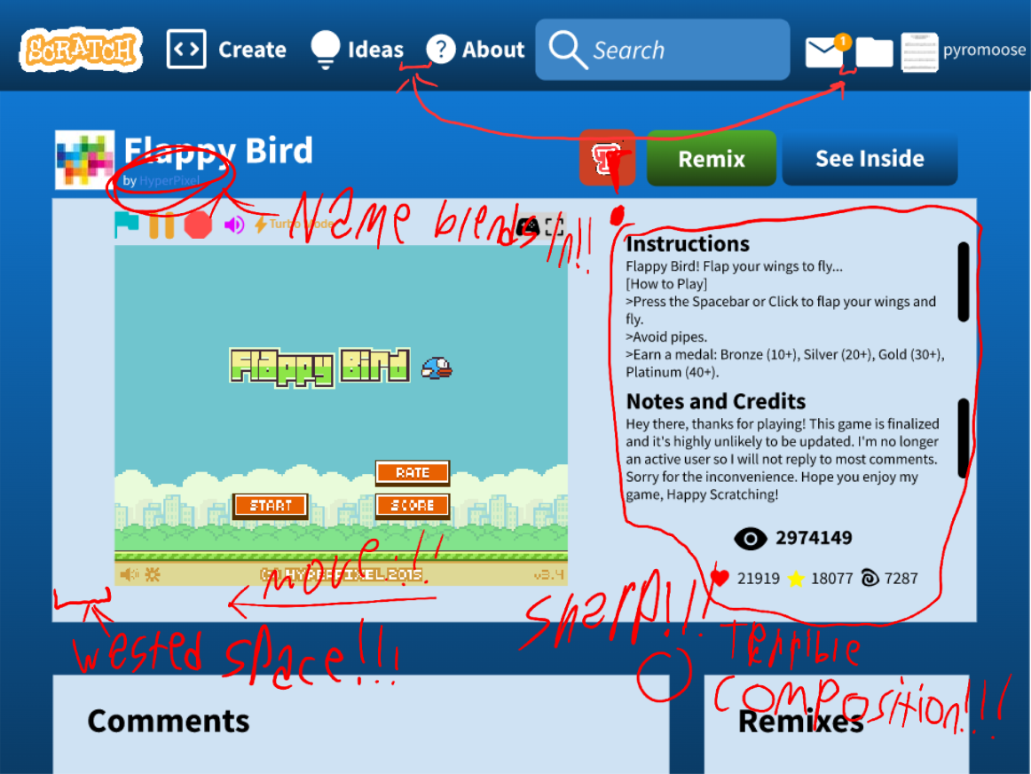
Okay, I'm back, with a design of a project page!


- medians
-
 Scratcher
1000+ posts
Project page for Scratch 3.1
I mean, I doubt that they would have a TurboWarp button because it’s not affiliated with Scratch.
Also, where is the share date?
Also, where is the share date?
- pyromoose
-
 Scratcher
92 posts
Project page for Scratch 3.1
I mean, I doubt that they would have a TurboWarp button because it’s not affiliated with Scratch.You need to hover over the project title to view the share date, and the modification date
Also, where is the share date?
- sonic__fan
-
 Scratcher
1000+ posts
Project page for Scratch 3.1
This is more like you redesigning Scratch, because the project page itself is the same. Only the colors are different, and it looks a lot less unique and more basic.
- The_Game_
-
 Scratcher
1000+ posts
Project page for Scratch 3.1
No support we don't need this at all. Also 3.1 already happened.
- medians
-
 Scratcher
1000+ posts
Project page for Scratch 3.1
…Yeah, I think that should be the full title or something instead since I don't see a lot of people knowing that.I mean, I doubt that they would have a TurboWarp button because it’s not affiliated with Scratch.You need to hover over the project title to view the share date, and the modification date
Also, where is the share date?
And you used to be able to see the last modified date without the api (there's an extension that I can't mention due to the policy [i checked without them okay] that allows you to hover over the share date to see this now though)
https://web.archive.org/web/201408/scratch.mit.edu/projects/104
- -Valtren-
-
 Scratcher
1000+ posts
Project page for Scratch 3.1
This is more like you redesigning Scratch, because the project page itself is the same. Only the colors are different, and it looks a lot less unique and more basic.Not to mention the I am canonically dead because of the gradients. It also has more elements that are unrelated to scratch and changed things so that it's harder and more unintuitive(what's the word) to access certain data.
- medians
-
 Scratcher
1000+ posts
Project page for Scratch 3.1
Also, I noticed this, but where's the explore navbar button LOL
Also, is the volume thing just supposed to be from forbidden word?
I mean, to be fair I am medians, though whenever I'm signed out and my mouse is over the “join scratch”, I expect there to be a gradient, then I remember they removed it.This is more like you redesigning Scratch, because the project page itself is the same. Only the colors are different, and it looks a lot less unique and more basic.Not to mention the I am canonically dead because of the gradients. It also has more elements that are unrelated to scratch and changed things so that it's harder and more unintuitive(what's the word) to access certain data.
Also, is the volume thing just supposed to be from forbidden word?
Last edited by medians (May 24, 2023 03:49:44)
- Crispydogs101
-
 Scratcher
1000+ posts
Project page for Scratch 3.1
My reaction.

The reason is because the fact it's like it was made in 1999 and it looks very unnatural for a website. It looks like if scratch was made in 2 hours.

The reason is because the fact it's like it was made in 1999 and it looks very unnatural for a website. It looks like if scratch was made in 2 hours.
Last edited by Crispydogs101 (May 24, 2023 04:08:46)
- Spentine
-
 Scratcher
1000+ posts
Project page for Scratch 3.1
Also, is the volume thing just supposed to be from forbidden word?Yes, also the pause button and the TurboWarp button is supposed to be from forbidden stuff.
- BloatedUnderpants3
-
 Scratcher
100+ posts
Project page for Scratch 3.1
Ouch. My eyes hurt now. That is waaaaaay too much contrast. Also, that is just a normal project page, but with no rounded corners, bad colour changes, and annoying gradients. Also, the padding size isn't even consistent. It's a 1990s student's side project that was made in 30 minutes. No support.
- medians
-
 Scratcher
1000+ posts
Project page for Scratch 3.1
I still have a big feeling that they said “3.1” because they knew if they said something like “4.0”, people would say stuff like “there are no current plans for 4.0”.
Ouch. My eyes hurt now. That is waaaaaay too much contrast. Also, that is just a normal project page, but with no rounded corners, bad colour changes, and annoying gradients. Also, the padding size isn't even consistent. It's a 1990s student's side project that was made in 30 minutes. No support.Honestly it's hard for me to remember what it looks like in 3.0, but without the comments icon or number, TurboWarp, pause, volume, and some other button, the remix number in a different place, rather than next to “Remixes”?
Last edited by medians (May 24, 2023 19:19:28)
- blablablahello
-
 Scratcher
1000+ posts
Project page for Scratch 3.1
I still have a big feeling that they said “3.1” because they knew if they said something like “4.0”, people would say stuff like “there are no current plans for 4.0”.but they miscalculated the fact that by saying “3.1”, people instead say “3.1 already passed”Ouch. My eyes hurt now. That is waaaaaay too much contrast. Also, that is just a normal project page, but with no rounded corners, bad colour changes, and annoying gradients. Also, the padding size isn't even consistent. It's a 1990s student's side project that was made in 30 minutes. No support.Honestly it's hard for me to remember what it looks like in 3.0, but without the comments icon or number, TurboWarp, pause, volume, and some other button, the remix number in a different place, rather than next to “Remixes”?
(we are currently using scratch like 3.3 or something)
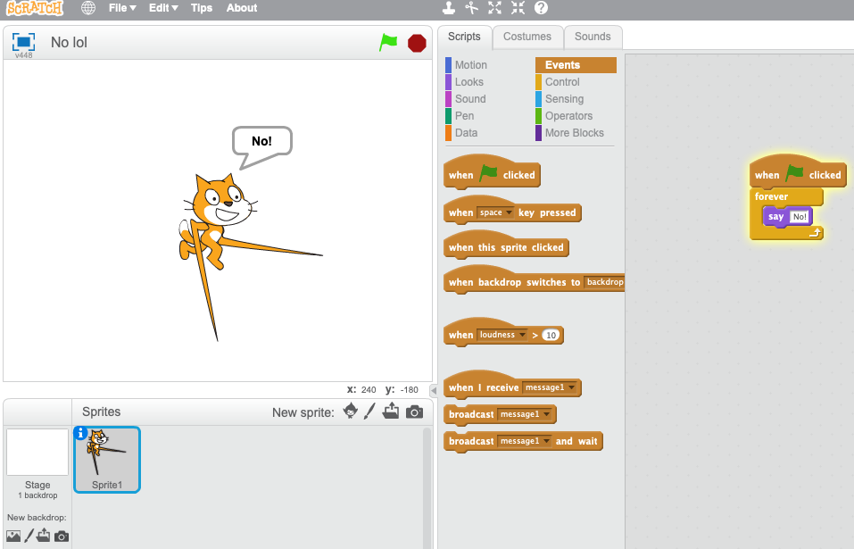
My honest reaction:
- medians
-
 Scratcher
1000+ posts
Project page for Scratch 3.1
LOL yeah I know, I've seen (they probably had no idea though because the wiki article refers to it as 3.0 still, and many people as well). They've made so many suggestions on these though, and they've been closed.
Also wow you're using my weird image XDDDDD
Also wow you're using my weird image XDDDDD
Last edited by medians (May 24, 2023 20:51:40)
- k7e
-
 Scratcher
1000+ posts
Project page for Scratch 3.1
The TurboWarp button is straight up a screenshot from a browser extension (don’t name it) , it’s not even gradient.
- rqnk
-
 Scratcher
39 posts
Project page for Scratch 3.1
tbh. Would would be the point of changing the project page? I really see no point of changing the project page design. Also some of the buttons blend to much with the very light blue. It looks a bit too harsh. Overall. I prefer the 3.0.
- medians
-
 Scratcher
1000+ posts
Project page for Scratch 3.1
Honestly it's hard for me to remember what it looks like in 3.0, but without the comments icon or number, TurboWarp, pause, volume, and some other button, the remix number in a different place, rather than next to “Remixes”?Did I get bamboozled
Also, the love and favorites in a different place technically.
Last edited by medians (May 24, 2023 21:04:46)
- k7e
-
 Scratcher
1000+ posts
Project page for Scratch 3.1
YesHonestly it's hard for me to remember what it looks like in 3.0, but without the comments icon or number, TurboWarp, pause, volume, and some other button, the remix number in a different place, rather than next to “Remixes”?Did I get bamboozled
- Discussion Forums
- » Suggestions
-
» Project page for Scratch 3.1
![[RSS Feed] [RSS Feed]](//cdn.scratch.mit.edu/scratchr2/static/__5f750b17a17db0b5d7ffaf5afb2e7e2b__//djangobb_forum/img/feed-icon-small.png)


