Discuss Scratch


- StevenTheSquare
-
 Scratcher

100+ posts
3.0 Profile Page Concept
ehhhhh no support, I actually like it the way it is. Maybe I'm just a creature of habit.
- the2000
-
 Scratcher

1000+ posts
3.0 Profile Page Concept
Ayy! Usually I don't like “hey can you make this look/act how i want it to in a future update” suggestions, and I was initially reluctant to support, but as I kept scrolling I was just kind of like, “woah.” I love the dynamic use of space! That's one thing I totally miss from 1.4 and hope they'll bring back to the home page at some point. It looks so flat right now because it's just a bunch of rows. Total support!
- IndianRuby718
-
 Scratcher

100+ posts
3.0 Profile Page Concept
Now That is a really great mock-up. 
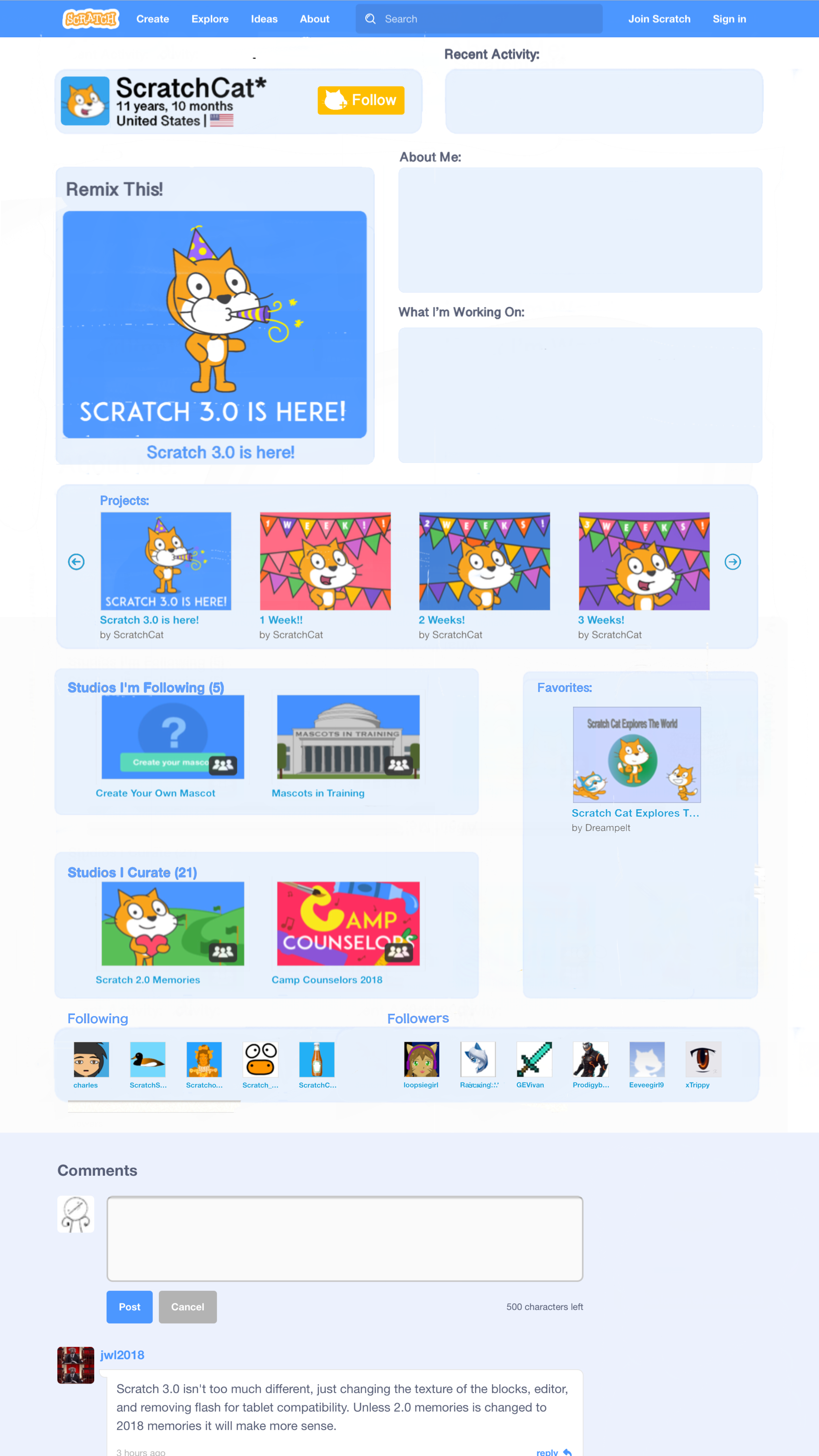
One thing I really like about this design is the size of the About Me and WIWO sections. There's a topic about increasing the character limit for both of these sections and a lot of people supporting it. I haven't posted there yet, but a point I have in mind to say is that it wouldn't fit the design. 200 characters fits the boxes perfectly if you're using the most of each line, and when you're not you'll have to scroll to see all of it. But if the limit were increased the available characters wouldn't fit the design. The answer to this would of course be a redesign, and this one would make that topic possible to fit with.
Onto some things I personally don't like… Firstly I agree with others about the different sections being in neat rows. Another thing is the section titles being blue from the view all links attached; if the titles are links it should at least be like the username on comments and the left side-bar on forum posts, that links to your profile but doesn't underline or change color. But even so I prefer having a separate “View All” button on the other side, taking up space and leaving the title less “contained” :P
One last thing is the follow button– whenever I think of redesigning profile and studio pages the first thing that comes to my mind is probably the follow button. The thing I think should most change about this design is the color; if it's going to fit Scratch's theme it should either be blue or orange. Though I'd prefer blue, orange could work with this design. Yellow just doesn't fit the site's theme.
These are all just my opinions and preferences– some more include the featured project being too big, About Me and WIWO being on the right instead of the left, or the country flag slightly drawing from the minimalist style. But I actually kind of like the recent section the way you designed it… if this is the style the “what's happening” section is going to be in, a scrollbar would fit perfectly here so you can see more activity than you currently can… I still prefer the current one, but the way it's placed here is kind of interesting…
Also, because I noticed them, I have two mess-ups to report :P One is that the “Scratch Team” status is missing, and two is that, well, this is impossible XD you're not signed in at the top, but there's a logo at the bottom for the new comment XD (but things like this happen to everyone, so it's totally fine :P)
Last edited by IndianRuby718 (Jan. 2, 2021 23:43:59)
- mybearworld
-
 Scratcher

1000+ posts
3.0 Profile Page Concept
Here are my THIngs To say.
- THe FoLLow BuTTon Is yeLLow. THaT JusT seems… weIrD To me. THougH, I LIKe THe new Icon.
- THe (new) scraTcHer sTaTus Is gone. IT Has Been repLaceD wITH THe FLag oF THe counTry, I Don'T THInK THe maIn Focus sHouLD Be THe counTry - IT sHouLD Be cHangeD To scraTcHer anD new scraTcHer agaIn.
- I LIKe How you puT FoLLowers anD FoLLowIng In one LIne. THaT way, THere Is JusT one LIne THaT says "Fame". aLTHougH, THere Is a proBLem. TransLaTIons. In german, THe worD For "FoLLower" Is "scraTcHer, DIe sIcH Für meIne sacHen InTeressIeren". anD "FoLLowIng“ ”scraTcHer, DIe mIcH InTerresIeren". I Don'T Know How THese couLD FIT In one LIne.
- mybearworld
-
Scratcher
1000+ posts
3.0 Profile Page Concept
you're not signed in at the top, but there's a place at the bottom for the new commentNow I finally get the [color=none] thing
IT's THe same on currenT proFILe commenTs.
wHen you cLIcK on IT, IT wILL TeLL you To sIgn In.
- PuppyGamer24
-
 Scratcher

7 posts
3.0 Profile Page Concept
I love Scratch 3.0! I never got to experience Scratch 2.0, but I'm sure it was good!
- mybearworld
-
Scratcher
1000+ posts
3.0 Profile Page Concept
I love Scratch 3.0! I never got to experience Scratch 2.0, but I'm sure it was good!HTTps://scraTcH.mIT.eDu/DownLoaD/scraTcH2
- GoogleInScratch
-
 Scratcher

1000+ posts
3.0 Profile Page Concept
Looks cool! But I don't see the place where it shows if this profile is a New Scratcher, a Scratcher, or Scratch Team.
Last edited by GoogleInScratch (Jan. 2, 2021 15:16:18)
- Chloe_Garcia_4
-
 Scratcher

28 posts
3.0 Profile Page Concept
I dunno, it would be hard to change and I can't even see your ideas because the images are blocked for me!!!
- Austinato
-
 Scratcher

1000+ posts
3.0 Profile Page Concept
This is a nice design!
It would be nice for profile pages to be updated so that they look similar to project pages. Your designs you showed in the original post are a nice representation of what that might look like! I like how most of the content is organized, but I just have a few concerns/critiques (similar to Za-Chary's post.)
Firstly, the favorites section feels a bit out of place. There might be a better place for that section of the page to be at. The “Following” and “Followers” section should be better differentiated, in my opinion. Although it is pretty clear which users are under each category, it might be confusing for users on mobile devices or when the browser window is narrow. Perhaps the darker blue region could be separated like the other sections on the page? Or maybe there could be a line that clearly separates the two.
Additionally, the “Recent Activity” section looks nice, but I'm just concerned that it might be too small to fit a decent amount of users' recent activity. Would users be able to scroll through that section (like “Notes and Credits” on projects and “What I'm working on” on user profiles)? Or would it just fit one item (like only the most recent love-it/fave-it/studio interaction/follow)? I'm sure it's probably the former, but I just wanted to bring that point up.
Apart from these concerns, your design looks nice! It really looks good! I think it would be pretty cool that (assuming the profile page gets updated) the new look strongly resembles yours! Again, good job!
- ForumHelperNanoPiex
-
 Scratcher

500+ posts
3.0 Profile Page Concept
It looks like you're in a project…No, I change to support, I didn't see the entire thing:
I like how favorites is in the side bar and it definitely looks great, and re-furnished. Support.
- IndianRuby718
-
Scratcher
100+ posts
3.0 Profile Page Concept
See the edit, I was going to say logo at first, but I couldn't remember if there was a place for a new comment on profiles when signed out at allyou're not signed in at the top, but there's a place logo at the bottom for the new commentNow I finally get the [color=none] thing
IT's THe same on currenT proFILe commenTs.
wHen you cLIcK on IT, IT wILL TeLL you To sIgn In.
- mybearworld
-
Scratcher
1000+ posts
3.0 Profile Page Concept
yeaH, THaT maKe more sense :pSee the edit, I was going to say logo at first, but I couldn't remember if there was a place for a new comment on profiles when signed out at allyou're not signed in at the top, but there's a place logo at the bottom for the new commentNow I finally get the [color=none] thing
IT's THe same on currenT proFILe commenTs.
wHen you cLIcK on IT, IT wILL TeLL you To sIgn In.

- TheTrillion
-
 Scratcher

500+ posts
3.0 Profile Page Concept
Although I think the profile page needs to update to 3.0, the design featured, in my opinion, is not perfect. The navigation is easier on the current profile page, while in the mockup, all the sections seem to be in random spots. The Shared Projects, Favorite Projects, Studios I'm Following, and the Studios I Curate, are all related in the fact that they are about the user. The mockup seems to get rid of that connection by making Favorite Projects vertical. Recent Activity is too small to fit more than one activity, so due to this, I think the Featured Project should be made smaller, as it is way too large. I also think the Following and Followers section should not be one, as that could cause confusion. I do not think the flags should be added as there are very small, and for more detailed flags it would be blurry and pixelated. I think the rest is alright though. Perhaps the 3.0 profile pages could look like what it looks like now, except in the 3.0 theme? (so, same arrangement of things except in 3.0 theme)
Last edited by TheTrillion (April 17, 2022 18:29:45)
- Myst--
-
 Scratcher

100+ posts
3.0 Profile Page Concept
I think that this would be better than what we already have, but I think to keep things like they were before to prevent damage to aesthetic sets there should be five visible projects instead of four, which is the amount on your mockup. Same for studios.
- Joshisaurio
-
 Scratcher

100+ posts
3.0 Profile Page Concept
Wow yeah it's so cool I hope ST makes the change!
It looks pretty modern!
It looks pretty modern!
SCRATCH: 3.0 MENU CONCEPT
Due to Scratch 3.0 recently being released without some pages being upgraded to the 3.0 format, I thought it was be time to share a concept.
more details below the image
NEW FEATURES:
- It is not shown here, although one of the potential features of this concept would be an improvement to the About Me/WIWO. When logged in, you would be able to change your About Me to something else (Ex: it could say ‘What I do’ or ‘Shoutouts’). If both columns had the same descriptor, they will merge together, making only 1 box (so you could have a 500 character About me instead of a 250 character one with a WIWO. I think this will add more customization, and would make it so people have more room to type.
PROOF OF CONCEPT:
- Easier Navigation. You may notice that there are no ‘show all’ buttons. You also might notice the text for ‘Projects’, ‘Studios’, or ‘Followers’ is blue. I think instead of a show all button, you just have to click the text itself. Favorite projects? Just click the text that says ‘favorites’. While it might take getting used to, I think it would assist in making the site easier to navigate.
DOWNSIDES:
- The shape of the different sections. When designing this concept, I wanted to make it look fun and interesting by adding different sized and shaped things. A downside to this would be the ‘aesthetic’ studios. The favorite projects section, and the studio section, have been limited to 2 items seen at a time. This would break the ‘I don’t follow studios’ text art. This would lead to many profiles simply saying ‘I don’t’, and it would lead to some anger.
- it can be confusing. That’s it. The changes could be confusing to some users, new and old. For example, the following and followers sections are combined. That was just an idea, and it probably won’t work as well as I assumed
FORGOT TO ADD:
- I didn’t end up adding the ‘scroll arrows’ (found in the ‘projects’ area). The arrows still exist.
- Didn’t demonstrate the Recent Activity area. I was thinking either it being just text (like it is right now), or making it so it shows you the project thumbnail (so you can see a better representation of what project they loved, or who they followed.
Anyways, that’s about it. I hope the concept looks good, and if you have any feedback, let me know! I would like to know what to change/what to keep (for any future design concepts)
- dertermenter
-
 Scratcher

1000+ posts
3.0 Profile Page Concept
I don't see the point of having a few horizontal tabs and vertical tabs that are squished together - these tabs can only show 2 projects/studios at a time which is a lot of scrolling to do. Back to the mix of horizontal and vertical tabs, it makes the page inconsistent, affecting the professionalism issue. I do not see a reason to squish the followers and following bars together as well.
On the positive side, I do like some of the layouts of the top half of the page - The profile information is really nice and has the modern geographical touch with the country flag. However, the About me and WIWO would make sense to be swapped with the featured project as Scratchers are used to that being on the left side, and maybe the follower button should still be blue - designs of webpages should have a basic colour palette spread out evenly on the site, so just having one orange asset looks inconsistent and blue is the standard colour for a follow button.
So my improvement would basically be to make it to the current layout of Profiles but implement the feature project and About Me and WIWO layout, although it would be better if they swapped positions.
- fox_creations
-
 Scratcher

63 posts
3.0 Profile Page Concept
ill be honest that looks really amazing, would be cool being added!
one single thing: i kinda prefer the sections to be underneeth eachother,
not side by side ,
for exmple to have a different row for followers& following people
one single thing: i kinda prefer the sections to be underneeth eachother,
not side by side ,
for exmple to have a different row for followers& following people
Last edited by fox_creations (Feb. 28, 2022 17:48:26)