Discuss Scratch

- Discussion Forums
- » Suggestions
- » Change background for costume editor
![[RSS Feed]](//cdn.scratch.mit.edu/scratchr2/static/__d235e7f35585482ca999583499337ccd__//djangobb_forum/img/feed-icon-small.png "[RSS Feed]")
- FireFlakes_1
-
 Scratcher

100+ posts
Change background for costume editor
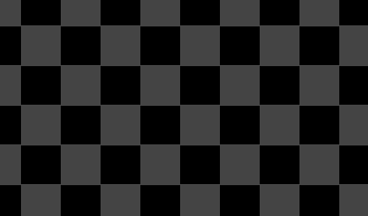
Have you ever been annoyed by those white and light blue squares on the background of the editor? Wishing that you could change it because it hurts your eyes trying to draw/erase something that has a light colour, and the background just makes it worse? Well, I'm sure you're sick of it. So here's my suggestion: Adding some more presets to the background of the costume editor only. It WON'T show up on the screen, it would just be a tool for the costume editor, like how the current background doesn't show up. Now here's what I was thinking in terms of the presets:
The first one (a bit of a darker touch):
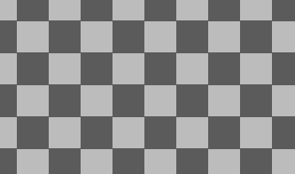
The second one (lighter than the last):
And the third (Modified version of the current one):
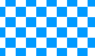
And the fourth one would be the current one (Even though we all know what it looks like, I'm just putting here cuz some of us might not):

Also there could be like some other options of just plain colours.
Now I know you're thinking “Well why not just put a huge square of a certain colour and put it under a your work and delete that square later”, well heres what I say to that.
First of all, that could work out, but then you'd constantly have to put the square back if you have to change something and you're irritated by the light background. Plus, im saying it for both vector and bitmap, and if you have to erase something in bitmap, there would be no point in putting that square under all your work because then it would also erase that square you put. And not all of us prefer the vector.
So what do you think?
FAQ's
none yet…
The first one (a bit of a darker touch):

The second one (lighter than the last):

And the third (Modified version of the current one):

And the fourth one would be the current one (Even though we all know what it looks like, I'm just putting here cuz some of us might not):

Also there could be like some other options of just plain colours.
Now I know you're thinking “Well why not just put a huge square of a certain colour and put it under a your work and delete that square later”, well heres what I say to that.
First of all, that could work out, but then you'd constantly have to put the square back if you have to change something and you're irritated by the light background. Plus, im saying it for both vector and bitmap, and if you have to erase something in bitmap, there would be no point in putting that square under all your work because then it would also erase that square you put. And not all of us prefer the vector.
So what do you think?
FAQ's
none yet…
Last edited by FireFlakes_1 (Feb. 23, 2021 16:11:55)
- StevenTheSquare
-
 Scratcher

100+ posts
Change background for costume editor
Support. And they should also make the editor fill the screen for bitmap. I get why you can look outside the full size for vector, but it makes no sense for bitmap.
- sportfan999
-
 Scratcher

1000+ posts
Change background for costume editor
The current checkerboard background represents transparent space. This is how it is with all images.
Last edited by sportfan999 (Feb. 19, 2021 20:21:32)
- cs4715962
-
 Scratcher

100+ posts
Change background for costume editor
I support. When I'm making eyes I can't see what I'm doing because the background is white  and I use Vector a bit to shape things and make thing un-pixellated
 and I use Vector a bit to shape things and make thing un-pixellated
- Ihatr
-
 Scratcher

1000+ posts
Change background for costume editor
Like someone else said earlier in the thread, the current pattern is what's used to represent a transparent background, so I see why they chose it. I just don't think a different pattern would really work as when exporting it exports as a .png. I really don't have an opinion.
- the2000
-
 Scratcher

1000+ posts
Change background for costume editor
All of these look way more disorienting than the current background. As a bitmap animator, I've never had any problems with this. I remember that a similar website with a somewhat similar art editor had a problem where your vision would go weird if you looked at the grid for too long, so I don't think that Scratch has it particularly bad as it is.
- the_cat_meows
-
 Scratcher

100+ posts
Change background for costume editor
Have you ever been annoyed by those white and light blue squares on the background of the editor? Wishing that you could change it because it hurts your eyes trying to draw/erase something that has a light colour, and the background just makes it worse? Well, I'm sure you're sick of it. So here's my suggestion: Adding some more presets to the background of the costume editor only. It WON'T show up on the screen, it would just be a tool for the costume editor, like how the current background doesn't show up. Now here's what I was thinking in terms of the presets:I support it, but the current background is standard for all vector art programs like Pixilart and Google drawings, so I doubt that it will change.
The first one (a bit of a darker touch):
The second one (lighter than the last):
And the third (Modified version of the current one):
And the fourth one would be the current one (Even though we all know what it looks like, I'm just putting here cuz some of us might not):
Also there could be like some other options of just plain colours.
Now I know you're thinking “Well why not just put a huge square of a certain colour and put it under a your work and delete that square later”, well heres what I say to that.
First of all, that could work out, but then you'd constantly have to put the square back if you have to change something and you're irritated by the light background. Plus, im saying it for both vector and bitmap, and if you have to erase something in bitmap, there would be no point in putting that square under all your work because then it would also erase that square you put. And not all of us prefer the vector.
So what do you think?
- FireFlakes_1
-
Scratcher
100+ posts
Change background for costume editor
I support it, but the current background is standard for all vector art programs like Pixilart and Google drawings, so I doubt that it will change.
ok, but i'm just talking about certain types of background to be added that aren't so light. Also, i'm pretty sure there are other ways to tell others that it's a png image. like perhaps darker squares?
- Maximouse
-
 Scratcher

1000+ posts
Change background for costume editor
I think the mockups all have too much contrast. It might be a good idea to just add a dark version of the background.
- Ihatr
-
Scratcher
1000+ posts
Change background for costume editor
Also, i'm pretty sure there are other ways to tell others that it's a png image. like perhaps darker squares?You don't see darker squares when you find and download a PNG image off of google and the like, Scratch's current pattern is the standard for all PNG images.
- Maximouse
-
Scratcher
1000+ posts
Change background for costume editor
Not specifically PNG images – all images with transparency.Also, i'm pretty sure there are other ways to tell others that it's a png image. like perhaps darker squares?You don't see darker squares when you find and download a PNG image off of google and the like, Scratch's current pattern is the standard for all PNG images.
- the2000
-
Scratcher
1000+ posts
Change background for costume editor
I think the mockups all have too much contrast.Yeah, that's what I said. All of the mock-ups look way more disorienting than the original.
- FireFlakes_1
-
Scratcher
100+ posts
Change background for costume editor
lol its been forever since the last post on thisbump
- Discussion Forums
- » Suggestions
-
» Change background for costume editor