Discuss Scratch
- Discussion Forums
- » Suggestions
- » Bring back the 2016 build look
![[RSS Feed]](//cdn.scratch.mit.edu/scratchr2/static/__5b3e40ec58a840b41702360e9891321b__//djangobb_forum/img/feed-icon-small.png "[RSS Feed]")
- Bacteria999
-
 Scratcher

1000+ posts
Bring back the 2016 build look
Look at this picture:
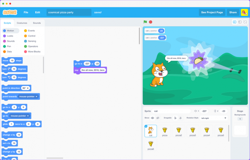
You won't notice that the menu was different: instead of those giant, weird blobs, we had a more simplistic block division system, which in my opinion was much nicer and more modern.
The reason they changed it might be ease on mobile devices, but that menu isn't even that small. Also, there should be an option to switch to the minimalist menu.
Other things we notice is that everything is smoother, more modern and consistent, with thinner lines and smoother surfaces
I think this design is less confusing, and comes closer to what the site wants to become: a modern way for young people to learn how to program.
- Chiroyce
-
 Scratcher

1000+ posts
Bring back the 2016 build look
That blew my mind.
Semi-support - Scratch does want people to use Scratch on mobile devices as well
But, where did you get that image from? And where did that Scratch Cat come from?
I love the UI and all but there might be some issues that I'm not aware of, thus I'm looking forward to more feedback from different people.
Semi-support - Scratch does want people to use Scratch on mobile devices as well

But, where did you get that image from? And where did that Scratch Cat come from?
I love the UI and all but there might be some issues that I'm not aware of, thus I'm looking forward to more feedback from different people.
- CatsUnited
-
 Scratcher

1000+ posts
Bring back the 2016 build look
But, where did you get that image from? And where did that Scratch Cat come from?It was a concept of Scratch 3's UI made by designerd in late 2016. They also were experimenting with switching up Scratch Cat's design to something more animal-like, which was scrapped.
(source)
Last edited by CatsUnited (March 14, 2021 15:02:21)
- Bacteria999
-
Scratcher
1000+ posts
Bring back the 2016 build look
That blew my mind.I found this image while I was browsing around the forums.
But, where did you get that image from?
This is the Official source.
- pavcato
-
 Scratcher

1000+ posts
Bring back the 2016 build look
I was wondering where that design came from, but good thing it wasn't added because it looked kinda weird.But, where did you get that image from? And where did that Scratch Cat come from?It was a concept of Scratch 3's UI made by designerd in late 2016. They also were experimenting with switching up Scratch Cat's design to something more animal-like, which was scrapped.
(source)
For the suggestion, I really want this added because it looks A LOT more modern.
- CatsUnited
-
Scratcher
1000+ posts
Bring back the 2016 build look
Also on the point of user interface decisions - the layout of the Scratch 3 editor we currently have most closely resembles a UI concept from August 2016 for tablet devices, while desktop was going to get the layout we see above.
The page that I sourced these images from also presents a Scratch Jr style tablet UI prototype and a mobile UI prototype, where the blocks are also laid out in the Scratch Jr style.
The page that I sourced these images from also presents a Scratch Jr style tablet UI prototype and a mobile UI prototype, where the blocks are also laid out in the Scratch Jr style.

- Bacteria999
-
Scratcher
1000+ posts
Bring back the 2016 build look
Also on the point of user interface decisions - the layout of the Scratch 3 editor we currently have most closely resembles a UI concept from August 2016 for tablet devices, while desktop was going to get the layout we see above.Since you are here: Do You Support or Don't Support
The page that I sourced these images from also presents a Scratch Jr style tablet UI prototype and a mobile UI prototype, where the blocks are also laid out in the Scratch Jr style.
- Chiroyce
-
Scratcher
1000+ posts
Bring back the 2016 build look
For the suggestion, I really want this added because it looks A LOT more modern.+1 | I love this design! What was the reason this wasn't added??
- CatsUnited
-
Scratcher
1000+ posts
Bring back the 2016 build look
¯\_(ツ)_/¯Also on the point of user interface decisions - the layout of the Scratch 3 editor we currently have most closely resembles a UI concept from August 2016 for tablet devices, while desktop was going to get the layout we see above.Since you are here: Do You Support or Don't Support
The page that I sourced these images from also presents a Scratch Jr style tablet UI prototype and a mobile UI prototype, where the blocks are also laid out in the Scratch Jr style.
I generally don't have a definitive Support or No Support when it comes to a lot of suggestions, this included (consider this a semi-support).
There's definitely things from this interface that I'd like to see, such as how the block categories are organised and that there isn't a big “delete sprite” button on the highlighted sprite.
However, this interface lacks a lot of the illustrations that the editor has (e.g the paintbrush on the Costume category button). It's pretty universally accepted that paintbrushes have something to do with drawing or art, so in the case of young children who may not immediately pick up on the words or someone who speaks a language that doesn't or has a bad translation of the editor, the accessibility of Scratch increases.
Last edited by CatsUnited (March 14, 2021 15:24:19)
- Chiroyce
-
Scratcher
1000+ posts
Bring back the 2016 build look
However, this interface lacks a lot of the illustrations that the editor has (e.g the paintbrush on the Costume category button).I mean if this is getting implemented they would add it right?
- dertermenter
-
 Scratcher

1000+ posts
Bring back the 2016 build look
I prefer the new menu design, It is thinner, and also has extensions at the end whilst this doesn't. The problem with that design is that there isn't really a place for extensions to fit in.
I know this suggestion isn't about this, but I'm glad that they scrapped that scratch cat.
I know this suggestion isn't about this, but I'm glad that they scrapped that scratch cat.
Last edited by dertermenter (March 14, 2021 16:08:22)
- Bacteria999
-
Scratcher
1000+ posts
Bring back the 2016 build look
I prefer the new menu design, It is thinner, and also has extensions at the end whilst this doesn't. The problem with that design is that there isn't really a place for extensions to fit in.It could be placed where it was in version 2.0:
I know this suggestion isn't about this, but I'm glad that they scrapped that scratch cat.
- the2000
-
 Scratcher

1000+ posts
Bring back the 2016 build look
Here's a definitive list of all the changes (that I noticed), with a little bit of commentary from me. This is ignoring vague differences in coloration and design which I didn't think were worth noting.
- Blocks are separated into tabs like in earlier versions as opposed to being free-flowing - I actually like the free-flowing list. I think it's fun to scroll through all the blocks, and I'm assuming they thought the list was a lot more friendly to newcomers than a bunch of tabs to look through. Thanks to the different block colors (for the most part, never forget events and control) it's not confusing at all and I find it quite fun. You can still click on the categories if you really want to. Maybe I could write a userscript for this if there isn't one already though; it sounds like it could be fun, and I haven't yet touched the 3.0 editor itself when it comes to writing scripts.
- Pen is a default category - I've discussed my reasons for agreeing with this decision over here. That also applies to the music and video sensing blocks, though you can't actually see if they are still present in the main palette here.
- “Variables” is still called “Data” - One of the few things here that I actually prefer. I've discussed my reasons for preferring the original name over here.
- No delete button on sprites - Really want this as well. If you need to delete a sprite then you should have to right click it, or maybe they could bring back 2.0's drag-and-drop widgets.
- 2.0 info button on sprites - Not sure what this button would do considering that all the info was put into the sprite header even in this mock-up.
- Rotation style has its own section in the sprite header - This was grouped into the rotation pop-up, and I think that it's fine there.
- “Draggable” toggle has its own section in the sprite header - This has been removed, and you can now only alter this with a block (which is nice since that block didn't exist in earlier versions, one of the few 3.0 additions which were actually very useful and practical). It would be nice to give this a spot on the sprite header but unlike rotation style I don't know where you could put it and it probably doesn't deserve a top-level position.
- “Backdrop” was reverted to “background” as in 1.x - One of the various 1.x ideas which were revisited while designing 3.0, but clearly not one which stuck. I have no feelings either way about this; they don't need to change it back but then again they never needed to change it in the first place. Renaming it to the “backdrop” would've made more sense if sprites were renamed to “actors” as well but they clearly didn't go that route so I don't know why they did that.
- dertermenter
-
Scratcher
1000+ posts
Bring back the 2016 build look
No delete button on sprites - Really want this as well. If you need to delete a sprite then you should have to right click it, or maybe they could bring back 2.0's drag-and-drop widgets.Mobile users cry
I like the trash can design but it could be smaller, I think it fits in with the design. I think that it is good to have a trash icon.
- Futurebot5
-
 Scratcher

1000+ posts
Bring back the 2016 build look
Mobile users cryHolding your finger is usually interpreted as a right-click.
- Rendangbike2
-
 Scratcher

1000+ posts
Bring back the 2016 build look
2.3 Set the editor to look like older versions of Scratch
Some users prefer the look and feel of the Scratch 2.0 editor, and have suggested that the editor look like Scratch 2.0, but still run off of HTML5 like Scratch 3.0 does. However, this would be more complicated for educational and documentation purposes. It could be confusing if someone is trying to learn Scratch from someone who is using a completely different layout of the editor than them.
- Bacteria999
-
Scratcher
1000+ posts
Bring back the 2016 build look
This is not an old version, it is a design that in my opinion should be implemented.2.3 Set the editor to look like older versions of Scratch
Some users prefer the look and feel of the Scratch 2.0 editor, and have suggested that the editor look like Scratch 2.0, but still run off of HTML5 like Scratch 3.0 does. However, this would be more complicated for educational and documentation purposes. It could be confusing if someone is trying to learn Scratch from someone who is using a completely different layout of the editor than them.
Also, the design is not even that different.
Last edited by Bacteria999 (March 15, 2021 10:28:34)
- Discussion Forums
- » Suggestions
-
» Bring back the 2016 build look