Discuss Scratch

- Discussion Forums
- » Suggestions
- » Recreating the Mobile Editor【DESIGN】
![[RSS Feed]](//cdn.scratch.mit.edu/scratchr2/static/__5f750b17a17db0b5d7ffaf5afb2e7e2b__//djangobb_forum/img/feed-icon-small.png "[RSS Feed]")
- bushymurry
-
 Scratcher

17 posts
Recreating the Mobile Editor【DESIGN】
Recreating The Mobile Editor
Explanation:
1. Make the Stage/Sprites into a tray. When you click on the tab on the right (image 1), it opens up the Stage/Sprites tray (as shown in image 2)
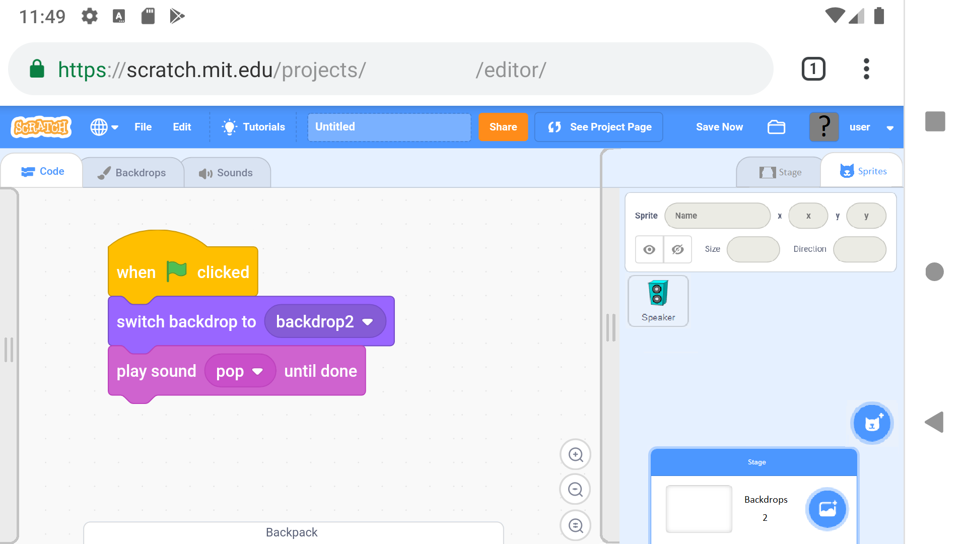
2. The Stage/Sprites tray will have two tabs, similar to the Code/Costumes(Backdrops)/Sounds (Stage tab shown in image 2, Sprites tab shown in image 5)
3. When this tray opens, it pushes the zoom buttons to the left and shrinks the backpack tray, and when it closes they return to their original positions and sizes.
4. Also, make the code blocks into a tray. When you click the tab on the left (image 1) it opens up the code blocks tray (image 3).
5. The Costumes/Backdrops and Sounds tabs will remain the same (but the stage/sprites tray will still be there).
6. The Code Blocks tray will have the blocks laid out like they are in the current editor, but the categories must be accessed via the category button (the four colored boxes). When this button is pressed, it opens up the categories (image 4). When a category is tapped or the empty space below is tapped, it returns to the Code Blocks (image 3)
7. This tray will automatically close when a block is taken, unless the pin toggle is on (lower right corner of the Code Blocks tray). The pin toggle is shown off in image 3 and on in image 4
Images:
Image 1
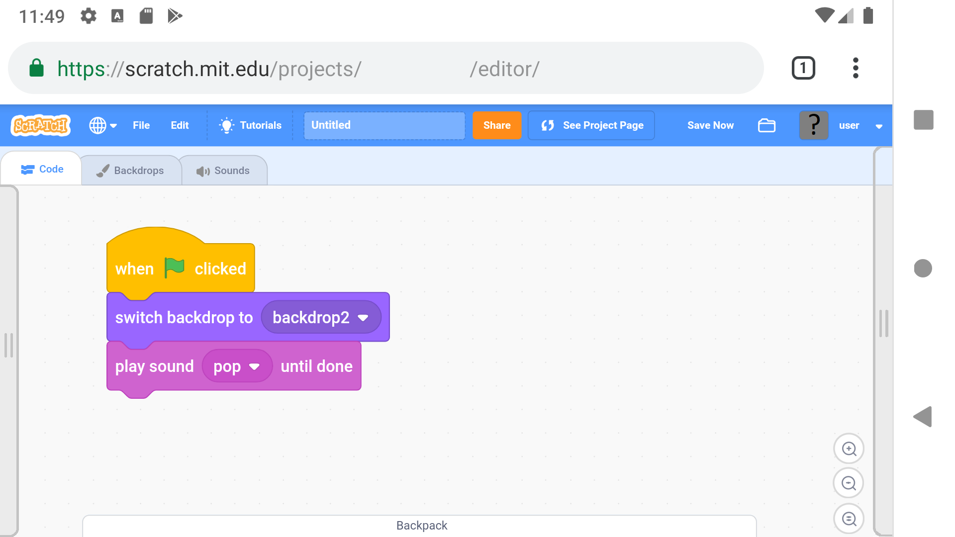 Image 2
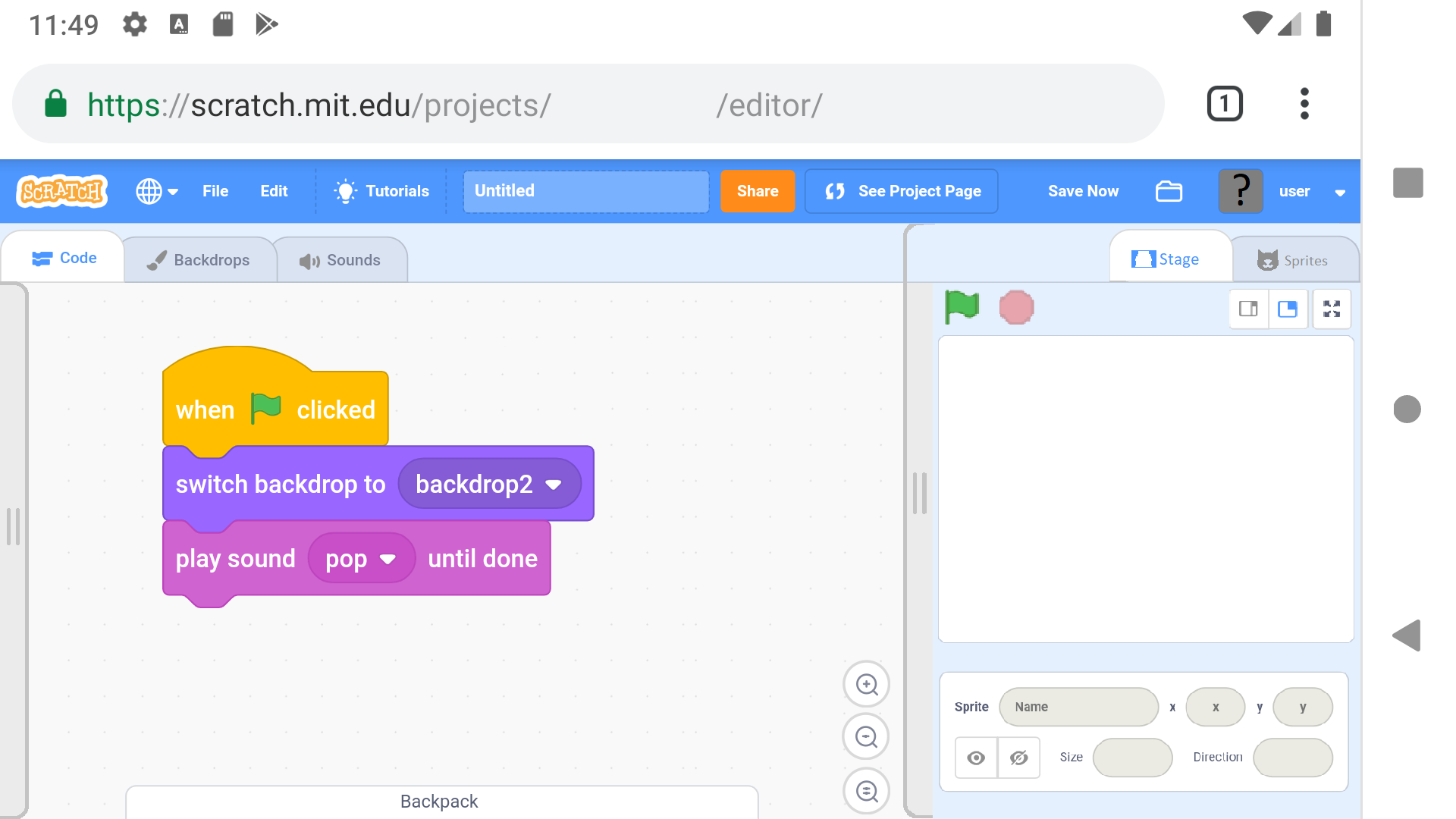
Image 3
 Image 4
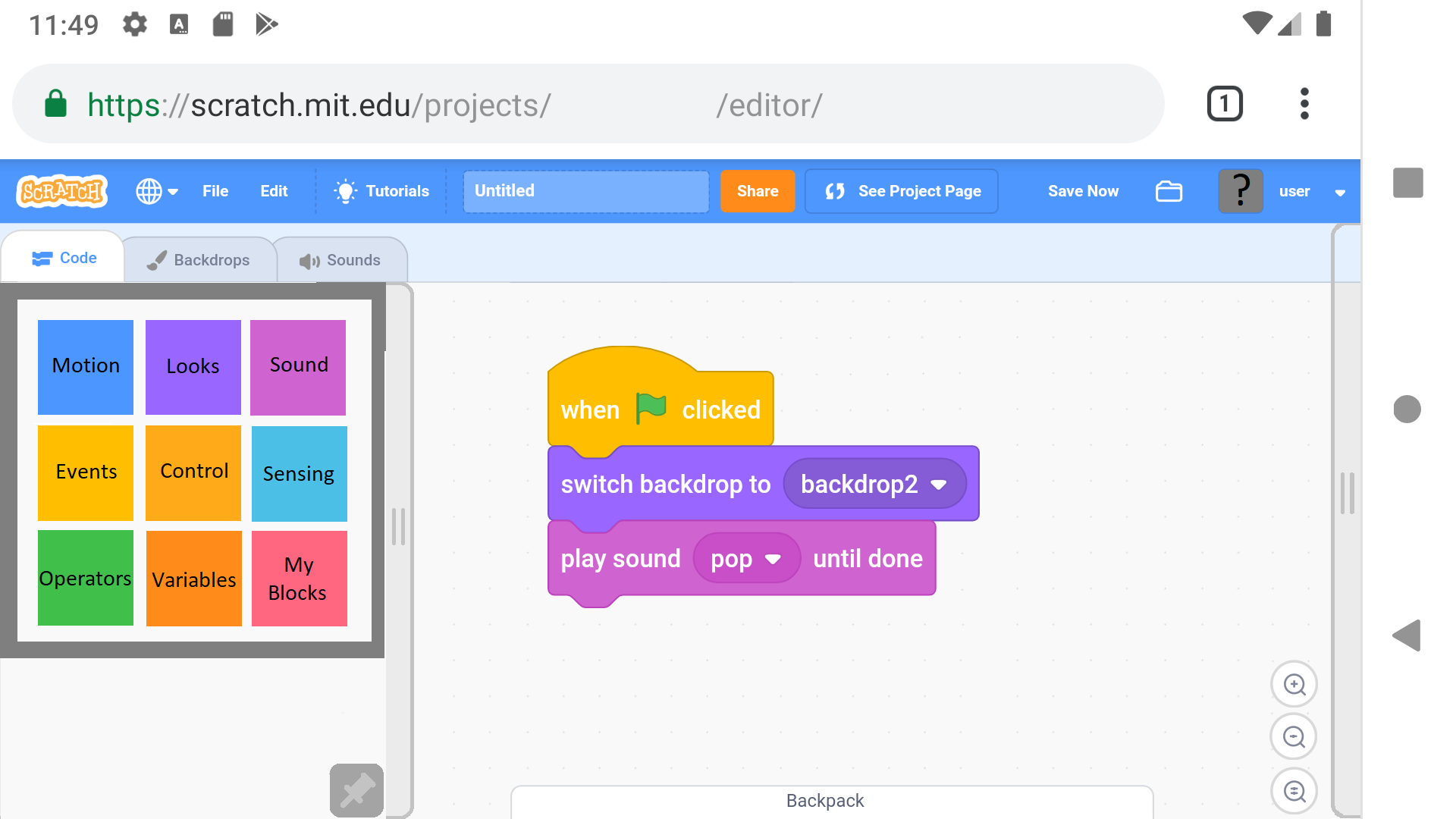
Image 5
IF YOU LIKE (or dislike) THIS IDEA, PLEASE REPLY AND SAY WHAT AND WHY
This will help gain attention from the Scratch Team!
Last edited by bushymurry (Sept. 2, 2019 00:56:27)
- Sheep_maker
-
 Scratcher

1000+ posts
Recreating the Mobile Editor【DESIGN】
Fascinating; I've been waiting for someone to suggest a mobile editor layout.
My concern is that the tray buttons are too small and too close to the edge of the screen, so they'll be hard to press on and may trigger some system gesture, like opening the notification centre.
I also think the desktop category selector should work on the phone because it's fairly thin, and it could be easier to just scroll to another category.
I wonder what an editor in portrait mode would look like since a lot of people prefer using apps in portrait mode; entering in a text input in landscape mode would have the on-screen keyboard take up most of the screen.
- bushymurry
-
Scratcher
17 posts
Recreating the Mobile Editor【DESIGN】
I don't think that Scratch should really be designed for portrait mode, but if it were, I would assume the code blocks tray is at the top, the stage/sprites tray is at the bottom, and the code in the middle (I don't know where backpack would go though).
As for the button size, you could make the tray buttons bigger, Just as long as they don't take too much space.
And the categories might be able to fit, but my concern is that it becomes so big that when you have both the code blocks tray and the stage/sprites tray open at the same time, it completely covers the code space.
Note that the screenshots were taken on an emulated pixel 2 phone, then modified.
That means that the pictures should be 5 inches by 2 inches. Once you resize them, you can likely see why I believe these things are necessary for an easy-to-use coding environment.
I might also add that there should be labels on the Code Blocks tray and the Stage/Sprites tray. (something like on the left, in vertical text, say “Blocks” and on the right, say in vertical text “Stage = Sprites” (where the = is the two lines on the tray button))
- Za-Chary
-
 Scratcher

1000+ posts
Recreating the Mobile Editor【DESIGN】
Had you envisioned this sort of layout to be used on tablets, phones, or both?
- bushymurry
-
Scratcher
17 posts
Recreating the Mobile Editor【DESIGN】
This is a layout for both tablets and phones.
However, since tablets have more space, you could move the categories to the side (as in the desktop/current online version of Scratch). A few other changes could be made too (I just can't think of anything else right now).
Should both trays be opened when Scratch first starts (so beginners know where things are)?
- bushymurry
-
Scratcher
17 posts
Recreating the Mobile Editor【DESIGN】
Here's a look at the Sprite tab:
(If the Scratch Team is considering this idea, or has accepted/rejected it, please post so )
)
(If the Scratch Team is considering this idea, or has accepted/rejected it, please post so
 )
)
I'll update the original post.
- bushymurry
-
Scratcher
17 posts
Recreating the Mobile Editor【DESIGN】
Anyone else have anything to add/suggest? (I like bumps to be constructive)
- poptko
-
 Scratcher

92 posts
Recreating the Mobile Editor【DESIGN】
Good Idea!Recreating The Mobile Editor
Explanation:
1. Make the Stage/Sprites into a tray. When you click on the tab on the right (image 1), it opens up the Stage/Sprites tray (as shown in image 2)
2. The Stage/Sprites tray will have two tabs, similar to the Code/Costumes(Backdrops)/Sounds (Stage tab shown in image 2, Sprites tab shown in image 5)
3. When this tray opens, it pushes the zoom buttons to the left and shrinks the backpack tray, and when it closes they return to their original positions and sizes.
4. Also, make the code blocks into a tray. When you click the tab on the left (image 1) it opens up the code blocks tray (image 3).
5. The Costumes/Backdrops and Sounds tabs will remain the same (but the stage/sprites tray will still be there).
6. The Code Blocks tray will have the blocks laid out like they are in the current editor, but the categories must be accessed via the category button (the four colored boxes). When this button is pressed, it opens up the categories (image 4). When a category is tapped or the empty space below is tapped, it returns to the Code Blocks (image 3)
7. This tray will automatically close when a block is taken, unless the pin toggle is on (lower right corner of the Code Blocks tray). The pin toggle is shown off in image 3 and on in image 4
Images:
Image 1
Image 3
Image 5
IF YOU LIKE (or dislike) THIS IDEA, PLEASE REPLY AND SAY WHAT AND WHY
This will help gain attention from the Scratch Team!
- gdfsgdfsgdfg
-
 Scratcher

1000+ posts
Recreating the Mobile Editor【DESIGN】
Good Idea!don’t quote the OP
- Discussion Forums
- » Suggestions
-
» Recreating the Mobile Editor【DESIGN】