Discuss Scratch

- Discussion Forums
- » Suggestions
- » General Editor Suggestions
![[RSS Feed]](//cdn.scratch.mit.edu/scratchr2/static/__74e70580e9dbe93ce1c3f8422dde592d__//djangobb_forum/img/feed-icon-small.png "[RSS Feed]")
- ResExsention
-
 New to Scratch

1000+ posts
General Editor Suggestions
Already familiar with many game engines, I find it quite unnatural to have the preview on the top right of the screen, and then the code and sprite editors taking up the rest of the space. This also doesn't really allow for multitasking, because since there are very few docks, most things are inside tabs, which can get annoying if you have to constantly switch between them especially on larger projects.
My suggestion is this: we'll keep the default UI, but there should be an option somewhere, where the entire UI gets overhauled.. Now, the preview will be larger in will be located in the center, and then there would be numerous smaller docks on the sides, keeping the costumes and the sound manager separate. Then, when a certain sprite is selected, there can be a sort of option to open the code editor, replacing the preview.
Mockup using ASCII:
| |
| Preview/ | Costume editor
Inspector | | ————–
| Code | Sound manager
| |
Both the sound manager and the costume editor would be smaller than the preview, and selecting anything in those menus will result in the inspector changing, so that the properties (position, visibility, etc.) can be changed. In the inspector, “code view” can also be enabled, so that the code for a specific sprite can be modified. The preview can be returned to at any time.
Of course, the original UI would still be there. I have a few games planned out, and I'm deciding on an engine, so I think these changes might make Scratch feel more natural for me.
Plus, I would really like to see a larger preview window. The one Scratch has right now is a bit tiny.
Infrequently active.
It feels weird to see how far we've come. I hope you're well, wherever you are!
- codeman1044
-
 Scratcher

1000+ posts
General Editor Suggestions
Semi support.
I like the idea of a larger preview window, but I'm not certain about the idea of all of the tabs in the same view. Scratch is supposed to be user-friendly and seeing all of those at once might overwhelm a newer and/or a younger user.
I like the idea of a larger preview window, but I'm not certain about the idea of all of the tabs in the same view. Scratch is supposed to be user-friendly and seeing all of those at once might overwhelm a newer and/or a younger user.
This is my signature, which shows up every time I post and is automatic. To make a signature of your own, locate the “Change your signature” option in the bottom left of the Discussion Home.
I am nothing if not consistently inconsistent.
Snap! is a website that offers block coding like Scratch, but also offers the creation of your own blocks and writing JavaScript functions. The adventurous should consider checking it out!
Potentially useful tutorials and topic coverage
If you want to see a new tutorial added to this, feel free to leave a suggestion on my profile.
- ResExsention
-
New to Scratch
1000+ posts
General Editor Suggestions
Semi support.
I like the idea of a larger preview window, but I'm not certain about the idea of all of the tabs in the same view. Scratch is supposed to be user-friendly and seeing all of those at once might overwhelm a newer and/or a younger user.
Precisely why I said it would only be optional. There would be the default, original layout, and then this.
Infrequently active.
It feels weird to see how far we've come. I hope you're well, wherever you are!
- Za-Chary
-
 Scratcher

1000+ posts
General Editor Suggestions
The problem with these suggestions about revising the layout (particularly if it's optional) is that it could add a lot of complexity for not only the Scratch Team, but also to anyone trying to teach or learn the Scratch language. It's tough to teach Scratch if not everyone might not have the same editor layout, and it's not entirely fair to the Scratch Team to code a layout so that a small percentage of users is satisfied. This is similar to why “Set the editor to look like older versions of Scratch” is rejected.
Of course, you are not suggesting the editor to look like older versions of Scratch. Therefore, I can't confirm that your suggestion is rejected — but I would guess that the Scratch Team wouldn't add this anytime soon.
Of course, you are not suggesting the editor to look like older versions of Scratch. Therefore, I can't confirm that your suggestion is rejected — but I would guess that the Scratch Team wouldn't add this anytime soon.
This is my forum signature! On a forum post, it is okay for Scratchers to advertise in their forum signature. The signature is the stuff that shows up below the horizontal line on the post. It will show up on every post I make.
I was a Scratch Team member from May 10th 2019 to October 29th 2021.
my notebook | scratch team essay | accessibility essay
- ResExsention
-
New to Scratch
1000+ posts
General Editor Suggestions
The problem with these suggestions about revising the layout (particularly if it's optional) is that it could add a lot of complexity for not only the Scratch Team, but also to anyone trying to teach or learn the Scratch language. It's tough to teach Scratch if not everyone might not have the same editor layout, and it's not entirely fair to the Scratch Team to code a layout so that a small percentage of users is satisfied. This is similar to why “Set the editor to look like older versions of Scratch” is rejected.
Of course, you are not suggesting the editor to look like older versions of Scratch. Therefore, I can't confirm that your suggestion is rejected — but I would guess that the Scratch Team wouldn't add this anytime soon.
No. The older versions were basically the almost same layout, here, I'm thinking of a complete optional overhaul to something more standardized, so that when people move away (or come to) Scratch, they won't have to completely relearn how an engine UI works.
Infrequently active.
It feels weird to see how far we've come. I hope you're well, wherever you are!
- _nix
-
 Scratcher

1000+ posts
General Editor Suggestions
No. The older versions were basically the almost same layout, here, I'm thinking of a complete optional overhaul to something more standardized, so that when people move away (or come to) Scratch, they won't have to completely relearn how an engine UI works.What about when someone is trying to teach Scratch, as Za-Chary mentioned? Suppose you're teaching a group of students, all fairly new to Scratch. If some users coincidentally discover the engine-style UI, they will probably have trouble following the rest of the class, because any photos or demos the teacher shows will be in the normal UI – which is totally different from the one the student is using!
Plus, having two different UI styles might make it more difficult to work together as a pair or group of students/users in person. Suppose one user swears by the engine-style UI mode, while the person working with them has never seen it before! If it's used, they might be overwhelmed and confused, and would certainly have trouble participating in the team. And if it's not used, well, the other user would probably face similar problems – they're used to the engine UI and like it much more than the normal mode. Who's in the wrong here? Well, nobody, really. It's a result of the circumstance – a problem inherent to having two very distinct modes in the editor.
When you're working alone, yes, I can see this editor being useful for someone who prefers that sort of editor appearance. (I wouldn't, but hey, opinions vary, and I've got years of experience working with Scratch's present editor, not those engine UIs which are all a bit overwhelming to me.
 ) The thing is, it would have a lot of impact on working in real-world settings, where there are other people also using or teaching Scratch around.
(PS: This is the kind of discussion I've had with regards to a dark mode for the Scratch editor, too – but it's considerably less significant there since that's just a color scheme change, rather than a whole UI overhaul. The same parts are in the same places, so it's generally easier to adapt to either mode.)
(Edit: formatting typo!)
Last edited by _nix (May 19, 2019 14:42:33)
══ trans autistic lesbian enbydoggirls // 16 17 18 19 20, she/they ════
sparrows one word to the paragraph // <3 // ~(quasar) nebula
- ResExsention
-
New to Scratch
1000+ posts
General Editor Suggestions
No. The older versions were basically the almost same layout, here, I'm thinking of a complete optional overhaul to something more standardized, so that when people move away (or come to) Scratch, they won't have to completely relearn how an engine UI works.What about when someone is trying to teach Scratch, as Za-Chary mentioned? Suppose you're teaching a group of students, all fairly new to Scratch. If some users coincidentally discover the engine-style UI, they will probably have trouble following the rest of the class, because any photos or demos the teacher shows will be in the normal UI – which is totally different from the one the student is using!
Plus, having two different UI styles might make it more difficult to work together as a pair or group of students/users in person. Suppose one user swears by the engine-style UI mode, while the person working with them has never seen it before! If it's used, they might be overwhelmed and confused, and would certainly have trouble participating in the team. And if it's not used, well, the other user would probably face similar problems – they're used to the engine UI and like it much more than the normal mode. Who's in the wrong here? Well, nobody, really. It's a result of the circumstance – a problem inherent to having two very distinct modes in the editor.
When you're working alone, yes, I can see this editor being useful for someone who prefers that sort of editor appearance. (I wouldn't, but hey, opinions vary, and I've got years of experience working with Scratch's present editor, not those engine UIs which are all a bit overwhelming to me.) The thing is, it would have a lot of impact on working in real-world settings, where there are other people also using or teaching Scratch around.
(PS: This is the kind of discussion I've had with regards to a dark mode for the Scratch editor, too – but it's considerably less significant there since that's just a color scheme change, rather than a whole UI overhaul. The same parts are in the same places, so it's generally easier to adapt to either mode.)
(Edit: formatting typo!)
I see. Making Scratch better for collaboration then.
For classes, may I suggest putting the option of the UI layout to the teacher, so that the teacher can decide whether to teach the standardized UI or the original UI? This way, the class basically doesn't end up getting confused with the new layout.
For team projects, I don't think your analogy of “both people have never seen the other UI” would fit in accurately. The original UI is still the default UI, and it would require some changes in the settings before the new engine UI can be used. This means, in almost every case, the person who uses the standardized UI will have at least some experience with the original UI, so I don't think this will be a problem. I don't think they would end up going “click here, then click there” anyway, they would both probably be accustomed to their respective settings, so they won't really have to deal down to the specifics of what buttons to press.
Let me know if you have anything else, thanks.
P.S. The engine UI is not overwhelming. Maybe it gets a bit of time to get used to but I find it more streamlined and standardized than the current editor. Lol, just about every game engine uses some variant of the “big preview in the middle, properties and options on the sides”, so there is no relearning involved if you switch engines.
I think the idea of not having to relearn the UI if you move away or come to Scratch is my most powerful argument here. I was exposed to the engine UI at first, so I've had my slops and falls when I was presented with the Scratch layout.
Last edited by ResExsention (May 19, 2019 14:54:24)
Infrequently active.
It feels weird to see how far we've come. I hope you're well, wherever you are!
- _nix
-
Scratcher
1000+ posts
General Editor Suggestions
P.S. The engine UI is not overwhelming. Maybe it gets a bit of time to get used to but I find it more streamlined and standardized than the current editor. Lol, just about every game engine uses some variant of the “big preview in the middle, properties and options on the sides”, so there is no relearning involved if you switch engines.Having the costume and sound editors visible all the time is overwhelming because they take up a whole lot of screen real estate and divert your focus to something you're not using. Is it really useful, the majority of the time, for the costume and sound editors to be actively visible? I don't understand the reasoning for that.
For team projects, I don't think your analogy of “both people have never seen the other UI” would fit in accurately. The original UI is still the default UI, and it would require some changes in the settings before the new engine UI can be used. This means, in almost every case, the person who uses the standardized UI will have at least some experience with the original UI, so I don't think this will be a problem. I don't think they would end up going “click here, then click there” anyway, they would both probably be accustomed to their respective settings, so they won't really have to deal down to the specifics of what buttons to press.That's fair, but I still disagree because I do find your editor suggestion to be a considerably more crowded experience. While the editors aren't so different that either would be unusable to someone inexperienced with it, it still seems like unnecessary friction – again, because I don't understand the advantage for having the costume and sound editors constantly visible.
For classes, may I suggest putting the option of the UI layout to the teacher, so that the teacher can decide whether to teach the standardized UI or the original UI? This way, the class basically doesn't end up getting confused with the new layout.I see your reasoning, but it seems like a bit of a hack or workaround. As a rule, I believe it's preferable to avoid introducing more modes to a UI in general, and specifically preventing access to a mode because of its flaws in a collaborative environment makes it seem rather like these issues ought to be resolved, rather than to continue existing but be set aside by disabling access to them. Of course, if you fix those issues, you just end up.. right back at the normal editor we have today.
PS: You've likely noticed that in Scratch 3.0, the stage (“inspector” as you call it) is on the right side of the screen instead of the left. This is because Scratch 3.0 (and 1.4) adapt an idea of working left-to-right, like you read stories. Where you get blocks is on the left of the screen, then the workspace where you build scripts is in the middle, and the stage where you view the result is at the end of the screen. (The UI actually flips in languages that read LTR.) Your suggested UI seems to send away with this reasoning. I understand that this is so that users can get better experienced with more advanced game engine editors, but is that worth sacrificing the intuitive work-in-reading-direction idea of the editor in that mode?
PPS: Again, unless there is a clear advantage to the mode outside of being a transition between programming editors, I feel it doesn't fit in Scratch. It seems to me a similar argument to whether there should be an “advanced” mode, where (setting aside compatibility issues) list indexing would start at zero instead of one. Arguably, there are benefits to this type of indexing, but if the core reason is to make it a smoother introduction to more advanced programming languages, I feel that's not a benefit great enough on its own.
══ trans autistic lesbian enbydoggirls // 16 17 18 19 20, she/they ════
sparrows one word to the paragraph // <3 // ~(quasar) nebula
- ResExsention
-
New to Scratch
1000+ posts
General Editor Suggestions
P.S. The engine UI is not overwhelming. Maybe it gets a bit of time to get used to but I find it more streamlined and standardized than the current editor. Lol, just about every game engine uses some variant of the “big preview in the middle, properties and options on the sides”, so there is no relearning involved if you switch engines.Having the costume and sound editors visible all the time is overwhelming because they take up a whole lot of screen real estate and divert your focus to something you're not using. Is it really useful, the majority of the time, for the costume and sound editors to be actively visible? I don't understand the reasoning for that.
I don't think having the additional menus always visible would be considered clutter. Plus, since't they're quite off to the side, you hardly notice them, and when you need them, you save yourself a few clicks and do it all in a standardized environment. I believe it's quite useful. Shouldn't game engines let you take as many shortcuts as possible in terms of navigating the UI, so that you can make your game more efficiently without having to mess with tabbed windows?
For team projects, I don't think your analogy of “both people have never seen the other UI” would fit in accurately. The original UI is still the default UI, and it would require some changes in the settings before the new engine UI can be used. This means, in almost every case, the person who uses the standardized UI will have at least some experience with the original UI, so I don't think this will be a problem. I don't think they would end up going “click here, then click there” anyway, they would both probably be accustomed to their respective settings, so they won't really have to deal down to the specifics of what buttons to press.That's fair, but I still disagree because I do find your editor suggestion to be a considerably more crowded experience. While the editors aren't so different that either would be unusable to someone inexperienced with it, it still seems like unnecessary friction – again, because I don't understand the advantage for having the costume and sound editors constantly visible.
Again, instead of crowding the editor, I feel as though it streamlines game development more.
For classes, may I suggest putting the option of the UI layout to the teacher, so that the teacher can decide whether to teach the standardized UI or the original UI? This way, the class basically doesn't end up getting confused with the new layout.I see your reasoning, but it seems like a bit of a hack or workaround. As a rule, I believe it's preferable to avoid introducing more modes to a UI in general, and specifically preventing access to a mode because of its flaws in a collaborative environment makes it seem rather like these issues ought to be resolved, rather than to continue existing but be set aside by disabling access to them. Of course, if you fix those issues, you just end up.. right back at the normal editor we have today.
I will have to concede there. You do have a point, but I still firmly believe that the students shouldn't have to completely relearn a game engine if they decide to pursue game development. Again, both editors essentially serve the same functions, and the engine layout may be hidden deep within the settings.
PS: You've likely noticed that in Scratch 3.0, the stage (“inspector” as you call it) is on the right side of the screen instead of the left. This is because Scratch 3.0 (and 1.4) adapt an idea of working left-to-right, like you read stories. Where you get blocks is on the left of the screen, then the workspace where you build scripts is in the middle, and the stage where you view the result is at the end of the screen. (The UI actually flips in languages that read LTR.) Your suggested UI seems to send away with this reasoning. I understand that this is so that users can get better experienced with more advanced game engine editors, but is that worth sacrificing the intuitive work-in-reading-direction idea of the editor in that mode?
About your analogy about reading the screen LTR. That's actually the default layout in most game engines. Basically, you start with a hierarchy, showing everything, allowing you to select which parts to modify, then you have the viewport, to see your creation, and then the inspector to allow the dev to make changes depending on what was seen in the viewport. I had actually considered the way that people would read the UI, and it seems to be fitting to the analogy of LTR. You have the inspector to make changes, and then see them in the preview. The costume and sound editors are on the right, so that when you come back around, you can make changes in the inspector before seeing it in the viewport. I don't see how I'm overhauling the way content is read, please forgive me.
PPS: Again, unless there is a clear advantage to the mode outside of being a transition between programming editors, I feel it doesn't fit in Scratch. It seems to me a similar argument to whether there should be an “advanced” mode, where (setting aside compatibility issues) list indexing would start at zero instead of one. Arguably, there are benefits to this type of indexing, but if the core reason is to make it a smoother introduction to more advanced programming languages, I feel that's not a benefit great enough on its own.
Uh, I didn't suggest indexing at 0. I don't think it was in my suggestion at all. Anyway, this suggestion was basically to just streamline the workspace to allow for a larger preview window (which is quite small, really, and I'm having a few problems with it), and then rebuild the editor layout around the enlarged preview, whilst still allowing for code editing at the same time. Sure, you can just make the preview fullscreen but then how would you edit the code so that the viewport would reflect those changes in real time?
Infrequently active.
It feels weird to see how far we've come. I hope you're well, wherever you are!
- kritav
-
 Scratcher

100+ posts
General Editor Suggestions
The problem with the editor is the amount of dead space, I don't know why they don't make use of the real estate…
- ResExsention
-
New to Scratch
1000+ posts
General Editor Suggestions
The problem with the editor is the amount of dead space, I don't know why they don't make use of the real estate…
Which is precisely why my suggestion exists

Infrequently active.
It feels weird to see how far we've come. I hope you're well, wherever you are!
- _nix
-
Scratcher
1000+ posts
General Editor Suggestions
About your analogy about reading the screen LTR. That's actually the default layout in most game engines. Basically, you start with a hierarchy, showing everything, allowing you to select which parts to modify, then you have the viewport, to see your creation, and then the inspector to allow the dev to make changes depending on what was seen in the viewport. I had actually considered the way that people would read the UI, and it seems to be fitting to the analogy of LTR. You have the inspector to make changes, and then see them in the preview. The costume and sound editors are on the right, so that when you come back around, you can make changes in the inspector before seeing it in the viewport. I don't see how I'm overhauling the way content is read, please forgive me.Oh, sorry! Yep, I definitely see what you mean. When I read your diagram I thought that by “inspector” you meant the stage view. But really you meant the space where you write the program's code (and maybe the list of sprites? since you mentioned a hierarchy screen in other IDEs, and you want to make more space for the stage).
So, my understanding is that your idea would basically involve just making the sound and costume editors visible on the right-side of the screen. Is that correct?
Uh, I didn't suggest indexing at 0. I don't think it was in my suggestion at all.Oh sorry, I really didn't make that part of what I meant clear. I feel that making a change purely for the sake of transitioning to an advanced editor or programming language isn't enough – that there needs to be considerable benefit to the user even if they don't plan on moving to a more advanced editor. That said, you are suggesting that it would be more useful – more streamlined that is, and so easier to work in, at least for someone such as you and others who are interested in trying the mode.
I will have to concede there. You do have a point, but I still firmly believe that the students shouldn't have to completely relearn a game engine if they decide to pursue game development. Again, both editors essentially serve the same functions, and the engine layout may be hidden deep within the settings.I'd argue again that burying it deep within an options screen is another workaround – not to mention rather inconvenient!
But seriously, that does beg an interesting question – who do you want to use this mode? And when? Should it be a natural step up from the normal editor, compellingly useful on its own, so that a new programmer is eased into the IDEs of larger editors automatically? Or should it be an extra option that users mostly only try after seeing other IDEs and wondering, gee, does Scratch have something like this? In my opinion, it'd be more interesting to aim for the former – so hiding the option away would go against that, because it would make it a lot harder for the user to discover the feature.I don't think having the additional menus always visible would be considered clutter. Plus, since't they're quite off to the side, you hardly notice them, and when you need them, you save yourself a few clicks and do it all in a standardized environment. I believe it's quite useful. Shouldn't game engines let you take as many shortcuts as possible in terms of navigating the UI, so that you can make your game more efficiently without having to mess with tabbed windows?OK, this quote lets me segue into a subject I definitely want to talk about because I'm a little confused about it!
I definitely agree that editors and UIs should be designed to be quite simple and easy to use – separating panes out into different tabs should only be done if it really makes sense. (Although the same goes for making a large grid-like structure. In essence, UIs need a lot of thought and decisions should only be made if they are found to have a lot of reason behind them! (And also user testing, but that's not relevant for this discussion. ))That said, I'm a bit confused about how it would all… fit. kritav mentioned there's a lot of free space to fill up with more UI, but I just don't see it on my screen! Here's what my editor looks like:
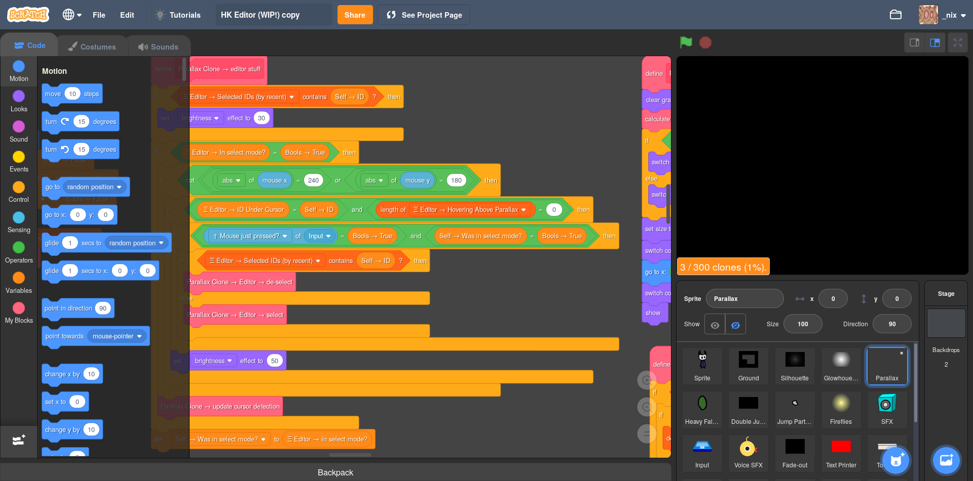
I have an ordinary 1920x1080 screen, and I work at +20% zoom level (and a little higher in the block workspace) because otherwise it's a little hard for me to read some UI elements. Presently, the workspace is arranged into two general columns, described as follows:
Workspace  |  Stage
(Tabbed)   |  Sprites
Workspace  |  Stage    |  Costume Editor
(Blocks)   |  Sprites  |  Sound Editor
You might exclaim blasphemy and say I am cheating by making the stage view 120%, and you'd be right.
But even at +0% (normal) zoom, the paint editor still takes up, say, 40% of the screen width (vs. the 50% in my screenshot). We'll say the sound editor is equal width because it can realistically be shrunk width-wise without worsening its UI.We'll take it as a given that, in the new layout, the width of the stage must be at least 30% (its normal width). After all, one of our goals here is to increase the size of the stage/viewport, right?
So, 40% for the paint/sound editor column + (at least) 30% for the stage = 70% of the width encompassed by those two columns, leaving us (at most) 30% of the screen space for the code workspace. And.. that's what confuses me. It seems to me that your suggested UI implies that the width of the code workspace be cut to less than half its present size. If you want to increase the size of the stage (as you suggest), it'd end up taking more width, resulting in an even smaller code workspace. (Do remember that the width of the workspace includes the width of the block palette, too, which spans some 15% of the screen itself!)
The reason this confuses me is because, at least for me, the vast majority of time working on a project is spent in the code editor, defining the behavior and implementation for every object in the creation. While I certainly appreciate the ability to access the sound and paint editors at the click of a tab (and even more quickly, with your suggested UI), the amount of time I spend using them just pales in comparison. So, I do not understand why it would make sense to decrease the width of the block workspace, only to make space for elements of the editor which are not used nearly as frequently.
I'm curious about your thoughts. It maybe as simple an issue as me just misunderstanding your layout diagram! Or maybe I spend more time in the block workspace than most people. Anyway, I'm interested in what you're visualizing and if it differs from what I'm laying out here, and what your reasoning for cutting the block workspace so small is if I do have the idea down.
══ trans autistic lesbian enbydoggirls // 16 17 18 19 20, she/they ════
sparrows one word to the paragraph // <3 // ~(quasar) nebula
- ResExsention
-
New to Scratch
1000+ posts
General Editor Suggestions
So, my understanding is that your idea would basically involve just making the sound and costume editors visible on the right-side of the screen. Is that correct?
Partially. And then rebuilding the UI around the larger preview and visible costume and sound editors.
That said, I'm a bit confused about how it would all… fit. kritav mentioned there's a lot of free space to fill up with more UI, but I just don't see it on my screen! Here's what my editor looks like:
How did you get a dark theme? Are you using a browser extension?
Workspace | Stage | Costume Editor
(Blocks) | Sprites | Sound Editor
Somewhat. The inspector was supposed to be a place when you can modify your sprites without code (such as manually changing the transform, visibility, etc). The code editor would be separate, and would replace the viewport, since writing scripts doesn't result in the changes being reflected in real time; the viewport can be expended for a larger code editor, since you wouldn't really need to see the viewport, anyway.
You might exclaim blasphemy and say I am cheating by making the stage view 120%, and you'd be right. But even at +0% (normal) zoom, the paint editor still takes up, say, 40% of the screen width (vs. the 50% in my screenshot). We'll say the sound editor is equal width because it can realistically be shrunk width-wise without worsening its UI.
Yes, that's blasphemy. You semi-oppose the idea and then zoom to work around it
So, 40% for the paint/sound editor column + (at least) 30% for the stage = 70% of the width encompassed by those two columns, leaving us (at most) 30% of the screen space for the code workspace. And.. that's what confuses me. It seems to me that your suggested UI implies that the width of the code workspace be cut to less than half its present size. If you want to increase the size of the stage (as you suggest), it'd end up taking more width, resulting in an even smaller code workspace. (Do remember that the width of the workspace includes the width of the block palette, too, which spans some 15% of the screen itself!)
That's the power of popups. Again, the inspector is not the code editor. It is for manually editing sprites without code. In the sprite hierarchy (located at the top part of the inspector), once you select a sprite there would be an “edit code” button, and then the code editor would replace the preview. Then, 75% or so would be the code editor.
Again, the power of popups. The code and sound editors would be resizable, of course, however I'm also suggesting that a button be implemented, resulting in the viewport replaced by the costume editor temporarily for more fine tuned work. Same with the sound editor. This means, if you want, instead of taking up 10% of the space, you can have it take 75% if you want. Again, you wouldn't really need to see the preview until you've finished with what you're doing, so it isn't very important that the preview is hidden. Most game engines kind of work like this, replacing the viewport for other windows if the preview's presence is inconsequential (such as during scripting or the creation of art).
The reason this confuses me is because, at least for me, the vast majority of time working on a project is spent in the code editor, defining the behavior and implementation for every object in the creation. While I certainly appreciate the ability to access the sound and paint editors at the click of a tab (and even more quickly, with your suggested UI), the amount of time I spend using them just pales in comparison. So, I do not understand why it would make sense to decrease the width of the block workspace, only to make space for elements of the editor which are not used nearly as frequently.
Yes. Obviously the code editor is the most important part of the UI, however while working with code you have no need to actively see the preview. Thus, instead of shrinking the code editor, I'm going for more of a “either hidden or very large” thing. So, it's normally hidden, but at the click of a button you can modify the code of sprites in a window that takes three quarters of the UI.
Last edited by ResExsention (May 20, 2019 02:36:23)
Infrequently active.
It feels weird to see how far we've come. I hope you're well, wherever you are!
- _nix
-
Scratcher
1000+ posts
General Editor Suggestions
Re: dark theme – Yeah, it's a userstyle I made a while ago. Here's the discussion topic if you're curious!
Thanks for the clarification all around – I've got a much better picture of what you're suggesting, and a lot of it really makes sense to me now. It's rather similar to, well, the little experience I've had with game engine editors.
One thing I noticed is that you said that editing code doesn't directly cause an effect on the stage, so there is no reason to see both at once. Accordingly, you swap between the stage and code views, which makes sense. Buuuut the thing is.. you're not really correct in thinking that the block workspace and stage view are entirely separate and that one need only be active at a single moment! See, Scratch is an interesting type of programming language – as you make changes to your code, the new code is reflected immediately. There's no need for recompiling, nor for the program's state to be reset as you develop. Changes you make just happen, instantaneously. This is a remarkably useful functionality in a variety of cases, so here are a few examples.
Suppose you're writing code for how quickly a sprite bobs up and down. You create this script and run it, either by clicking the script or pressing the green flag:
It does what it's supposed to, but you decide that it's animating a bit too quickly for your target. So, while the program is running, you select the “1000” input and tweak it to some lesser value. As you type, the stage reflects what you are writing. Eventually, you find a value which is satisfying, and move on.
Another example. Say you're working on a death animation for an enemy character in your game. For convenience, while you're developing it, you decide to attach the animation script to a “when key pressed” hat block. This allows you to quickly test the animation as you expand and tweak it – all you have to do is press the key and look at the result reflected on the stage. (You do this with virtually any other time you're writing a specific code sequence too, such as while designing save/load utility code or confirming that clones are being spawned at the correct positions.)
One more! Imagine you've worked on a project for a long while, but have just discovered an odd bug that happens under certain conditions in your project. It's straightforward for you to reproduce, but debugging is going to take a fair amount of effort, going back and forth between tweaking your code and testing to see if the issue is resolved. Luckily, this is no difficult process. All you have to do is exactly that – modify the scripts and re-do the input which repros the bug. Now imagine if you had to swap between – may I emphasize this – tabs every time you wanted to do that!
Indeed, in all of these cases (and the many similar ones), there is a huge advantage to being able to modify your code and then immediately see the result. These would be dashed or lost altogether if you had to switch views to see only one or the other.
As you see, I am quite used to Scratch, and I've grown accustomed to how to use it efficiently. So it is probably no surprise that I struggle to see the gain in productivity from your suggested UI – I spend relatively little time in the sound and paint editors, and any actions I'd like to perform on a sprite (transformations, costume changes, etc) I can easily do with ordinary Scratch blocks. (In fact, I rather prefer to do those actions with blocks – which I place into initialization scripts, since I feel it's good practice to guarantee the state of your project is reset correctly when the project is started.)
Curious on your thoughts on the matter. I'm noticing the big theme here is that I'm used to Scratch while you're used to game engine IDEs, and there is a dramatic amount of difference in the way one develops projects between the two. Of course, I'm arguing that the current Scratch editor simply suits Scratch as a programming language much better than your suggestion does; but I'm interested in what you think!
(Edit: formatting.)
Thanks for the clarification all around – I've got a much better picture of what you're suggesting, and a lot of it really makes sense to me now. It's rather similar to, well, the little experience I've had with game engine editors.
One thing I noticed is that you said that editing code doesn't directly cause an effect on the stage, so there is no reason to see both at once. Accordingly, you swap between the stage and code views, which makes sense. Buuuut the thing is.. you're not really correct in thinking that the block workspace and stage view are entirely separate and that one need only be active at a single moment! See, Scratch is an interesting type of programming language – as you make changes to your code, the new code is reflected immediately. There's no need for recompiling, nor for the program's state to be reset as you develop. Changes you make just happen, instantaneously. This is a remarkably useful functionality in a variety of cases, so here are a few examples.
Suppose you're writing code for how quickly a sprite bobs up and down. You create this script and run it, either by clicking the script or pressing the green flag:
when green flag clicked
forever
  set y to ((50) * ([sin v] of ((1000) * (timer))))
end
It does what it's supposed to, but you decide that it's animating a bit too quickly for your target. So, while the program is running, you select the “1000” input and tweak it to some lesser value. As you type, the stage reflects what you are writing. Eventually, you find a value which is satisfying, and move on.
Another example. Say you're working on a death animation for an enemy character in your game. For convenience, while you're developing it, you decide to attach the animation script to a “when key pressed” hat block. This allows you to quickly test the animation as you expand and tweak it – all you have to do is press the key and look at the result reflected on the stage. (You do this with virtually any other time you're writing a specific code sequence too, such as while designing save/load utility code or confirming that clones are being spawned at the correct positions.)
One more! Imagine you've worked on a project for a long while, but have just discovered an odd bug that happens under certain conditions in your project. It's straightforward for you to reproduce, but debugging is going to take a fair amount of effort, going back and forth between tweaking your code and testing to see if the issue is resolved. Luckily, this is no difficult process. All you have to do is exactly that – modify the scripts and re-do the input which repros the bug. Now imagine if you had to swap between – may I emphasize this – tabs every time you wanted to do that!
Indeed, in all of these cases (and the many similar ones), there is a huge advantage to being able to modify your code and then immediately see the result. These would be dashed or lost altogether if you had to switch views to see only one or the other.
As you see, I am quite used to Scratch, and I've grown accustomed to how to use it efficiently. So it is probably no surprise that I struggle to see the gain in productivity from your suggested UI – I spend relatively little time in the sound and paint editors, and any actions I'd like to perform on a sprite (transformations, costume changes, etc) I can easily do with ordinary Scratch blocks. (In fact, I rather prefer to do those actions with blocks – which I place into initialization scripts, since I feel it's good practice to guarantee the state of your project is reset correctly when the project is started.)
Curious on your thoughts on the matter. I'm noticing the big theme here is that I'm used to Scratch while you're used to game engine IDEs, and there is a dramatic amount of difference in the way one develops projects between the two. Of course, I'm arguing that the current Scratch editor simply suits Scratch as a programming language much better than your suggestion does; but I'm interested in what you think!
(Edit: formatting.)
Last edited by _nix (May 20, 2019 03:10:12)
══ trans autistic lesbian enbydoggirls // 16 17 18 19 20, she/they ════
sparrows one word to the paragraph // <3 // ~(quasar) nebula
- ResExsention
-
New to Scratch
1000+ posts
General Editor Suggestions
-snip snip-
Really? Userthemes exist now? Please tell me how I can use it with Scratch, please?
-snip snip-
I suppose you do have a point, however I generally find constantly swapping between the preview and code editors quite inefficient, mind you. When you avert your eyes, it takes time to refocus, so my idea is to remove the distraction of the preview and hide it with the code editor.
And of course, with the improved inspector that may or may not support expressions, it becomes easier.
And, you forgot to mention that you actually have to run the script, the changes don't get reflected in real time. Plus, I must say that running scripts by themselves aren't very efficient sometimes, since scripts can depend on other scripts and so on. I think it would be better to just restart the whole project, this way you don't have any script dependency issues, and you can always return to the code editor if need be.
Again, the costume editor will just list the costumes for the selected sprite, you'll need to click a button, which will result in the paint editor replacing the viewport or code editor. Thus, you can actively see all the costumes for the selected sprite without having to tab out. This also allows for easier name reference when writing scripts, since sometimes costumes aren't named very well, so I have to constantly switch to the costume list. Same goes for sounds.
Thanks for your opinion, though!
Infrequently active.
It feels weird to see how far we've come. I hope you're well, wherever you are!
- _nix
-
Scratcher
1000+ posts
General Editor Suggestions
Really? Userthemes exist now? Please tell me how I can use it with Scratch, please?Yeah! Well, sorta. Scratch 3.0's GUI is made totally out of HTML elements which are styled with CSS, so by using a browser extension (Stylus, available on Firefox/Chrome/Opera), we can create our own custom CSS to modify the editor's appearance to our tastes. This was one of the goals of Scratch 3.0's design, actually! So, to use my userstyle, you'll need to install Stylus, then, while in the Scratch editor, click the “write style for (this URL)” button in the extension popup. Then just paste the CSS code from here into the editor that shows up; save, and you should see it take affect!
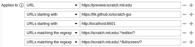
(BTW, you'll want to actually fill out the “applies to” section riight below the editor according to this screenshot. The two important ones are “URLs matching the regexp”; they make the theme apply anywhere on the Scratch website.)
(PS, Scratch unfortunately has strict terms disallowing the sharing of JavaScript browser extensions on Scratch. I'm linking you Stylus and my userstyle both from my own confidence that they are perfectly safe and do not tamper with your ability to use Scratch or act maliciously at all, and that's relatively easy for me to guarantee, since userstyles are not made with JS and so can't do stuff on its behalf (without some ridiculous trickery). But yeah. Sharing around JS extensions will apparently (still) get you a warning from the ST with your posts deleted. PPS don't use or link to the similar browser extension, Stylish! Stylish is not Stylus. Stylish is a malicious extension that steals and collects your browser history!)
And, you forgot to mention that you actually have to run the script, the changes don't get reflected in real time. Plus, I must say that running scripts by themselves aren't very efficient sometimes, since scripts can depend on other scripts and so on. I think it would be better to just restart the whole project, this way you don't have any script dependency issues, and you can always return to the code editor if need be.OK, that's a fair opinion, though I respectfully disagree.
In the case of a complex algorithm-based project, sure, it may be better to restart the project, but in the vast majority of my games I find it much more useful to develop while I'm running the project. Different use cases I suppose!Again, the costume editor will just list the costumes for the selected sprite, you'll need to click a button, which will result in the paint editor replacing the viewport or code editor. Thus, you can actively see all the costumes for the selected sprite without having to tab out. This also allows for easier name reference when writing scripts, since sometimes costumes aren't named very well, so I have to constantly switch to the costume list. Same goes for sounds.Oh, gotcha! That's fair, yeah. I somehow didn't recognize that part of your post earlier. Again, to a degree I disagree, because I do find it useful to see how changes to a costume or sound are reflected in the context of the full project view, but hey, again, our use cases for Scratch, not to mention our development styles, are pretty different.
Thanks for the discussion about all this, too. I quite enjoy ranting about UIs, so it's nice to have a place where I can do it constructively!
I'm probs not going to be around a whole ton to discuss more through the not-weekend, but I feel we've basically gotten to a clear point here. It's really just a misalignment of working styles. I feel what I was describing is more natural and fits Scratch better, buuuuut I'm biased because I'm way more used to it. They're just different methods of working, and different editor layouts fit them better.══ trans autistic lesbian enbydoggirls // 16 17 18 19 20, she/they ════
sparrows one word to the paragraph // <3 // ~(quasar) nebula
- ResExsention
-
New to Scratch
1000+ posts
General Editor Suggestions
Really? Userthemes exist now? Please tell me how I can use it with Scratch, please?Yeah! Well, sorta. Scratch 3.0's GUI is made totally out of HTML elements which are styled with CSS, so by using a browser extension (Stylus, available on Firefox/Chrome/Opera), we can create our own custom CSS to modify the editor's appearance to our tastes. This was one of the goals of Scratch 3.0's design, actually! So, to use my userstyle, you'll need to install Stylus, then, while in the Scratch editor, click the “write style for (this URL)” button in the extension popup. Then just paste the CSS code from here into the editor that shows up; save, and you should see it take affect!
(BTW, you'll want to actually fill out the “applies to” section riight below the editor according to this screenshot. The two important ones are “URLs matching the regexp”; they make the theme apply anywhere on the Scratch website.)
(PS, Scratch unfortunately has strict terms disallowing the sharing of JavaScript browser extensions on Scratch. I'm linking you Stylus and my userstyle both from my own confidence that they are perfectly safe and do not tamper with your ability to use Scratch or act maliciously at all, and that's relatively easy for me to guarantee, since userstyles are not made with JS and so can't do stuff on its behalf (without some ridiculous trickery). But yeah. Sharing around JS extensions will apparently (still) get you a warning from the ST with your posts deleted. PPS don't use or link to the similar browser extension, Stylish! Stylish is not Stylus. Stylish is a malicious extension that steals and collects your browser history!)And, you forgot to mention that you actually have to run the script, the changes don't get reflected in real time. Plus, I must say that running scripts by themselves aren't very efficient sometimes, since scripts can depend on other scripts and so on. I think it would be better to just restart the whole project, this way you don't have any script dependency issues, and you can always return to the code editor if need be.OK, that's a fair opinion, though I respectfully disagree.Again, the costume editor will just list the costumes for the selected sprite, you'll need to click a button, which will result in the paint editor replacing the viewport or code editor. Thus, you can actively see all the costumes for the selected sprite without having to tab out. This also allows for easier name reference when writing scripts, since sometimes costumes aren't named very well, so I have to constantly switch to the costume list. Same goes for sounds.Oh, gotcha! That's fair, yeah. I somehow didn't recognize that part of your post earlier. Again, to a degree I disagree, because I do find it useful to see how changes to a costume or sound are reflected in the context of the full project view, but hey, again, our use cases for Scratch, not to mention our development styles, are pretty different.
Thanks for the discussion about all this, too. I quite enjoy ranting about UIs, so it's nice to have a place where I can do it constructively!
Great then. Glad we both managed to share opinions without this turning into a full blown flame war. Lol. I enjoy ranting about my preferences too, maybe so I can indoctrinate them into the style of bigger preview windows
So, along the lines of editor layouts, how about being able to move and resize the docks to your own liking, sort of like Blender? You can duplicate tabs, move them, resize them, even have two previews if you which. I may be hijacking my own thread, but I think my suggestion was more on being able to change the layout than static themes.
Please let me know if I am indeed hijacking my own thread. The way it all pertains to editor layouts makes it seem like they should be in the same thread, but they both seem like completely different suggestions…
Infrequently active.
It feels weird to see how far we've come. I hope you're well, wherever you are!
- codeman1044
-
Scratcher
1000+ posts
General Editor Suggestions
(I realized that this post didn't add anything)
the amount of scrolling I had to do to find my own post box… lol
the amount of scrolling I had to do to find my own post box… lol
Last edited by codeman1044 (May 21, 2019 13:48:06)
This is my signature, which shows up every time I post and is automatic. To make a signature of your own, locate the “Change your signature” option in the bottom left of the Discussion Home.
I am nothing if not consistently inconsistent.
Snap! is a website that offers block coding like Scratch, but also offers the creation of your own blocks and writing JavaScript functions. The adventurous should consider checking it out!
Potentially useful tutorials and topic coverage
If you want to see a new tutorial added to this, feel free to leave a suggestion on my profile.
- Discussion Forums
- » Suggestions
-
» General Editor Suggestions