Discuss Scratch

- yzyzyz
-
 Scratcher

500+ posts
Merge the two "my stuff" buttons.
bump
hi! I'm yzyzyz, the owner of the #bring_it_back studio, a sticky, 400+ projects and 500+ posts.
I am an active scratcher.
advertise in my signature!
ad:Urgently need a popular animation? If you do, check out Every Time I Share A Project, by Randomness-TV!

I am an active scratcher.
advertise in my signature!
ad:Urgently need a popular animation? If you do, check out Every Time I Share A Project, by Randomness-TV!
- PrincessPandaLover
-
 Scratcher

1000+ posts
Merge the two "my stuff" buttons.
No support, I don't see a reason to fix it.
 MONEH MONEH MONEH MONEH
- PrincessFlowerTV
-
 Scratcher

1000+ posts
Merge the two "my stuff" buttons.
Semi support. They are so close together, there is practically no reason to have 2 of them.

Got to be good looking cause he's so hard to see -The Beatles
(Thank you @just-there from The Profile Picture Shop for the banner ^^)
Nothing's down here, sorry to disappoint you.
JK. there may be something down there…
Maybe not, tho.
You're determined, aren't you?
Talar du Svenska? Om inte, det ar fin.
Just stop it, will ya?
Fine, you win.

Take a rice cake. *yeets you a rice cake*
Say “Thanks for that rice cake, Kewpie!” if you made it this far.
JK. there may be something down there…
Maybe not, tho.
You're determined, aren't you?
Talar du Svenska? Om inte, det ar fin.
Just stop it, will ya?
Fine, you win.

Take a rice cake. *yeets you a rice cake*
Say “Thanks for that rice cake, Kewpie!” if you made it this far.
- wWSunPandaWw
-
 Scratcher

1000+ posts
Merge the two "my stuff" buttons.
Support, we don't need two. I suggest that the one in the NAVBAR BE REMOVED (I completely changed my opinion) so it frees up space.
Last edited by wWSunPandaWw (March 23, 2018 19:10:58)
I moved to BelieverGirlSun
- Nero-Guineadoq
-
 Scratcher

50 posts
Merge the two "my stuff" buttons.
Support. There is no reason for two buttons. In three years, I've clicked the one in the dropdown zero times.
- pinkieofthepies
-
 Scratcher

500+ posts
Merge the two "my stuff" buttons.
i dont really support this, there is really nothing wrong with it, although it i had to choose which one to loose, i would loose the one on the navigation bar. i always use the dropdown menu.
still here
- Haz-_-
-
 Scratcher

500+ posts
Merge the two "my stuff" buttons.
I don't really see a problem with this
No support why can't we use the menu one and the drop down one?
It's not necessary the menu one is quicker for some people and is the same to the drop down.
No support why can't we use the menu one and the drop down one?
It's not necessary the menu one is quicker for some people and is the same to the drop down.

continue this hashtag if you live in australia [img]http://u.cubeupload.com/rabbitcarrots/FEDB1435D41540BFB9FB.jpeg[/img] is the image code xD oh and btw this siggy is from @Hellounicorns2 :cool:
- hellounicorns2
-
 Scratcher

1000+ posts
Merge the two "my stuff" buttons.
Support! I personally think the dropdown one should be removed, as it is completely unnecessary, and a file button looks kinda similar to the ones found in google drive 

inactive :)
- Botcho_Otkho
-
 Scratcher

1000+ posts
Merge the two "my stuff" buttons.
No support at all, there's no reason to fix it and would bother some users that use the dropdown one instead of the header one and vice versa. Though, if we may really need to remove one of them, I think we should remove the one in the topbar (instead of the one in the dropdown) for two reasons:
- May be a good way to bring it back.
- Mobile users don't have it.
Last edited by Botcho_Otkho (May 10, 2018 20:41:09)
I see now that the circumstances of one's birth are irrelevant. It is what you do with the gift of life that determines who you are. - Mewtwo
- zafzaf
-
 Scratcher

1000+ posts
Merge the two "my stuff" buttons.
.
“that's life, goofball, sometimes you lose people. sometimes you lose people you care about. and you never see them again. and the worst part is, you never even get a chance to apologize to them for letting them down.”
give me an internet so I can feel better about myself
- cinnamon_bun_puff
-
 Scratcher

500+ posts
Merge the two "my stuff" buttons.
No support, some people probably prefer one over the other, and vice versa.
c i n n a m o n _ b u n _ p u f f
“Even the darkest hour has only 60 minutes.”
~ Morris Mandel
“Even the darkest hour has only 60 minutes.”
~ Morris Mandel
- Haz-_-
-
Scratcher
500+ posts
Merge the two "my stuff" buttons.
.?
continue this hashtag if you live in australia [img]http://u.cubeupload.com/rabbitcarrots/FEDB1435D41540BFB9FB.jpeg[/img] is the image code xD oh and btw this siggy is from @Hellounicorns2 :cool:
- TheRealNetherBefore
-
 Scratcher

1000+ posts
Merge the two "my stuff" buttons.
Support- it's unnecessary to have both, and those who typically click one could easily learn to click the other without much issue.
*Drinks ketchup*
there is no ethical consumption under capitalism my dudes
Small Games | Tips and Advice | Boredom Cat | Misc
Want to make a fantasy world everyone on scratch can use? Click here!
G'thorpax the Unspoken
there is no ethical consumption under capitalism my dudes
Small Games | Tips and Advice | Boredom Cat | Misc
Want to make a fantasy world everyone on scratch can use? Click here!
G'thorpax the Unspoken
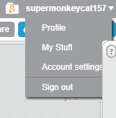
- supermonkeycat157
-
 Scratcher

100+ posts
Merge the two "my stuff" buttons.
Support! Plus, on the editor, there are THREE my stuff buttons!

Scratch Clone Script by me:

- Sheep_maker
-
 Scratcher

1000+ posts
Merge the two "my stuff" buttons.
It's probably like this because the mystuff icon disappears on smaller screens (eg phones) but the messages icon doesn't. Typically the content in dropdowns don't change based on the width of the screen, but the links in navigation bars do. The mystuff link in the dropdown is probably for the phones.
- Sheep_maker This is a kumquat-free signature. :P
This is my signature. It appears below all my posts. Discuss it on my profile, not the forums. Here's how to make your own.
.postsignature { overflow: auto; } .scratchblocks { overflow-x: auto; overflow-y: hidden; }
- Haz-_-
-
Scratcher
500+ posts
Merge the two "my stuff" buttons.
well some people like using both buttons, but getting rid of them? It's unnecessary, I mean whats the point of getting rid of them. For more space?
well there are 2 empty borders on the top left and right, you could add buttons there!
+ Whats the reason of deleting them?
I feel like an opposition team xD
well there are 2 empty borders on the top left and right, you could add buttons there!
Support! Plus, on the editor, there are THREE my stuff buttons!And why removing, those 3 “my stuff” buttons when there are 2 my “save” buttons
+ Whats the reason of deleting them?
I feel like an opposition team xD
continue this hashtag if you live in australia [img]http://u.cubeupload.com/rabbitcarrots/FEDB1435D41540BFB9FB.jpeg[/img] is the image code xD oh and btw this siggy is from @Hellounicorns2 :cool:
- -raspberry_
-
 Scratcher

500+ posts
Merge the two "my stuff" buttons.
Remove one at the top. More space to bring back the discuss button.
- IgDegOo
-
 Scratcher

1000+ posts
Merge the two "my stuff" buttons.
If it ain't broke, don't fix it
Last edited by IgDegOo (March 11, 2018 20:05:39)
- radishboy
-
 Scratcher

100+ posts
Merge the two "my stuff" buttons.
Support. They got rid of the Discuss button because it took up too much space. Why not remove the extra my stuff button
StormCrow Storm

- Haz-_-
-
Scratcher
500+ posts
Merge the two "my stuff" buttons.
Remove one at the top. More space to bring back the discuss button.Welll the top right andleft borders have tons of space…
continue this hashtag if you live in australia [img]http://u.cubeupload.com/rabbitcarrots/FEDB1435D41540BFB9FB.jpeg[/img] is the image code xD oh and btw this siggy is from @Hellounicorns2 :cool: